-
Limited Editions: Shep Fairey at Deitch
by Alice Gregory May 22, 2010

It’s difficult to keep an open mind when approaching the work of Shep Fairey, née Shepard Fairey. I know he’s responsible for those Andre the Giant Has a Posse stickers and for OBEY; he did the Obama poster and he was sued for cropping a copyrighted photograph. Other than that though, his work seems like little more than Urban Outfitters ready-made dorm decoration. And as with the store, Fairey’s success has followed a similar course of (un)cool. Like many other Deitch artists (Barry McGee, Jo Jackson, Futura, Larry Clark, etc.) Fairey comes out of the skate punk community whose juvenilia is one thing when relegated to the street, but it’s quite another when moved indoors, what with the referent for its alleged grittiness long since forgotten.
I’m never one to spite bands or artists for “selling out.” Usually, if something disseminates to a mainsteam audience, it’s actually just really good. Put Shep Fairey in a gallery, however, and he transforms from an underground graf artist made good into a mediocre graphic designer who scored the final Deitch show. Fairey’s “look,” though certainly sleeker now, has remained consistent over the past two decades, so my queasiness isn’t rooted in his pandering, but rather in the sheer fatigue of his imagery. He might be the prime example of the latent commercial potential in skate punk culture. But at this point, especially within Jeffrey Deitch’s walls, the associations with “youth revolution” and “cultural resistance” are distant, if they still exist at all.
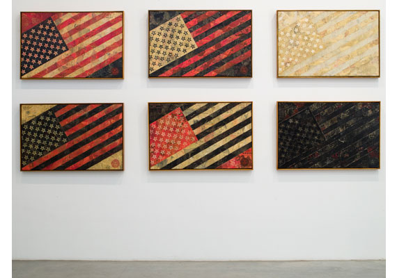
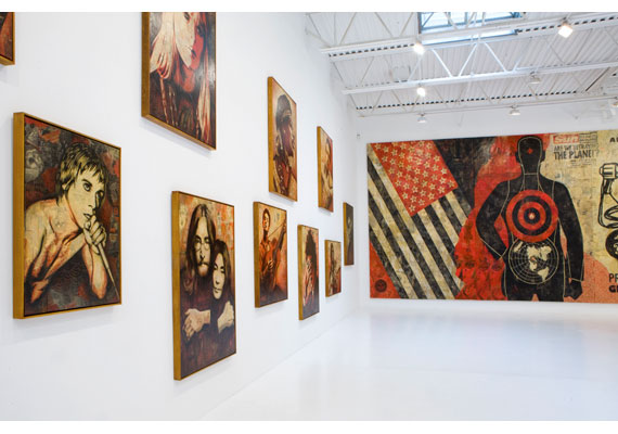
Like Warhol before him, Fairey is obsessed with silkscreen and celebrity, but his colors – black, white, and red – are muddy, and the portraits seem vacant. Art Observed noted that the “stark use of colors and graphic style in combination with areas that mimic the layering of posters that occurs on real billboards, exploits the stylistic approach of advertising, but as an ad for an absent product.” This would only be true if this absent product somehow signified the very product-ness of Fairey’s own work; it doesn’t quite. Fairey’s street art might have functioned as advertisement without product, but in a gallery context the portraits are products themselves, merely tautological ads. This is maybe why it’s so perfect, but also so frustrating, to see the work in SoHo, a neighborhood now devoted to nothing but commerce. Warhol’s success as a commercial illustrator preceded his art world fame; his rendering of people as products was the result of a logical trajectory, whereas Shepard’s background works in the opposite direction; his work was already a product, it just wasn’t for sale.

Titled in reference to the exhibition’s opening, May Day consists of hundreds of portraits of people who, according to the press release, advocate for the working class. But many of the figures – Basquiat, Debbie Harry, Robert Rauschenberg – make no sense at all in this context. The conceit seems dishonest. With the exception some Zapatistas, Woody Gutherie and (maybe, maybe) Cornel West, the subjects are more famous than they are radical.
It seems like wasted vitriol to even bother getting upset about the show; Deitch Projects is indisputably commercial. But this is one of those phenomena that you witness and cannot believe you’re really seeing the whole picture. Say what you want about Jeffrey Deitch, but he’s got to be smarter than this, right? The fact that Fairey is responsible for the single image of the single biggest “progressive” victory of the past thirty years seems like a fluke. Perhaps propaganda is the limit of Fairey’s usefulness; mostly he seems like just a dude who avoids the whole question of art and art criticism. His success in spite of this disinterest could be massively compelling if the work was just not so bad. My problem must just be an aesthetic one. I want there to be a successful artist who skirts if not the art market then the art world. I just wish it were someone else.
When I’m bored by art, I usually turn to its viewers for some metonymical perspective. And here it’s difficult to walk through a bustling, sunny SoHo to the moribund Deitch Projects and view Fairey’s portraits as celebrations of progressive heroes. There were more wealthy Europeans in the gallery than in any equally-sized swath of SoHo, an impressive feat. A young man in a powder blue polo shirt (collar popped), whiskered jeans, and blindingly white sneakers paced through the gallery, Chanel shopping bag hanging from his tanned forearm. How much for these? he asks the gallery assistant, pointing the small portraits hanging behind the front desk. “Oh, those are $2,000, but they’re all sold out. They sold out right away.” He sighs and walks out, maybe to be told the same thing about a limited edition Louis Vuitton down the street.

