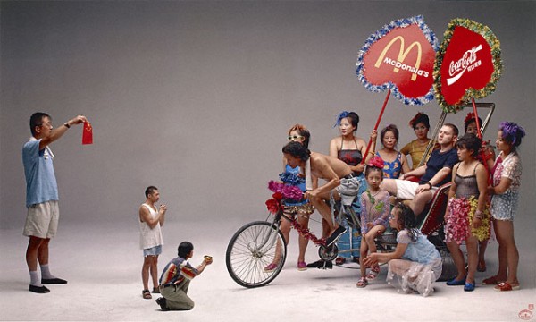
Wang Qingsong, Can I Cooperate with You?, 2000. Via the Getty
To the United States, China is a threat and a friend, a customer and a creditor, an inspiration and a cautionary tale. Just as the young Soviet Union was in the 1920’s, or Japan was in the 80’s, the People’s Republic of China is the obsessive focus of America’s dreams and nightmares of profit and collapse. But forty years after China opened to the West, the nation is still a bit of a mystery to us. And if what it means to be Chinese now can be confusing, anything before the Great Leap Forward often seems downright unknowable.
Three related photography exhibitions currently up at the Getty in Los Angeles attempt to fill this gap by depicting key moments in Chinese history, with a particular focus on crucial moments of interaction with the west. “Brush and Shutter: Early Photography from China,” “Felice Beato: A Photographer on the Eastern Road,” and “Photography from the New China,” present pictures from the arrival of the first daguerrotypes in China to the current period of economic dynamism. This trio walks a fine line between exploring orientalism and just being orientalist.
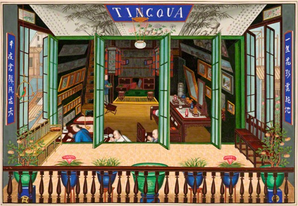
Tingqua, Tingqua studio in Guangzhou, about 1840. Via the Getty
“Brush and Shutter” is a small show, perhaps because there was precious little photography in early China. Although there are a few interesting pieces here, the exhibit suffers from a muddled curatorial vision. Comprised mostly of portraits, posed group shots, and cityscapes, the show, while interesting from a historical perspective, is repetitive. One 1860 panoramic triptych of Shanghai’s waterfront could be a nice place-setting—but I didn’t know what I was supposed to think when presented with an entire wall of them.
Where repetition isn’t a problem, obscure and unexplained curatorial choices are. Why, for instance, is the charming, meticulous watercolor Signing the Peace Treaty at Hai Kwang Monastery next to Hing Qua John and Co.’s photograph, Theatrical Troupe? Is it because they are both documentary pieces? Because they represent a similar moment in Chinese history? Because they’re group images? Or just because they’re the same size?

Lai Afong, Hong of Smith, Archer & Co. in Guangzhou, late 1860s. Via the Getty
Arranged in rough chronological order, the exhibition’s centerpiece is a section displaying the work of Chinese-operated photo studios. The show’s wall text asserts that, “Chinese photographic studios offered their own style of photographic representation, ranging from traditional Chinese settings to painted landscape backdrops.” But the images shown here, or in any other section of the exhibition, fail to back this up. Just steps away, there was a wall of images created by European photographers that placed a Chinese figure against a traditional backdrop; the posing, the dress, the composition, are all largely indistinguishable from Chinese photographers’ images.
China’s notable addition to the field—the use of traditional Chinese painting methods to color photographs—is touched on by “Brush and Shutter,” but only lightly. A handful of Chinese colored photos are on display, and they’re eye-catching and odd—just a little different from Western painted photos, but different enough in the quality and application of the color to suggest that there was a uniquely Chinese approach to photography. That only a small group of these photos should be on display in an exhibition whose title refers to the union of paintbrush and camera shutter is indicative of this small show’s big problems: its overambitious, undersized, and not fully formed. A documentary of the dawn of China’s modern age demands better.
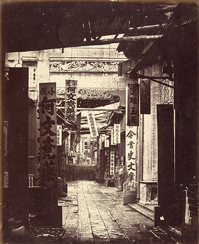
Felice Beato, Treasury Street, Canton, April 1860. Via the Getty
Perhaps that’s why, just down the hall the Getty has placed two additional, China-focused exhibits. Although, that’s not quite accurate: “Felice Beato: A Photographer on the Eastern Road,” broadens its scope to include, um, the Orient. Presenting the work of the prolific Italian-British photographer, the Beato show covers his work in India, China, Korea, and Japan. It’s an expansive show, and perhaps Beato deserves the star treatment. At the very least his work is a compelling collection of period pieces that explore the nineteenth century trope of the mysterious and stoic east without quite challenging it. In Treasury Street, Canton , two blurred figures dart into doorways at middle-distance, breathing the ghost of life into a narrow alleyway. In Woman in Winter Dress, a Japanese woman in a kimono struggles through fake snow against a canvas backdrop of a chilly scene: a tableau from a Japanese print recreated in a photography studio’s “real life.”
But “Felice Beato’s” real problem isn’t its content, but its placement. The show is sandwiched by the early and contemporary Chinese photography exhibitions, and indeed shares a wall with the latter. Clearly the curators seek to link Beato’s work with his influences and successors. That’s fine—but they’d have been wise to exclude his work in Thailand, Japan, Korea, and India, the collective presence of which creates a pan-Asian scope that seems out of place. It doesn’t help matters that “Photographers from the New China” shares a wall not with Beato’s Chinese photos, which would make sense, but with his Indian ones, too. The enormous scope of China would seem enough for one exhibition.
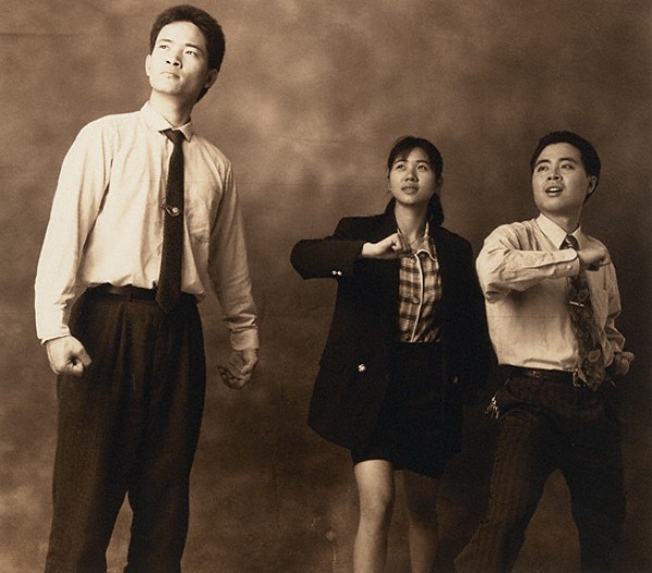
Qiu Zhijie, Standard Pose, 1997. Via The Getty
The transition from the sepia-toned Beato images to the ecstatically hued “Photography from the New China” is jarring in the best way. The final show is as bold and exciting as “Brush and Shudder” and “Felice Beato” are murky and confusing. As if refuting the Western-authored images in the previous two exhibitions, “Photography from the New China” presents a nation deeply ambivalent about its growing commercial might and frank about its own failures to live up to its highest principles.
Wang Qingsong’s New Women (2000) poses five women in yellow, blue, red, and pink satin pajamas—plays on traditional Chinese dress—arranging them so they tower over a tiny man curled up next to a tiger. The women, who stare out from the frame, are a witty, trippy re-imagining of the notion of Chinese women as fetish objects. Similarly satirical is Qiu Zhije’s series Standard Pose, which poses men and women in modern business dress in the absurd, heroic poses of Maoist propaganda.
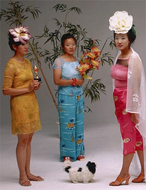
Wang Qingsong, New Women (detail), 2000. Via the Getty
Other images are slyer. East Village, Beijing, No. 8 (1-4) by Rong Roy is a fascinating exploration of the emotional acrobatics that an un-free society demands of its citizens. In this series, the artist peaks an eye through a metal vent, then an ear, then his lips. In the final photo, he licks the side of the opening. The piece pushes towards the very limits of government-sanctioned expression—and then it licks it, taunting its seriousness, while at the same time finding sensuality and art in oppression itself. Huang Yan’s Chinese Landscape—Tattoo also sensualizes Communist China’s volatile mixture of culture and state. Two photos depict a traditional Chinese landscape painted onto Yan’s naked torso. The landscape has cracked and peeled in places, an ideal vision worn away by experience, yet still present.
Compared with the two preceding exhibitions this is an enormously diverse collection, but these pieces all share a bracing forthrightness. Unlike Beato’s oriental fantasies or the early Chinese images, the contemporary pieces are neither coy nor mysterious: they plainly state complicated truths.
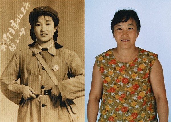
Hai Bo, I Am Chairman Mao's Red Guard, 2000. Via the Getty
The China of “Photography from the New China” is a vastly different place than the nation depicted in the images of Beato and his contemporaries. It’s a bona fide superpower, and not the hazy, benighted backwater imagined by nineteenth-century Europeans. What’s missing here—its space taken instead by the long and unenlightening Beato collection—are images from China’s period of transformation. (There must have been photographers working in China during the twentieth century, right?)
But in their collective successes and flaws, the Getty’s trio of China shows offer a terrific reminder of a simple but important fact about understanding other societies: a culture is most eloquently depicted in its native language. Just as you’re the only one who can really understand what’s wrong with your parents, the Chinese are most adept at criticizing, and celebrating, the People’s Republic.
]]>
David Wojnarowicz, Fire in My Belly, 1987 via tbd
Art, unfortunately, imitates life.
This time it’s David Wojnarowicz who’s bearing the brunt of it. The late artist’s Fire in My Belly is currently featured in the National Portrait Gallery’s Hide/Seek: Difference and Desire in American Portraiture, a groundbreaking exhibition of images of GLBT Americans from Walt Whitman to Ellen Degeneres. Wojnarowicz’s video piece is ostensibly under fire from conservative voices, including the incoming House of Representative’s two leading Republicans, John Boehner and Eric Cantor, because it depicts a crucifix overrun with ants. Shortly after objection to the piece was raised by the Catholic League, the Smithsonian’s leadership promptly removed the piece.
It’s beyond me how Catholics in particular could take umbrage with an image of the cross used to express human suffering. After all, isn’t that what the cross represents? (And who are bigger torture fetishists than the Catholic Church? In any cathedral you’ll find icons subjected to whips and spears that wouldn’t be out of place in a Robert Mapplethorpe photo.) But the particular image under attack is merely representative of a larger issue. Don’t be fooled: this is not about religious sensitivity. This is gay hatred, period.
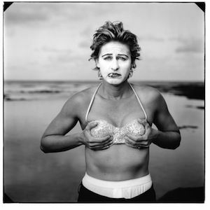
Annie Leibovitz, Ellen DeGeneres, Kauai, Hawaii via Smithsonian Institution
We should have seen it coming: the fuel was building for a while, as this past fall was a refreshingly dry season for gay-hatred. Don’t Ask Don’t Tell had been creeping towards repeal, all those “It Gets Better” Videos seemed to be gaining traction against the entrenched tradition of bullying gay teenagers, and the Smithsonian put up Hide-Seek. That a gay artist would have the audacity to appropriate a Christian image—his own cultural and spiritual heritage—was, apparently, simply too much for some. It was the match that set the kindling aflame. That’s why the criticism of the Wojnarowicz piece quickly engulfed far more than the piece itself. Even Annie Liebovitz’s tame, Vanity Fair photograph of Ellen Degeneres covering her breasts has been attacked by those questioning the show’s right to appear in a building funded by taxpayer money (apparently only straight people pay taxes).
Intolerant is too polite a word for both the citizens who are kicking and screaming about this exhibit and the politicians who are trying to gain from it. These are fag-haters—they don’t want to see portraits of fags next to portraits of Founding Fathers. That the Smithsonian didn’t stand its ground is disgraceful.
But that sinking feeling is too familiar for GLBT Americans, who since the victory of Proposition 9, seem always to get tantalizingly close to full citizenship only to have it slip out of reach. So, in art as in life: half-measures towards inclusion only add insult to injury. The Wojnarowicz piece must be returned to the exhibit—without it, Hide/Seek is fatally bruised by the Smithsonian’s pandering to the lowest exclusionary impulses of our culture.
]]>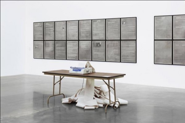
Hans Haacke, News, 1969/2008. Via NuMu
The death of print media is a favorite topic of people in the media business. Readers and reporters turn online in ever-greater numbers, while at the same time bemoaning the disappearance of physical newspapers and magazines. We’re willing but somehow-helpless destroyers of our own environment: it’s global warming writ small.
The Last Newspaper, now on exhibition at The New Museum, gives a terrific and deeply felt examination of what we’re losing. If this seems like a better exhibition for, say, a design museum, it’s useful to remember the role that newspapers have played in art since their emergence as the fourth estate. At once a conduit for, and a representation of, culture, society, and the world, the newspaper has provided artists of many stripes with an ideal stand-in for received wisdom. Hence the presence of newspapers in Cubist collage, in Cornell boxes, or in Warhol’s silkscreens: newspapers are the voice of authority, and can literally be torn apart for art’s sake.
The pieces in The Last Newspaper don’t reach so far back, but they reference this tradition. Jacob Fabricius’s Old News Mexico, part of a project in which artists were invited to alter selections of existing newspapers to include in a new edition—a collage that not only includes bits of newsprint ala Georges Braque, but comprised completely of newspaper itself. The result, editions of which are piled up for visitors to take home, is a moveable feast, a celebration of the easy possession of images and information the broadsheet form gives readers. It’s fun to walk out of a museum with art in hand: I have pages 16 and 17, Begoña Morales’ paper-cut genitalia, hanging above my desk.
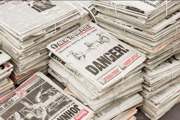
Robert Gober, Newspaper, 1992. Via NuMu
But as the title of the show suggests, physical newspapers are on their way out. Which is why some of the show’s best pieces directly address this shift from physical to ethereal. Hans Haacke’s News is at first an unassuming sight, a beat-up daisy printer sitting glumly on a card table in the middle of the gallery. But when a news item comes to the printer through the wires (in its original incarnation, the piece was connected to satellite news feeds; now it gets RSS), the old machine noisily starts up, producing a fresh news story, which is then added to the thick ringlets of paper gathering appealingly below the desk. The piece, first created when electronic media had already begun to alter the gathering and dissemination of information, elegantly expresses the mixed blessing of instant news: the magic of information arriving suddenly out of the ether is darkened by the way that data suddenly directs our lives. When the printer comes to life, the whole gallery jumps to attention at the noise: we’re at its command. It’s a prescient piece, and still pertinent—as if to underscore that point, when I visited, the item being printed was entitled “ENDURING PASSION.”
Also touching on this theme is Vinyl #1 (Karl Holmqvist Reads Old News, August 11, 2001). In this recording, available at The New Museum both at a listening station and in the gallery elevator, the artist begins by slowly repeats certain phrases: “Old news… old news… There’s nothing new… about old news…” before taking off into some kind of song. “A kid like you could never understand/ A kid like you could never understand/ There’s nothing new about old news.” In addition, the listener hears Holmqvist turning the page of a newspaper and reading a few lines from it. The mode of recording utilized by Vinyl #1 is as outdated as the newspaper Holmqvist is reading from. And, as he says, there is an emptiness in a young person’s understanding of “old news.” The forms that once brought us the new are disappearing—and when newspaper content is transferred to other media (as it is in Vinyl #1), certain meanings become unmoored.
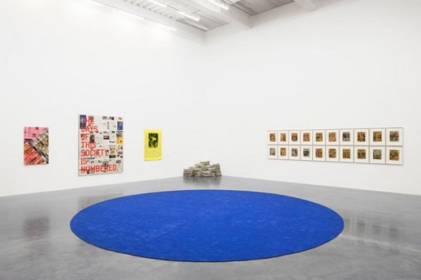
The Last Newspaper, Fourth Floor Gallery View via NuMu
Without its physical bonds, the amount of information we can receive quickly grows from impressive to unmanageable to harrowing. An interesting early prediction of electronic media’s impact on news, Sarah Charlesworth’s Movie-Television-News-History, June 21, 1979 touches on how volume affects meaning. The piece displays the front page of 26 American newspapers, each carrying the story of Bill Stewart, an ABC News correspondent murdered in Samoza’s Nicaragua. But for the mastheads, all text is stripped away from the broadsheets, and only images of Stewart’s assassination, taken from video footage, remain. The image of the murder, first copied and recopied and then printed again and again and again becomes not less but more disturbing. And as his murder is re-depicted nationwide, Stewart’s personality dissipates and the man himself becomes ghostly— the sort of being a real person can’t understand. Movie-Television-News-History focuses in on one case of how endless reproduction and distribution can obfuscate lives and events. 31 years later, now that we’ve gone digital, this process is repeated for nearly every story that goes out on the wire.
The show’s not without some missteps. Spaced throughout the exhibit are viewing stations where visitors can watch famous philosophers reflect on Kant’s “Perpetual Peace.” Not only is this discussion’s relation to the exhibition a bit obscure (newspapers express the current state of the world, which is un-peaceful?) but it’s just hard to stand and listen to the professors hold forth. Further, the few pieces that examine digital media are unenlightening and are put to shame by those focused on newspapers or early electronic media.
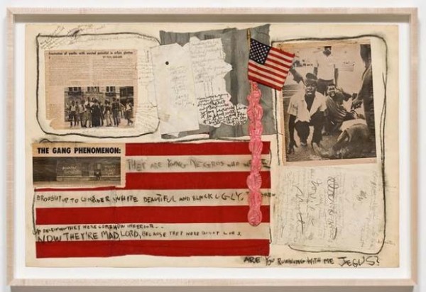
Judith Bernstein, Are You Running With Me Jesus?, 1967. Via NuMu
Even with these flaws, The Last Newspaper has an impressive cohesion—rare for a group show organized around a theme as broad as “newspapers and news.” Indeed, welcoming, and even playing up, a multiplicity of voices works uniquely to the show’s advantage. How else to express simultaneously the ubiquity and the multiplicity of cultural meanings that newsprint once had? A newspaper is, after all, a collection of different voices, with each reporter trying to tell society’s story, one section or dispatch at a time. In this way, a paper is not unlike an art exhibit, with the editor serving as curator. This notion isn’t lost on The Last Newspaper. In the show’s final room a group of live artists-cum-writers gather around a table, working on a weekly newspaper, The New City Reader, of which every visitor gets a copy. (Disclosure: Idiom’s own editor, a term used loosely in this context, will be collaborating on an upcoming edition of The New City Reader -ed.)
In one way or another, each piece in The Last Newspaper mourns the loss of the editor by exploring our inability to process and sort through all the information to which we’re subject. Which is why we need editors to organize our news, a service we lose, in a certain sense, when we lose the physical newspaper. Just as I wouldn’t want to see all the art in the world (or even all the art about newspapers) I don’t want to read all the news in the world either. Curating and editing are both an art in themselves, a fact for which The Last Newspaper provides ample evidence and appreciation.
]]>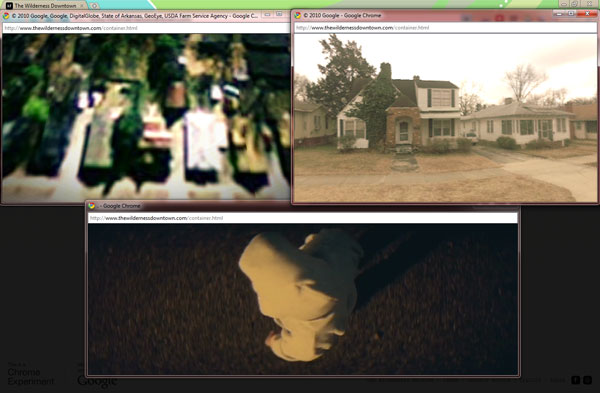
Chris Milk, The Wilderness Downtown 2010. Via Taste Like Crazy
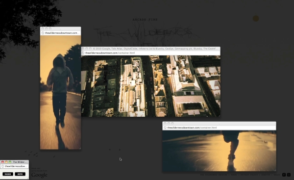
It needs only your childhood address, and then it takes control. You’re spirited across states and through time with a flock of darting blackbirds. You circle above your childhood home—and then you’re on the ground, running down the street, trees and houses and streetlamps flickering at the edge of your vision. Meanwhile, the song sings your life. Is it a time machine? Magic? No—or yes, both: it’s The Wilderness Downtown, an interactive film/Arcade Fire promotion created by Chris Milk and set to the song “We Used To Wait,” off the band’s excellent new album The Suburbs.
If you’re reading this, you’re online, which means there’s a good chance you’ve had a look at it. The Wilderness Downtown is something just beyond a video—it uses the medium, but it also takes over your computer screen, opening and closing windows in different parts of your desktop. Based on the address you provide at the beginning, the presentation uses Google Maps to find satellite and, when available, street-level images of your childhood home. It pairs these images with video of a person in a hooded sweatshirt running through a non-descript street at night—your mind quickly populates the empty backdrop with your hometown, the figure’s shadowed face with your own—while playing Arcade Fire’s pulsing, urgent music.
The Wilderness Downtown is already a sensation on the Internet. There’s never before quite been anything like it. It’s geo-targeted but it’s also universal, it’s a music video but it’s also interactive, it’s interactive but it’s not a game. It’s something entirely new, a mixed medium we’ve never quite seen before.
It’s also disturbingly invasive. Not only because at the outset it blithely asks for your childhood address, or flashes surveillance footage of your mother’s house, or busily takes over your computer screen (although all these features are creepy)—it’s because it occupies your memory and then serves it back up to you. The presentation capitalizes on the fact that a computer remembers better than a person, with more detail and more accuracy. Google Maps then provides the truer memory of the appearance of your childhood street, Arcade Fire provides the emotion, and the program itself directs the eye. All you need to do is experience the thing and, when prompted, type a postcard to yourself as an adolescent. The Wilderness Downtown doesn’t allow the viewer to draw connections of his or her own; it takes you by your collar and tells you where and what and when to remember, and then it tells you what to do about it.
This is not a music video; I don’t know if it’s art. There’s no metaphor here—the connections are literal. In that way, The Wilderness Downtown has less to do with, say, that Paula Abdul video where she dances with cartoon cats than it does with a medieval morality play.
Chris Milk, The Wilderness Downtown 2010. Via The Reel
Morality plays like Everyman don’t really have characters; instead they have stand-ins. The only human in Everyman is Everyman himself, who acts out the universal experience of life and death. At the play’s end Jesus, another non-character, appears and speaks directly to the audience, commending them to repent, making the play even more plainly applicable to life. In The Wilderness Downtown, the hooded figure plays the same role as Everyman—it’s an un-character, a mirror held up to the viewer.
In the way they directly appeal to their viewers, Everyman and The Wilderness Downtown are vital, personal, relevant. But they miss something big: they miss the humanizing potential of the fourth wall. This separation between audience and actor was an innovation of the morality plays’ successor, the Renaissance theater of Marlowe and Shakespeare. The fourth wall contains the world of the play, allowing for the creation of fully “human” characters who aren’t immediately relatable. But by containing the action, by cultivating “true” characters, the fourth wall forces audiences to step out of their consciousness in order to relate to unfamiliar people and situations. In this way, the theater of metaphor stretches its viewers to expand their consciousness. It’s one of the ways that Shakespeare and his cohort invented the modern individual (apologies to Harold Bloom). And it’s a humanity that The Wilderness Downtown misses.
Troublingly, this latest digital experiment somehow feels like the prototype of a new kind of art. Geo-targeting is just one example of countless new digital technologies that enable artists and advertisers to “personalize” pieces for their viewers, in the same style as The Arcade Fire’s interactive experience.
It’s not all art—advertisers use it too: Every time I open my Gmail, new ads appeal to themes Google’s algorithim-spinning robots have identified in my emails: “Gay Men in New York!” “Free Internet Marketing Tools,” “Men’s Suits & Separates.” Sadly, they all fit. And then there’s stuff like “Barging in France.” I can’t quite figure out how I got that one (although I like to imagine myself as the intercontinental business sailor to whom it appeals). Misses like this are glimpses into the remaining weaknesses of the internet’s ever-improving machinery of personalization. Although the machinery isn’t yet perfected, it soon will be. And as Google and its competitors get better at targeting what we see, advertising, culture, and even art threaten to move away from expansive metaphor and towards solipsistic reflection.
For this reason, it’s appropriate that this online experience is set to “We Used To Wait,” a song that explores how love, longing, and waiting are altered in the age of digital communication. The song seems to anticipate the potential impact of its interactive marketing material—and oddly, it seems to regret the change. Lead vocalist Win Butler sings, “I used to sleep at night/ Before the flashing lights settled deep in my brain.” This lyric describes a medium that insinuates itself in your mind, a digitized world whose flashing lights outshine sleep, block out dreams, and limit imagination.
All this said, I’d urge anyone who hasn’t encountered “The Wilderness Downtown” to do it right away. Everyone should experience it once—but maybe just once. It’s uncanny to have a machine do your imagining for you, but in the end it’s not real imagining. It’s deceptively simple, really no more than a high-tech mirror. And you can only gaze into your own eyes for so long before you stop seeing anything.
]]>
via BUTT
Is sex still sexy? When any gay man with an internet connection can tap instantly into a limitless supply of body parts and assignations, the idea of the love that dare not speak its name, a cornerstone of the gay erotic ideal, becomes laughably old fashioned. The intimacy and secrecy that makes sex—and particularly, homosexual sex—an experience different from others, is under threat from the internet. Like photographic film, another relic, exposure to light destroys our old notion of eroticism.
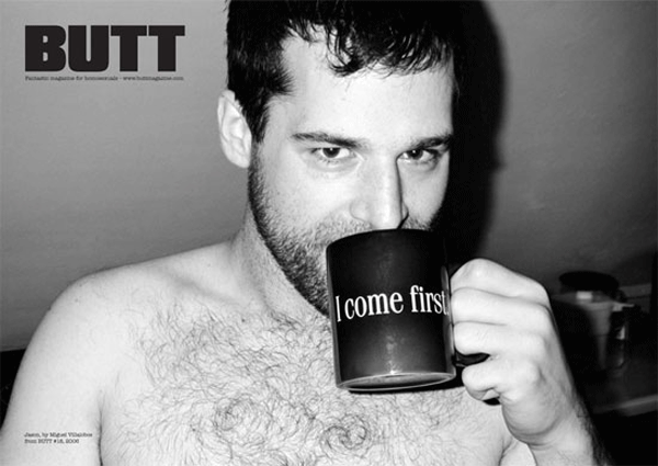
Over the past ten years, a crop of gay little magazines has emerged and grown alongside and often in opposition to the Internet. These publications propose a new, old-fashioned gay erotica: un-campy and unabashed, non-commercial and non-exploitative, and above all, stubbornly analogue and print-based. The grandfather of these magazines is BUTT, which was founded in 2001. BUTT is as straightforward as its name. It’s printed on shocking pink paper and features interviews with gay men from porn stars to Hollywood directors to, most recently, a deaf Berlin baker whom the correspondent happened to think was cute. The artless titles of the pieces (“Ryan Trecartin Gay Video Artist Finds Lesbians Super Exciting”) speak not only to its being translated (BUTT arrives from The Netherlands), but to an ardent refusal to be snide or sly about sex; after all, in this open age there is no longer a need.
So too the photographs, which are a real draw of the magazine. They’re full-page nudes, usually in black and white, of men looking out windows, drinking coffee, reading magazines. Often, the work is by notable photographers—the most recent issue features a spread by Wolfgang Tillmans. Artist Paul Sepuya, who has contributed to BUTT notes that it and similar magazines provide “alternatives to mass-produced images and pornography. The overlaps within the immediate community of fellow artists, designers, fashion fags, etc, make for much more approachable, tactile and sexy product.”

Justin via Pinups
Indeed, regardless of who’s shooting them, the men photographed in BUTT never quite fit the pornographic ideal you’re more likely to see online. They’re not quite bears, not quite twinks; they’re regular guys, lit well and given a privileged place on the page. Models are chosen, as Sepuya suggests, for their talent as much as for their looks, drawn as they are from an artistic community. The images are matter-of-fact, but they’re not snapshots—they’re taken with care, and with an eye toward revealing something of the subjects’ personalities, rather than a six-pack or lazily conjured bedroom eyes. Make no mistake, BUTT is porn, but it’s a different kind of porn. It gives its models agency and respect—and does the same for its readers.
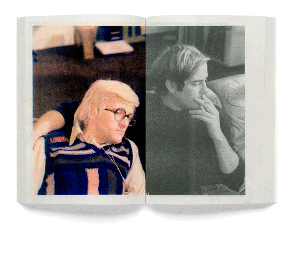
BUTT precedes a host of gay little magazines that have further developed an erotic discussion that’s very consciously non-digital, and that share a straightforward, unpolished aesthetic. Mary focuses on literature. Christopher Schulz’s Pin Ups does away with the words altogether, and just presents a series of one or two models in every issue. Little Joe gives film a queer reading.
All these little magazines are mainly print operations, and together they present a legitimate example of the medium being the message. That they print at all, rather than focus their energies online, is a statement. Like the unglamorous, personal photos in BUTT (and Pin Ups and Little Joe), the choice to actually print in print is rendered unique – even counter-cultural – by the flood of erotic gay images and words on the Internet.
Little Joe, Issue 1 via Little Joe
Sam Ashby, who publishes Little Joe, told me that his magazine is intended to be “a tactile, personal experience. I don’t believe one can have this experience with a computer.” He sees his audience as a generation who “grew up without the Internet and experienced film in a very specific way, discovering their sexualities through films seen by chance via late night TV viewings, or scouring the aisles of their local video rental store, or even the recorded VHS’s, passed amongst friends.” The conversations taking place in Little Joe and its brothers require a certain intimacy with the physical magazine itself, a relationship that’s simply not possibly online.
Indeed, the physicality of the magazines—that you can buy them, hold them, and keep them—creates a closer relationship between reader and content. When I was preparing to write this piece, I found myself walking out of St. Mark’s Bookstore holding a plain brown-paper bag full of gay rags. At that moment I felt connected to a gay past that I had never experienced: the formerly common experience of sliding a few bills across the cover of a dirty magazine and then scurrying home. Having to go out and actually buy the stuff—in public, no less—calls for a heightened level of ownership and identification. One might lazily click through any number of perversities online; out in the open, you’re drawn not only towards what might turn you on, but what makes sense as a broader perspective.
We’re so used to getting provocative content for free that magazines that cost money are held to a higher standard. That’s why they’re not just porn, and not only criticism. They’re both. These new little magazines use sex not only to titillate but to define a new, matter-of-fact gay identity, constructed not around total demographic buying power, but creativity and aesthetic appreciation—how old-fashioned is that?
]]>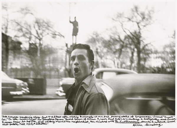
Allen Ginsberg Jack Kerouac wandering along East 7th street after visiting Burroughs at our pad, passing statue of Congressman Samuel 'Sunset' Cot, 'The Letter – Carrier's Friend' in Tompkins Square toward corner of Avenue A, Lower East Side; he's making a Dostoyevsky (sic) mad-face or Russian basso be-bop Om, first walking around the neighborhood, then involved with The Subterraneans, pencils & notebook in wool shirt-pockets, Fall 1953, Manhattan. 1953 via nga.gov
“Photography has become as widely practiced an amusement as sex and dancing—which means that, like every mass art form, photography is not practiced by most people as an art,” Susan Sontag wrote in On Photography. “It is mainly a social rite, a defense against anxiety, and a tool of power.”
When Sontag published these essays in 1977, photos appeared in newspapers and on TV, in family albums and office desks. It seemed that photography couldn’t get more pervasive. How quaint. Now every cell phone is somehow incomplete without a camera, Polaroid has stopped producing instant film because it’s not instant enough, and every personal image is posted on Facebook for browsing and comment.
When we voluntarily photograph and display all of our actions, does photography’s value as art disappear? Of course not—that would be like saying that because we use the written word to write rent checks, literature is dead. But it does become increasingly important to delineate photographs that have seem to have aesthetic value beyond their documentary function.
In Washington, DC there are currently two photography shows on display that come up against the question of what makes a photograph count as ‘art.’ Both exhibitions feature work that predates the digital, so the photographers necessarily had to be somewhat careful about how they spent their film. But in a world where photos of everything are everywhere, a photography show—and particularly a documentary show—poses an intellectual and aesthetic challenge: what makes these pictures more significant than the ones I take with my iPhone? Beat Memories: The Photographs of Alan Ginsburg, currently up at the National Gallery through mid-September has a clear answer: photos are worth looking at if they are have famous people in them.
The exhibit fills two small rooms with photos the poet himself took from 1953 through the mid-nineties (with a two-decade break between 1963 and the mid-eighties, noted but left oddly unexplained by the wall text). The collection starts out promisingly, if only because it piques historical curiosity. A shot of St. Mark’s and Ave A from fifty years ago sets the scene nicely. And there are off-handed pictures of Larry Rivers, Peter Orlovsky, Jack Kerouac, and other mid-century creative notables in their youth, fooling around, mugging for the camera or striking mock-heroic poses. It’s engaging if not illuminating.
But as the show goes on and the subjects age, it becomes clear that some essential insight is missing here. The snapshots have very little to say that’s not beneath the surface. There’s no comment in their compositions, and no deeper personalities betrayed in the candid shots. These are, in fact, the pictures Ginsburg would have taken with his iPhone, had he had one, and he seems to know it. Like a Facebook user, he supplements the early photos with exuberant, handwritten comments in the margins as if to provide meaning that’s not apparent in the image. Just because these photos were taken by an artist doesn’t make them art. These are documentary images of the lives of great artists, artifacts better suited for display at the Library of Congress than at the National Gallery.

Martha Rial, Trek of Tears via Pulitzer.org
Across the Mall at the (unfortunately named) Newseum, a museum of news media, there’s another documentary show on display. The Pulitzer Prize Photo Gallery makes no claims to the mantle of art. The images in the show capture a time or an event. As stated in the press materials, the photos “record the defining moments of our time.” They exist first and foremost to relay information about events to the viewer, not appeal to emotion and intellect.
While the art part of the Ginsburg art show was sadly elusive, it kept creeping into the Pulitzer Gallery at the Newseum. The display – comprised of photos that have won one of Pulitzer’s various news photography prizes – is worthy of attention not only because their subject matter is historically important, but because, unlike the Ginsburg photos, some additional, aesthetic value instills them with deeper meaning. These photos are not exhausted by their documentary function, but persist, pushing beyond the simple act of communication for which they are ostensibly known.
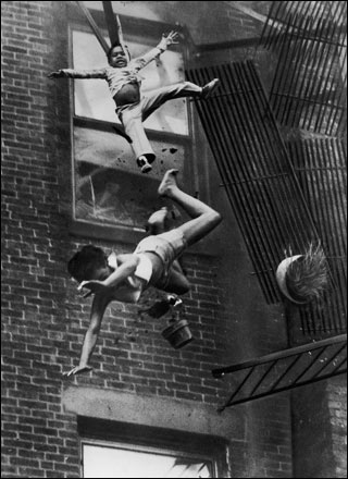
Stanley Forman, Fire Escape Collapse, 1975. via Enticing the Light
Certain images are so familiar as to be difficult to examine with new eyes—there was the protester at Kent State shot by the National Guard (1971), the Vietnamese girl fleeing a Napalm attack, the soldier being welcomed home by his family. But it was the lesser-known pieces that stood out. In Joseph Forman’s 1976 black-and-white photo, a fire escape collapses, leaving a toddler dangling by her collar and tossing a woman downward, hands and legs spread. Flowerpots fall around the woman’s arms and feet, as the child’s stunned face catches in midair; the world is suddenly, terrifyingly disordered.
Another piece, taken in 1995 and credited to the Associated Press, shows Hutu refugees in Rwanda. A row of adults, each flanked by small children, marches down a road. Each grown-up is saddled with huge bags, and looks on, expressionless and exhausted. At their sides, the children march too, but rather than look ahead, they glance warily to the side, at something unknown outside the left corner of the frame. These people form the vanguard of a line of refugees that stretches up a dusty road that climbs a brilliant green hill; there are hundreds, maybe thousands of them. In pictures or in words, I have never encountered the experience of refugees expressed with such economy—the physical exhaustion, the anxiety of the unknown, the unseen horror just behind them.
There is nothing incidental in these images, even when they depict everyday events. In John H. White’s 1983 black and white photos of Chicago, two children run beaming towards the camera, one seeming to leap upwards, the other moving down. Behind them rises the grid of a giant apartment complex. The figures are ecstatic, unstable variables against the building’s graph-paper façade; the individual’s rise and fall is the life of the city.
The Newseum displays these photos alongside a lot of information. The wall text includes historical background, what happened to the subjects after the photo was taken and commentary from the photographer. This is valuable and, given the museum’s focus on “the first draft of history,” it’s appropriate. But this contextualization seems also to refuse the artistic power these pieces have outside of history. The photos’ aesthetic integrity, in their attention to composition, light, and color, in combination with their irreducibility to words or information, make them much more than a record of events. Seen together, they speak to the exhilarating and confounding complexity of existence. Perhaps this is why many viewers on my visit to the gallery simply ignored the wall text entirely and gazed only at the photos. The images have an affective power that exceeds the specific events they documented.
Sontag writes that what separates photographs from television is that photos are curated images. That is, the best and most meaningful moment in time is frozen for examination and reflection; human experience, edited, becomes art. As digital has freed us of the material barriers to shooting a thousand photos of our cats, all photos can no longer claim this distinction. The Ginsburg show proves that even when film required forethought not everyone, not even bona fide artists of other media, had a sense for what to photograph and how to capture it. But the Pulitzer photos illustrate that even in our over-documented age, a well-taken photo still has the power to silence a room.
]]>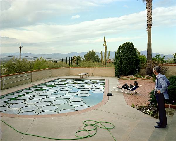
Joel Sternfeld, Solar Pool Petals, Tuscon, Arizona, 1979 via MoMA
Years ago, in the basement level of the Art Institute of Chicago there used to be a gallery that housed the museum’s collection of contemporary photography. On permanent display was a giant color photo depicting a man in shirtsleeves, leaning against a desk in a corner office strewn with objets d’art of a vaguely religious variety. Behind him, windows show a sunlit cityscape. His arms are crossed and his mustache obscures a half-smirk of self-satisfaction. His expression and bare feet show that he is smugly in control: the office is somehow both his bedroom and his hallowed ground.
The picture is titled Barefoot Attorney, Chicago and was taken by Joel Sternfeld. The man in the photo is my father. The piece is part of a series the photographer did in the 80’s of people at work: grocery baggers, teachers, meter maids, and people like my dad: lawyers, doctors, etc. The Art Institute has the full collection now on rotating display in the new Modern Wing.
As a boy I used to love it when my class, on a visit to the museum, would file past the photo. Oh, I’d say as casually as I could, my dad’s in a picture here somewhere. I always appreciated the strangeness of its presence, and pointing it out was sort of my field trip party trick. But more than that, I was proud of the photo and I wanted to show it off. Although I couldn’t admit it to myself at the time, I liked that my father was handsome enough to be the subject of such a huge picture, and sophisticated enough for his image to hang in a museum.
Dad has always hated the photo. On a purely aesthetic level, he doesn’t like how he looks in the picture. He feels it’s just not him. “It wasn’t even my office,” he points out. “We were down the hall from my office.” But more than that, he thinks the photo is making fun of him. In the past, I’ve taken this complaint with a grain of salt. While my father can be severe (he is a lawyer, after all), he’s also a sensitive guy—in his own words, his emotions are close to the surface—and he’s particularly sensitive to being mocked. He once told me that he hates songs with his first name in them because he feels like the singer’s making fun of him. If anyone could see mockery where it isn’t, it’s my father.
I admit this grudgingly but when I look at the photo again, it’s clear to me that Dad’s critique is right on both counts. First, the picture doesn’t really depict him. (We were unable to secure a digital version of the print -ed.) The attorney Sternfeld shows is brazen, powerful, and pushy; a person who controls people, and enjoys doing it. He is a cartoon lawyer, a macher at the height of Reagan’s Age of Greed. This man is imposing, impressive, and in control, but he’s not my father. The man in the photo ends his day at Le Cirque, maybe even with a hooker; my father’s evenings are spent alone in his study, washing down the day’s work with a novel.
And to Dad’s second point, yes, Sternfeld is making fun of him—or at least, he’s making fun of the figure in the photo. Sternfeld’s work seems to take equally from Robert Franks and David Hockney—photos of empty streetscapes and overused workers compete with confident, healthy rich people standing against sunny prospects as they squarely face the viewer. This is how Sternfeld photographed my father because this is how Sternfeld photographs all people: through the lens of a certain, sometimes cruel, irony.
Should my father care if the photo is true or not? He seems undecided. Art, we’re often reminded, tells a truth greater than that of individual lives. When I wrote my father that I was writing an article on the photo, he responded immediately: “As you know, I don’t like the picture. But he’s an artist and deserves credit for his work.” Even Dad, who has avoided this photo for going on three decades now, and who is, after all, the subject of the picture, is quick to defend Sternfeld’s artistic vision. One wonders if the boys who Caravaggio plucked off the street to pose as Jesus and the Apostles appreciated the sexed-up chiaroscuro treatment he gave them, or whether Man Ray’s Sleeping Muse objected to her depicted passivity. Did they see themselves in their images?
It’s often said that artists think of their work as their children: the artist creates, and then the piece has a life of its own. But what is the link between subjects and the work in which they appear? Judging from my father’s response to Barefoot Attorney, I’d say that the subject-artwork relationship is the artist-artwork relationship played out in reverse: it’s child-to-parent.
Though the subject is, almost by definition, older than the work in which they appear, art is, again, bigger and more powerful than the individual —it’s paternal in its imposition. When my father looks at his portrait and protests it’s just not him, he mirrors every son (myself included) who has looked as his father with confusion, anger, and amusement, and thought, “No way that’s supposed to be me,” while to others the likeness is beyond obvious. This is why Dad ultimately allows Sternberg “credit” when he talks about the photo. The piece is beyond argument simply because it is art—just as a father’s judgment can go unquestioned because he’s a father. Individuals fade but fathers, even once they’re dead— especially once they’re dead—dissolve into Barthelme’s all-father. An individual work of art, like one’s own father, is bigger than the piece itself.
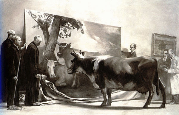
Mark Tansey, The Innocent Eye Test, 1981 via University of Hawaii
There are a few prints of Barefoot Attorney floating around. (My grandmother has one of them. Like something out of a Woody Allen movie, she’s hung the giant piece in her living room, forcing my poor father to confront it whenever he walks through the door.) Dad’s declined the chance to own a copy of his own, but his office is still filled with art. One of the pictures he’s hung there has always stood out to me. It’s a giant poster of Mark Tansey’s The Innocent Eye Test, a black-and-white painting of a group of distinguished men unveiling a painting of a cow to an actual cow. The cow blankly observes her likeness without comprehension.
The poster is just about as big as Barefoot Attorney and takes up the wall behind my father’s desk where the Sternfeld could be. I think of it as my father’s quiet protest against the artist. The Innocent Eye Test is about an inherent cruelty in art: the men are playing a trick on the cow, and the painter is playing a trick on the viewer. No, the painting laughs at us, of course it’s not real. But you believe it don’t you? All subjects are rendered bovine by the art that depicts them; they’re forced to believe in the legitimacy of the image before them, and, like little boys looking up at their fathers, they have no choice but to measure themselves against it.
]]>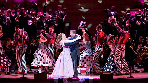
Show Boat via the Times
For a certain subset of New York homosexuals, the Greenwich Village piano bar Marie’s Crisis is a crucial hub, a cornerstone of what it means to be gay in Manhattan. The place is packed seven days a week with men young and old, belting out Broadway classics alongside a piano.
I have visited Marie’s Crisis only once, when I was dragged there on a date that was beginning to flag. Although I had heard of the place, it had never actually occurred to me to go there. Hanging out with a bunch of old show queens was not my idea of a good time. I wasn’t big on labels, I told myself, but hanging around singing show tunes was not how my kind of queer spent a Saturday night.
I learned after half a beer that what separates me from the sort of guy who sings showtunes in bars is, well, half a beer. Although I fall safely in the “New Gay” camp as defined by Doree Shafirir, I sang Rogers and Hart, Rogers and Hammerstein, Kander and Ebb, Stephen Sondheim, Leonard Bernstein, and eventually distinguished myself by being one of only a handful of men in the crowded bar who knew all the words to Fiorello!, the obscure musical biography of Mayor LaGuardia.
What can I say? I was raised with musicals, and no matter how much I try to wash them out of my system with the underground rap my straight brother sends me, my gay soul is steeped in Broadway. I like the stories, I like the words, I like the tunes—it all speaks to me. That I tend to keep this affinity under wraps stems from the usual reasons—mainly internalized homophobia and an adolescent desire to look cool. In my own lame way, I suppose I, too, wear the mask.
Which is why I envied the men in the bar who shamelessly embrace what’s arguably the gayest form of music. But for a genre that most everyone agrees is pretty gay, there are scant few musicals that actually address gayness. At the dance clubs just uptown from Marie’s Crisis, you can hear any number of songs about boy-on-boy action by Bloc Party, Scissor Sisters, Franz Ferdinand and others. But you could hang out by the spinet at Marie’s for days without hearing a single tune about two boys falling in love.
So if musicals are so gay, where are our great gay musicals?
Historical timing is a major reason. During the genre’s golden age, from the 1940’s to the ‘60s, money and mores forbade forthright discussion of homosexuality in light entertainment. The musicians and lyricists behind some of the greatest works of musical theater were often gay men who wrote their own repression into their work. Using heterosexual characters, they expressed an experience of love that was interrupted or destroyed by prejudice.
Three cornerstones of the genre, Show Boat (1927), South Pacific (1949), and West Side Story (1957), all turn on interracial romances, which were still subject to public debate when the pieces were written. (Indeed, Loving v. Virginia, the Supreme Court case that legalized interracial marriage, was passed in 1967, after all of these classic musicals had premiered and were embraced by audiences.) Show Boat’s first act runs headlong into the debate, uniting white Steve and biracial Julie with “Can’t Help Lovin’ That Man,” privileging love over race as well as personal behavior. West Side Story’s climactic “Somewhere,” in which Bernstein’s star-crossed lovers imagine that “there’s a place for us” must have reverberated beyond the theater for the gay men in his audience. And in South Pacific, Bloody Mary enchants Lt. Cable with the promise of “Bali H’ai”—“your special island”—and, implicitly, her Tonkinese daughter.
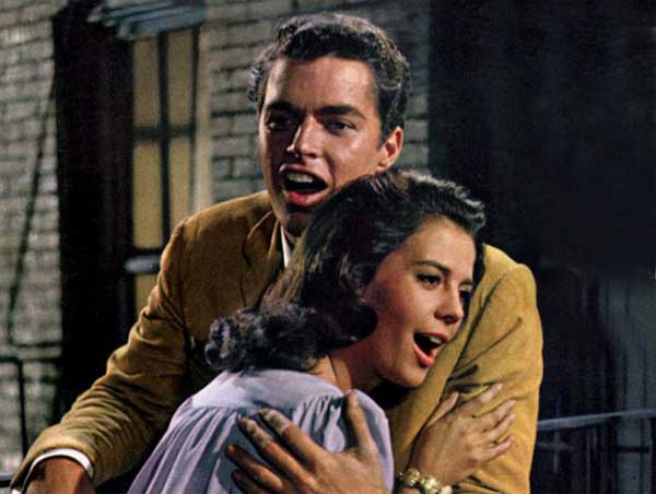
West Side Story from imdb
The bittersweet tension between love’s flamboyant emotions and societal oppression drives these three influential pieces. And although Jerome Kern and Oscar Hammerstein, who wrote Show Boat, and Richard Rogers, who wrote South Pacific with Hammerstein, were not gay, they wrote for gay actors, worked with gay theater professionals, and catered to an audience; their attention to the gay concerns is clear in their work. These shows, and the many musicals they inspired, use race, class (Carousel), or family (The Fantasticks) in place of gayness. In this way, they, too, are drag shows.
That essentially gay experience—we have historically been forced to conduct our lives in drag as straight men—could perhaps explain the persistence of musical theater’s reluctance to tell gay stories outright: to gay audiences, talking in code too often feels like speaking the truth.
Thus, we’ve inherited a musical tradition that shies away from gayness, even now. For instance, Stephen Sondheim’s work forms the backbone of musical comedy since the 1970’s, with plays including Company (1970), Sweeney Todd (1979), Sunday In The Park With George (1985), and Into The Woods (1987). These works are rightly lauded for their musical and emotional complexity, as well as their topical breadth, touching as they do on subjects from modern romantic alienation to murderous obsession to the psycho-sexual maelstrom of fairy tales. But for all this, Sondheim, who himself is gay, has never featured a major gay character, much less a gay romance.
And what of those more recent works that do offer gay characters? A Chorus Line (1975) and Rent (1996) are ensemble pieces, whose homosexual characters are merely supporting players. The latter, in particular, is fundamentally a story about two, straight white men, limiting its gay relationships to a pair of fetching lesbians and a black man taken with the most widely beloved drag queen this side of Lypisinka. The lead character of Cabaret (1966) is gay—until he sleeps with Sally Bowles. John Cameron Mitchell’s Hedwig and the Angry Inch (1998) is less a musical and more a one-man show—and aside from that, it’s more of a transsexual love story than a homosexual one. Tony Kushner’s excellent Caroline or Change (1999), circles all the way back to the tradition set out by Show Boat, presenting a story of a struggle for racial equality that strikes a chord with the fight for gay rights.
There is a single oasis of queerness in this empty landscape. La Cage Aux Folles (1983) does indeed focus on a gay couple. Although it’s notable that drag plays a heavy role in this piece, thus perhaps easing the piece’s explicit gayness into the musical theater vernacular, La Cage is a lonely pink flag planted in a desert of whispered homosexuality.
40 years after Robertson Davies griped that “the love that dare not speak its name has become the love that won’t shut up,” gay men should be able to see their own lives, told earnestly, in the form of theater with which we’re so associated. We don’t live in the shadows anymore. It’s time for musical theater to hold a mirror up to its most enthusiastic audience—and to really give the boys at Marie’s Crisis something to sing about.
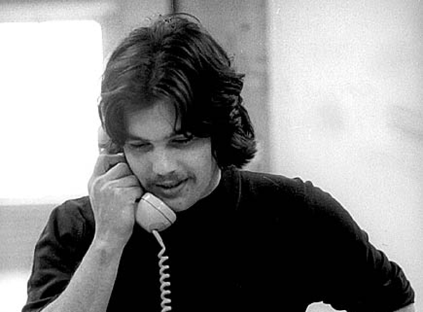
Jann Wenner via altmanphoto.com
It’s a business cliché that change is the only constant. So much so that, in certain offices in which I’ve worked, the word “change” has been banned from internal communications. But it’s repeated because it’s true: capitalism thrives on what’s new, operating on the assumption that there’s always something better, or at least more salable, around the corner.
Jann Wenner and David Geffen, two of the most illustrious Baby Boomer businessmen, exemplify this thinking. Wenner, who founded Rolling Stone and Geffen, who remains one of the world’s most powerful record producers, epitomize Baby Boomer success. Launching their businesses and their personal brands out of the music-driven counterculture of the sixties, they monetized their own hipness through publishing and recording. As their business profiles grew, so did their personal visibility. The bearded bad boy son of a wealthy San Francisco family, Jann was sexy, powerful, and fun: he was never without a bump to share with his writers. David was the brash Jewish upstart, a Brooklynite with an ear for what was next, and always had a model on his arm. In a phrase, they were big personalities. Their egos fueled their success and vice versa. That they were both college drop-outs is no accident—it speaks to how iconoclasm doesn’t hurt when you’re trying to launch an empire.
And both were selling the same Aquarian vision of a loose lifestyle, in which all personalities were changeable and all traits were ethereal. On a Geffen record, Joni Mitchell sang about being a Free Man in Paris (a song, incidentally, inspired by Geffen himself), while Wenner named his very publication after that which grows no moss.
Aside from their product and their egos, Wenner and Geffen have yet another quality in common: they are both gay. For much of their careers, they were both in the closet. Finally, protected from prejudice by wealth and distanced by time from initial shock of AIDS, Wenner and Geffen both very publicly declared their sexuality in the early nineties. Wenner’s coming out earned a feature in the Wall Street Journal (which shows just how far he had come from the hairy, skunky sixties) and Geffen announced his gayness at a keynote address at a benefit in LA (ditto). The news came as a shock to some, but not to all. Wenner had what seemed to be a marriage of convenience with his longtime wife, who owned half of Wenner Media, Geffen had conducted a string of relationships with recording stars in the seventies, including Cher—whom, as beards go, gets something close to a D-minus.
So, twenty years on, is there a significance to the shared sexuality of these captains of media, or is it just biography? I don’t know if gayness can ever just be background. In our overheated culture, sexual preference is central to personality—particularly when it’s so closely guarded. Successful people who choose to remain in the closet are necessarily excellent adapters. The closet is a hothouse specially designed to chameleons. It creates extreme extroversion, which allowed both men to be so flexible, and so eager to be a part of what was happening next. Wenner and Geffen had a choice between being in with the in crowd or being out of the closet.
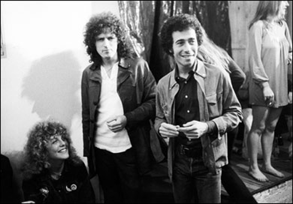
David Geffen, via Nuns Having Fun
Just as assumed personalities to fit the demands of wives, lovers, and publicists, so did they assimilate their business models to the demands of the market. Throughout their closeted decades of seventies and eighties, Wenner and Geffen were able to grow their empires thanks in large part to their ability to embrace the constant change that define both Boomers and business. Geffen switched from acoustic, folksy rock to Disco to Peter Gabriel. In the early eighties, when San Francisco’s cultural scene was floundering, Wenner packed up shop and moved the operation to New York, to be a part of the city that was on the verge of a renaissance.
But as similar as the two icons were in their heyday, when they came out their paths diverged. Right after Wenner came out, he missed a big gamble on the Internet, having been offered insider deals on Netscape and other Silicon Valley start-ups that still remembered his contribution to the Bay Area. He turned them all down. It’s arguable that he moved his operation out of San Francisco at the worst possible moment, just before the city became flush with investment for the new economy. And his slow slide has continued. Rolling Stone itself was late to the Internet, and has been overtaken by Pitchfork and other online titles as the first voice in music journalism. Finally, in recent years, Rolling Stone had to scale back its iconic outsized printing style. If that’s not indicative of a loss of influence, I don’t know what is. Wenner, then, finds himself strangely stalled. He’s stuck with the last big identity he embraced
Geffen, however, burst out of the closet but never forgot the lessons. Bracing himself against the collapse of the music business, he wisely widened his scope to entertainment, hitching his wagon to Dreamworks’ star, and producing some of the most popular and profitable movies of the last decade. He even proved himself to be politically nimble, famously abandoning the Clintons in the most recent presidential primaries for the Next Big Thing, Barack Obama.
Did the closet actually create the twentieth century’s most visionary businessmen? Not entirely—but it couldn’t have hurt. Wenner and Geffen were perfectly primed by the closet to connect with the identity-anxiety capitalism fosters in the modern consumer. The closet discourages its prisoners from alighting on a finite personality—that would mean “giving in” to homosexuality. Consumer capitalism likewise thrives on feelings of deep inadequacy and constant transformation: buying a new brand of toothpaste, different shoes, the latest model Mustang will create a new you. Both the closeted homosexual and the consumer then reject self-definition in favor of a kind of anti-personality, a personhood that is built around willful denial of self-knowledge.
Wenner and Geffen were able to unite these two similar anxieties and profit greatly. But not everyone is so smart, or so mercenary. Indeed, most of us are simply subjects of consumer culture, rather than influencers. The system pushes each of us to constantly transform in the most superficial ways, via new and different patterns of consumption, just like the gay man constantly shifting his position to convincingly play straight. Consumer society reminds us that our personalities are never “right,” that we’re always lacking some essential element, making closet dwellers of us all.
]]>
Mad Men, via the Rockford Register Star
When I was little, my father would take my sister and me to his office in the Loop on Saturdays. While Dad collected his Saturday mail and checked his messages (this was before e-mail), Lucy and I would Xerox our hands and play with the Coke fountain, eat his secretary’s mints and run our hands over the pumps she kept in the bottom drawer of her file cabinet.
This quiet office was a world at rest—an off-hours preview of the workplace we’d know as grown-ups. And as an adult, my own working world is a lot like my dad’s office, but not in the way I expected it to be. I work at a giant multinational company, one that employs nearly a thousand people in our New York office alone. But from Monday through Friday, the place is often nearly as quiet as my father’s empty law offices on those weekends twenty years ago.
People simply don’t speak out loud too often in my office, and I don’t think this is rare. Communication is done online, so we’re never on the phone. And instead of gossiping with one another around the coffee machine, most of us are chatting with our friends on AOL or Gmail, reading Gawker or shopping. As a boy, I was expecting the rhythmic typewriters and chummy, chatty colleagues of How To Succeed In Business Without Really Trying or maybe the tough-guy, locker room atmosphere of Wall Street; what I got instead is more akin to the scenes in 2001 before the computer takes over.
The culture of the office is in the middle of a long demise. Long before e-mail made face-to-face communication almost completely unnecessary, phones and fax machines started to keep us apart. But GChat and the current downturn have accelerated these changes. A notable trend in this Great Recession is the elimination of benefits across industries, which translates to a de-facto elimination of full-time employment. In the future, some analysts predict, we’ll all be contract workers. An all-freelance workforce armed with Blackberries and iPads means no more Cartier watches on your 15th anniversary with the company, no Morgan Stanley Corporate Challenge runs though Central Park, no more drinks with the department when you cross the finish line.
I doubt the office will ever disappear, but its foundational place in the American culture and economy has been threatened. This anxiety about the death of the office is reflected in a new kind of office story, in literature and on television. These are not just tales that happen to take place in an office—not 30 Rock, for instance, or older ensemble shows like Newsradio or Wings, which are defined by the industry in which they take place. These are pieces about the office, where the primary character is the workplace itself.
Jonathan Ferris’s Then We Came To The End from 2007 is perhaps the most notable recent office novel. TWCTE, the story of an ad agency collapsing during the 2000-2001 recession, gained attention for its first-person-plural narrative, which connects the reader with the collective voice of the office. Because it takes place during a period of lay offs, the scope of the voice shrinks throughout the book, even as it chatters on about all the little intrigues and pranks that make the day go faster.
Ferris criticizes the drudgery of the corporate workplace, but in the gentlest way. The novel is far more committed to showing how sweet the office can be. At the agency in TWCTE, all crushes are eventually requited, all gossips are eventually shamed, all the employees really do respect the boss. There are dark clouds in the novel—cancer, kidnapping, a recession—but they are notable for being not of work; disorder is the abject of the office. To Ferris, it’s a place where corporate politesse creates a peace that might not always be comfortable, but is more or less welcoming to all.
Only eulogies are ever so sunny. By contrast, the characters in Office Space, the 1999 cult movie from the nineties boom, are driven so mad by their coworkers and bosses that they gleefully defraud their employer, revel in debilitating injuries that keep them from work, and eventually burn the place down. Less than a decade later, after one recession and on the edge of another, TWCTE caters much more gently to an audience of workers unsettled by recent economic earthquakes. Ferris’s boss is stern but maternal, rather than capricious and cruel; his workers are caring and curious, not petty and destructive.
That likeable, accidental community, is also represented in the British and American versions of The Office. Where TWCTE brings the reader into the fold with an expansive narrative voice, The Office uses archetypes. Its characters are painted with strokes broad enough to make them recognizable and loveable to anyone: the horrid boss, the cute boy, the sniveling sycophant (and, in the American version, the gay one, the fat one, the Ivy Leaguer, et cetera).
But the core of The Office is just as soft—and just as elegiac—as that of TWCTE. Take Tim’s closing speech in the last episode of the British version, in which he finally wins over Dawn, the receptionist whom he’s loved throughout the series:
The people you work with are people you were just thrown together with. You know, you don’t know them, it wasn’t your choice, and yet you spend more time with them then you do your friends or your family. But probably all you’ve got in common is the fact that you walk around on the same bit of carpet for 8 hours a day. And so, obviously, when someone comes in who you… you have a connection with… yeah. And Dawn was a ray of sunshine in my life and it meant a lot. But, if I’m really being honest I never really thought it would have a happy ending. I don’t know what a happy ending is. Life isn’t about endings, is it? It’s a series of moments.
In spite of himself, Tim comes to the conclusion that the office really is where life—that “series of moments”—takes place. He thinks of his experience in his own office as one in which he’s thrown together with people he doesn’t know in a place that he didn’t really choose. That sounds more like the human condition than just a corporate workplace. And yet, it’s where he eventually found love and, after some struggle, a kind of happiness.
When I saw this episode, I found myself crying for an embarrassingly long time after it finished. This kind of talk is enough to make any junior associate dampen his lapel. Just as TWCTE was an elegy of sorts, so is The Office: it’s no accident, after all, that both versions of this show take place at a paper company, that former staple of corporate life made obsolete by digital innovation (not to mention the reams of blank pages on which the viewer can write themselves into the story). Indeed, in this season corporate austerity measures threaten the whole organization.
The Office is still running new episodes in the US, but it has begun to feel old. Mad Men, even though it takes place 40 years ago, is far more current. Nearly every desk jockey in the United States harbors some kind of fantasy life that involves the just-barely repressed copywriters and art directors depicted in Mad Men. Beneath its cool (and beautiful) exterior, the show gleefully criticizes the iniquities of the post-war period. We laughed at the woeful treatment of the secretaries in the show, and gasped heartily at the boss’s blackface routine. How disgusting, how uncouth—how unprofessional!
But those who work in glass towers shouldn’t throw stones. A little over a year ago, just down the block from us, Salomon Smith Barney disappeared in an afternoon. One day, the courtyard where we’d eat sandwiches from Pret-A-Manger was full of handsome young bankers; the next, they were all gone. It was like Brigadoon but with assholes. Those young investment bankers were as victimized by their own irresponsible behavior, their own reckless office culture as the characters of Mad Men are, or will surely be when the series turns the time machine up to 1969.
The characters in Mad Men might behave badly, but the show’s reverence and nostalgia for the workplace of the 60’s is so profound that it borders on fetishism. The show’s production design has rightfully drawn praise for its obsessive detail; everything at Sterling Cooper is just right, down to the Eames office chairs, the period coffee machines, and the secretaries’ amazing dresses. It’s a museum of work, an office recreated by those who really care—and in this way, Mad Men is just as loving and misty-eyed as TWCTE and The Office.
In reflecting on this trend, I was surprised by the types of people who were putting out these wistful office stories. After all, shouldn’t novelists and screenwriters and improvisational actors hate the corporate workplace? Shouldn’t they have nothing but venom for bosses and hierarchies and receptionists? Perhaps it becomes harder to hate something when you see it slipping away—especially something so central to our culture. In the midst of all this, it’s essential to point out, repeatedly, if necessary, what we’d gain if we lost the office. More personal time, more autonomy. And who would miss running out the door every morning at 7, staying late on deadline, trying to stay awake through meetings, or kowtowing to the CEO?
Together, these little disturbances that define our work lives aren’t so little when they start to stack up. Boarding the elevator this morning, I realized that today was roughly my third anniversary at my current job which means that I have trudged through the lobby and up to my cubicle something like 750 times. That kills me. I think of my friends who are making movies or going to graduate school or traveling, living various, active lives, while I’ve been riding up and down in an elevator a few hundred times. If you stay in the same office, three years can pass by in an afternoon.
Further, while offices throw strangers together in close quarters—which is good for the individual and for the republic—it also diminishes their personhood. This is a simple function of the fact that office workers are the foot soldiers of the service economy. One’s success relies on one’s ability to see people not as complete human beings but as parts of an audience, a market, a demo. We wind up doing the same thing to each other—sorting out and learning all there is to know about the pertinent bits, while leaving the rest alone. This phenomenon is so essential to the contemporary workplace that Melville wrote about it in Bartleby The Scrivener, maybe the first piece of modern office literature. For the narrator, Bartleby exists to work, period. The moment he refuses to work he becomes strange, his humanity is suddenly present, but in a pitiable, diminished way. How is Bartleby to be understood when he refuses to do the one thing he’s suppose to? In the giant machinery of capitalism, a cog that refuses to turn has no reason to exist.
For these reasons, I can’t align myself with the characters in The Office. or TWCTE, and embrace my workplace as the centerpiece of my life. I may spend most of my waking hours there, but it’s not where I spend most of my thinking, or feeling. If I lost the office, I doubt I’d lose my sense of self.
So while I may get a little teary watching that last episode of The Office, it’s worth noting that when I watch it now, I’m watching it under duress. In a less threatening economy, I wonder if my reaction would be the same. It might be—economic scars are emotional scars. Take those who grew up during the Great Depression, who always saved as though a new crash was just around the corner (it was, incidentally). Maybe Great Recession will have a similar effect on how people like me approach our work— making the myth of the benevolent office the only American institution that emerges from the downturn stronger than before.