
Mathias Poledna, Untitled (detail), 2010. Courtesy of the artist and Richard Telles Fine Art, Los Angeles; Galerie Daniel Buchholz, Cologne/Berlin; Galerie Meyer Kainer, Vienna
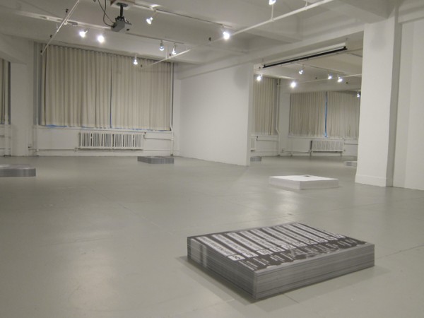
Nothing activates the acquisitive impulse like large swathes of free paper: I just can’t refuse. Present them in separate stacks and I’ll take two of each. To think: I don’t need permission! Still reeling from the prohibitive expensiveness of the recent Art Book Fair, and still feeling plenty desirous, I visited EFA Project Space earlier this week knowing that some of these baser itches would be scratched. Indeed, I left the space with many posters, and was even provided a rubber band before exiting. The group show currently mounted there, all we ever wanted was everything, consists of ten stacks of posters, all for the taking, with each stack given the polite radius of empty floor space that would likely surround a more conventional art object in a similar setting. galeria perdida, the elusive cooperative that organized the show, invited nine accomplished artists to produce a black-and-white, 37” x 27” poster, to be reproduced in editions of 1,000. (Shannon Ebner, with her two smaller posters, is the exception.) The show also includes a newsprint “literary contribution” from Michael Ned Holte, who emphasizes the show’s engagement with a radical tradition and its avoidance of “an unspoken distain [sic] for the products of mechanical reproduction.”

Emory Douglas, poster from The Black Panther newspaper, 1969. Via SDS
Despite the show’s professed “interest in the cultural and political history the poster has served,” much of that history is elided here. When I first encountered Emory Douglas’s posters, which were part of a Douglas retrospective at the New Museum last year, I felt as though each one sprang from a deep knowledge of The Poster’s potential power. Douglas’s posters—armed and vertical, with the thick blocks of primary color that characterized early lithographic prints—were on my mind during the time I spent in all we ever wanted. Sure, one isn’t invited to remove a Douglas poster from the New Museum’s premises, but the boldness and urgency of his work offers a countervailing idea of the poster’s history and function, a counterpoint to the quietist, prostrate generosity of all we ever. Spencer Finch’s attractive piece is a perfect example of this disagreement: What looks like a photo of iced and dappled ground, the poster is soft, decorative, and pleasing to the eye. It is not in the least bit urgent, and it is resolutely not concerned with the swift transmission of a message.
Rather, the historical precedent that hangs mightily over all we ever wanted is the work of Felix Gonzalez-Torres. The presentation, the tone, the palette—these seem largely inherited from the late artist (though much of his mortal weight proves recessive). From a distance, the stacks look like impenetrable rectangular cubes, but are the opposite—gifts!—and they boast additional qualities that are central to Gonzalez-Torres’s poster pieces, namely a fascination with the stacks’ gradual depletion and diffusion. These qualities appear as wistful here as they did at the source. The allusion is in many ways very moving, as few contemporary artists have been as beloved, and few losses as felt.
Fia Backström, Contemporary Worker, detail, 2010. Courtesy of the artist
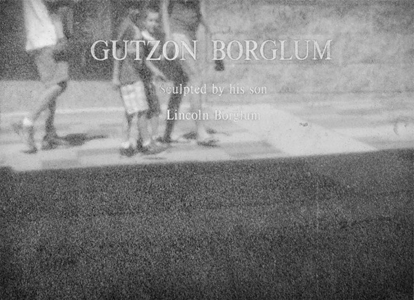
My favorite artist in the show, Danh Vo, elsewhere owns his indebtedness to Gonzalez-Torres, having installed one phase of the that artist’s retrospective at WIELS in Brussels. Vo’s work is so mired in personal significance and private history that one feels like a pervert for hazarding an explanation of it. This probably applies to his poster here, which shows the reflective placard beneath Lincoln Borglum’s bust of hist father – Gutzon Borglum, the visionary architect of Mt. Rushmore – that stands in front of that monument’s visitors’ center. The very idea that this bust exists—that a son could humbly memorialize his father in the very medium that the latter had so colossally mastered—is amazing to begin with, and painfully sweet. As an artist who has included his father’s effects in his own work, this bust must be doubly redolent for Vo, who seems interested in different kinds of paternity.
Danh Vo, Untitled, 2010. Courtesy of the artist
Mathias Poledna’s contribution both belongs to and lampoons an entirely different tradition. If popular posters have been effective by representing an idea in a rudimentary and attention-grabbing way, Poledna’s wins by losing: His poster depicts two handsome, albeit diminutive, Rolex watches, both of which would make an ordinary watch-lover salivate, if it weren’t for their damned reduced size (they’re practically thumbnails) and the mitigating black-and-white. His is the only work to address the medium’s advertising utility, its complicity with, rather than repudiation of, capitalism and consumerism.
all we ever wanted was everything, installation view. Via EFA
Poledna points to the dominant narrative largely ignored throughout the show: that posters have historically been – and might intrinsically be – designed to activate different sets of desires. (Even Emory Douglas’s posters, which seem so anticapitalist and revolutionary, got people thinking aspirationally.) For a show so concerned with the function of the medium, all we ever wanted contrives the viewer’s desire in an unintuitive way. I was continually smiling while walking through EFA Project Space, aware that, despite the absence of expensive and singular art objects, a gallery has never felt like more of a retail environment to me. If posters have traditionally activated a desire for the objects they display—for rock concerts, for bath products, for political movements and candidates—it is uncannily appropriate that the gallery here should activate a desire for the posters it contains. (“I want that one, and that one.…” The very title of the show says as much.) As the medium is the message, this gallery is the poster (through December 4), and it will give you a rubber band.
]]>
Robert Lazzarini Brass Knuckles, 2010 via Salon 94
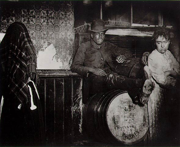
If the 1890 publication of Jacob Riis’s How the Other Half Lives offered an immersive vision of a destitute Lower East Side, it also presumed a remoteness for its readership proportional to the brutality of Riis’s imagery. The iconic shots of sweatshops, forbidding alleyways, overcrowded tenement bedrooms, and scores of children pretending to sleep in public, little heaps of contrived exhaustion—they have lost their ability to horrify in any novel way. The images did, of course, horrify in a completely novel way upon their first publication; the very title of Riis’s book announces the estrangement of his audience from his subjects, from “those who were underneath,” as he describes them.
The moral universe of How the Other Half Lives is born out of such binary oppositions, with one financially secure—and, incidentally, photo-appreciating—half of the population rendering the other “Other.” By framing poverty and privilege in terms of bastardized codependency, with the “underneath” already implying the oblivious “above,” Riis’s book outlines not only the specific circumstances of Lower East Side destitution, but also the mutual inaccessibility of the two halves to one another. As Martha Rosler writes,
In contrast to the pure sensationalism of much of the journalistic attention to working-class, immigrant and slum life, the meliorism of Riis … argued for the rectification of wrongs … [and] the assumption that [those wrongs] were tolerated rather than bred marks a basic fallacy of social work.… Charity is an argument for the preservation of wealth and reformist documentary represented an argument within a class about the need to give a little in order to mollify the classes below… (Second emphasis mine)
The sense of desperation that appeared in How the Other Half Lives continues to underpin contemporary photographs of systemic suffering: It is a kind of mannered striving to make unimaginable situations vivid for viewers whose disapproval, it is dearly wished, carries enough currency to bring necessary aid. At its most optimistic, Riis’s book hopes that merely by introducing the impoverished to the privileged, some attenuation of suffering that might be had.
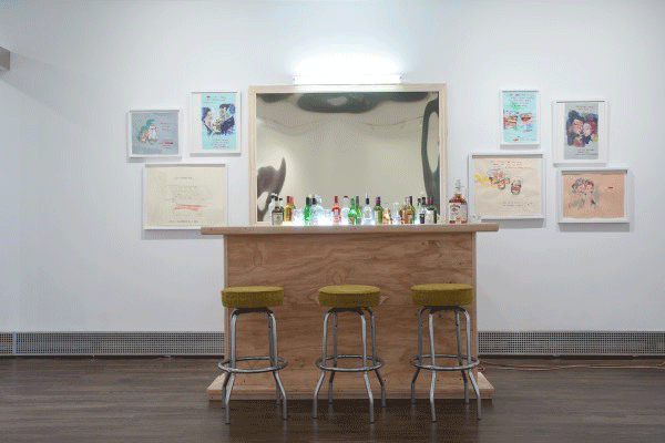
David Kramer, (Bar) Unfinished Business, 2010 via Sue Scott
Revisiting this same terrain today, one can see that the Lower East Side is now “whole.” Or rather, it has been settled by the twentieth-century equivalents of Riis’s two halves, becoming a staging area for them to largely ignore each other. The “half,” however, is not really the relevant unit for approaching the demographic splits among those who currently call the neighborhood home. Now it’s much more complicated. Richard Price’s novel Lush Life, set in the post-9/11 Lower East Side, accurately charts the variegated landscape of identities: There are the Orthodoxim, the old-guard Irish families, the “pioneers” (Price’s term for the artists who arrived “early,” making the neighborhood eligible for white people more generally), the ensuing “La Bohèmers” (alternately known as “Young, White, and Gifted”), the predominantly black and Hispanic residents of the Lemlich Houses (a fictional housing projects based on the Alfred E. Smith Houses), a diverse Chinese population, and a smattering of Israeli and Yemeni immigrants, all of them navigating the same begrudgingly shared territory.
In the late 19th century, Riis’s subjects had no means of visually capturing their own condition, placing it on display, and demanding a response; now, in this same area, each of these tasks can be accomplished internally—the area is now flush with galleries, most of which arrived on the heels of the art-making “pioneers”—and that is exactly what a current group exhibition sets out to do. Inspired by Price’s novel, Lush Life is an incredibly ambitious show, with its participating galleries falling into the novel’s geographic constellation of activity.
Price’s panorama revolves around the mugging and accidental murder of Ike Marcus, a “Young, White, and Gifted” bartender who had just begun working at Café Berkmann (based on Schiller’s) at the time of his death. Owing a debt to Jens Hoffmann’s work at the Wattis Institute, curators Omar Lopez-Chahoud and Franklin Evans attempt something functionally similar to Price’s novel, by offering, in the words of the press release, “a potent vehicle for the consideration of community as voices compete for, ignore, and occasionally share the same physical and conceptual space.” Lopez-Chahoud and Evans have installed shows in nine galleries, each representing “the idea of one of the nine chapters in the book.”
Using a novel as a way of organizing artwork activates two curatorial impulses, both of which undergird much of the work on view here. The first is to focus on atmosphere, to address the novel’s setting and thematic index without offering any chunky narrative bits; conversely, there is an impulse to invoke plot points overtly, and to intimate the book’s arc for the viewers able to discern it. This balancing act isn’t easy, but it’s pursued by Lopez-Chahoud and Evans with remarkable grace, as in the first show, Whistle, at Sue Scott Gallery. Alice O’Malley’s nighttime photographs of a pre-9/11 El Sombrero Restaurant and Stetson storefront are perfect scene-setters, two old “haunts” placed in conversation with a novel so interested in the neighborhood’s “ghosts.” David Kramer’s Bar (Unfinished Business) is like a sinister Relational Aesthetics exercise: At a bar hewn from unfinished wood, with shot glasses and an open handle of Jim Beam sitting atop it, viewers are invited to drink and simultaneously see themselves reflected in the funhouse mirror above. Stripped of all affect and swathed in fluorescent light, Kramer’s bar captures the bleakness of every liquor-licensed establishment in the novel.
Nanna Dubois Buhl’s Other Halves, a short film about Jacob Riis, bookends the show, appearing in both Whistle and She’ll Be Apples, the show’s final installment at Eleven Rivington. As a Danish immigrant fascinated with the Lower East Side, Dubois Buhl has an immediate connection to Riis. Her film presents stills and audio from a guided tour of the Lower East Side, and viewers are encouraged to imagine what these modernized, mostly gentrified sites looked like when Riis documented them over a century ago. The inclusion of the film is an excellent choice, as Riis figures heavily in the novel, sometimes as a pregnant historical signifier and sometimes as a desiccated one. Though Riis’s photographs remain a vital part of the neighborhood’s identity, their decorative, rarefied status in Price’s novel suggests their irrelevance. Harry Steele, the owner of Café Berkmann, collects original Riis prints, and while he would prefer patrons to read his Riis fetish as reverence for the neighborhood’s history, the photos are more a means of authenticating his presence there. That portraits of the old “underneath” have become an appropriated accoutrement of the new “above” is an irony not lost on Price. The relationship of Lush Life’s “Young, White, and Gifted” to Riis-era Lower East Side is at once overrehearsed and meager. Price presents them as something akin to Zionists, returning and laying claim to their ancestral turf—many of his “La Bohèmers” are descended from immigrants who originally settled here—despite being essentially divorced from what the area has become since their families moved away. They are, however, occasionally thrust up against haunting inscriptions of history: Protagonist Eric Cash notices “Gedenken mir [Remember me]” carved into a wooden rafter in Café Berkmann’s basement, and places it in the background of a Riis photo. These are the types of vestigial markings that Dubois Buhl’s Other Halves is interested in.
Christoph Draeger’s photo series, which appears in the shows at Y Gallery and Invisible-Exports, is less concerned with the area’s longstanding ghosts than with those of the recently deceased,whose absence carries an Ike Marcus-like freshness. His series documents the white “Ghost Bikes” illegally chained to Lower East Side parking signs. The photos are mounted in light boxes, making the spectral whiteness of each bike really pop. Like most light-box photos, the back-lit brightness of the image makes it seem alternately epiphanic and reminiscent of an advertisement. The photos, as well as the bikes themselves, serve as commemorations of those killed in bike accidents, yet they also confirm the inadequacy of any such commemoration.
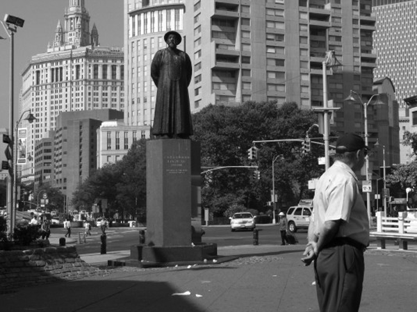
Nanna Debots Buhl, Other Halves, 2007 via Sue Scott
In the fourth show, Let It Die, at Lehmann Maupin, there is another piece, Robert Beck’s site-specific The Shrine, that explores how we commemorate our dead. Beck’s vision, however, is more entropic and more engaged with Price’s novel. Inspired by the shrine erected in Ike Marcus’s honor at the site of his shooting, The Shrine is installed outside the gallery and includes a low-hanging balloon, jar candles, stuffed animals, and wilted bodega flowers, some still wrapped in plastic. Like the shrine in the novel, it began as a vibrant display but has grown lackluster, languishing in the elements.
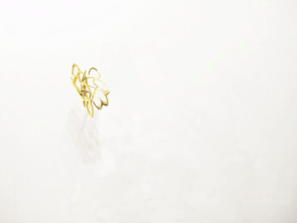
The seventh show, Salon 94’s Wolf Tickets, offers a more inventive riff on its title than any other “chapter.” “Wolf tickets” is a slang term for empty threats of violence, and the show features many tough postures that collapse upon further inspection. Robert Lazzarini has two sculptures on display, one of a gun and another of brass knuckles, both of which almost register as real weapons but have been altered in a way that renders them completely aesthetic. The two sculptures are completely confident in art’s inability to issue a convincing threat of violence: The brass knuckles have a bouquet of extra finger holes, giving the piece a delicate, brooch-like quality, while the gun is stretched out, goofy and elastic, and only seems uncannily a gun when one eye is closed and the other is angled properly. Patrick Lee’s masterful graphite drawing of a burly, tattooed man named “Big Top” was intimidating until I realized it was a drawing (many will be convinced it is a photograph), and thus the result, when considered in terms of classical drawn and painted portraiture, of an intimate rapport.
The thematic sweep of Lush Life is immense, and far greater than I could begin to address here. The curators maintain a fanlike fidelity to the text, mapping each entry in the expanse of Price’s fascinations. (The correlation between novel and artwork was often too strong, in fact, with many of the works seeming to bridle at the prospect of being forced into dialogue with hardboiled realist fiction.) Price’s descriptions of the Lower East Side’s laminations of history and culture already seemed to beg for visual representation, and now this leitmotif of layering duly haunts the show. And yet, in an exhibition that so meticulously catalogs Price’s themes, there is only a thin discussion of how these galleries interface with the processes of gentrification depicted in the novel. It would have been interesting to see a more focused exploration of what this relatively new gallery presence means, although the show demonstrates one very positive answer to this question.
]]>
The London Review of Books recently commemorated its thirtieth anniversary by holding a series of lectures and discussion panels in New York City. The final installment of the series was a panel entitled “The Author in the Age of the Internet,” which featured John Lanchester, a novelist, critic, and contributing editor to the magazine; Colm Tóibín, a novelist and critic; James Wood, a critic and member of the editorial board; Mary-Kay Wilmers, editor; and Nicholas Spice, publisher. (Andrew O’Hagan, a scheduled panelist, was withheld by volcanic ash.)
After a passing reference to Walter Benjamin, Spice framed the discussion by citing e-book revenue figures for 2009—they came in at over $100 million—and asking, open-endedly, what such dramatic technological changes imply for authors and readers today. In a sort of panel-wide disclaimer, the panelists immediately confessed their relative non-participation in the Web 2.0 zeitgeist: none have Facebook accounts (“Oh, God no,” Tóibín replied) and, though James Wood does use YouTube, he certainly does not engage in “recreational texting.”
Wood spoke for the panel in saying that his most formative reading experiences occurred before the advent of the internet. No writers, he claimed, anticipated this degree of “technological ferment” when determining their career paths. These remarks laid the groundwork both for nostalgic descriptions of an older mode of writing and for wooden complaints about the noise of the blogosphere, so hostile to literary thought; yet neither of these two lines of thinking were pursued more than cursorily. Tóibín did address the loss of anonymity and solitariness induced by the internet’s totality, but he quickly turned to a positive consequence of this loss: “the end of gay loneliness.”
When the e-book came up again, it was treated tentatively, as if the panelists were unwilling to let it become the focus of the evening. (With little fuss, a consensus emerged that the e-book format is clunky but will take over.) One of the most interesting exchanges touched upon the e-book only obliquely: Spice asserted that writers become writers because they want fame and Lanchester disagreed. Lanchester asserted that he, as a novelist, is driven instead by the desire to create a holistic “thing” and to have people respond to that thing. He delivered his words with an unexpected gravity, and it was startling to hear him use such a hearty, toothsome term to describe a form whose very materiality is in question. Lanchester, while reserved in his optimism, implied that this “thingness”—a definite “something”—will and must survive the various innovations of Apple, Google, and Amazon. By extricating the substantive, physical-sounding aspect of the book from its actual physicality, Lanchester suggested a precondition for the book’s continued existence, sprung from the sort of steely hopefulness that is now scarce in the publishing industry.
Elsewhere, in a recent interview with The Atlantic, novelist Paul Theroux expressed what has become a familiar, almost generic, complaint about the e-book and its inexorable rise to predominance: “something certainly is lost—the physicality of a book … sometimes a talisman.” Wistful and sympathetic to Theroux, public conversations among literary and publishing traditionalists have tended towards this vocabulary, bemoaning the absence of a “something” in the e-book, while prizing the “physicality” of the printed book, its status as a “talisman.” Though these lines of thought—which often appear, modified only by rhetorical animus, as full-blown lines of argument—make sense to anyone who has cherished a single volume and populated it with markings, their vagueness remains striking. Often beginning with a word like “physicality,” a concept opposed to vagueness by definition, they are then loosed back into the language cloud of the “talismanic,” the ineffable. The qualities of the moribund* book that will be missed, it seems, are bound up with the book’s physicality without being fully explained by it; either the very reasons for missing the book resist explanation, or the only explanations for missing it resist precision.
Walter Benjamin’s canonical “The Work of Art in the Age of Its Technological Reproducibility” has proven a consistent reference point throughout this unfolding drama, supplying the e-book-averse with the cryptic core of their relative Ludditism. The essay, invoked by overeager web-publishing entrepreneurs and nail-biting intellectuals alike, lends itself more fully to the latter group, to the Therouxs (call them “bibliophiles”) who are rightly distressed by the unsentimental and degraded new form in which literature is now cast. Benjamin is their model as he defends an apparently antique way of apprehending a cultural product (i.e. visiting a museum to view an original sculpture, as opposed to viewing a reproduction of that same sculpture in a book); using a fantastic analytic power to circumscribe something as nebulous as that cultural product’s “aura.” Even when Benjamin is absent from discussions about the e-book, his specter lingers, hovering over every mention of a “talismanic” text. And yet his essay’s implications for our current print crisis are rarely discussed with any thoroughness—after a cursory mention of the physical book’s “aura,” the conversation is over. This could easily be because “The Work of Art” is overly familiar, even exhausted. (Most humanities students I know could locate at least five mentions of the essay in their accumulated syllabi.) It is such an established touchstone that to convey its larger meaning may only require such a cursory mention of “aura.” The meat of Benjamin’s essay does, however, have a tremendous amount to tell us about what is lost to the e-book, for something certainly is lost.
As print continues its descent, “The Work of Art” appears to Old-Guard readers and writers as most useful for its empathy. (That the auras of artworks are being held hostage by immaterial reproductions must resonate with the present mood.) Though Benjamin’s discussion revolves around the essential singularity of a work of visual art—upon emerging from the presses, books are anything but singular—his arguments about physical presence have uncanny relevance here: “In even the most perfect reproduction, one thing is lacking: the here and the now of the work of art—its unique existence in a particular place.” For Theroux, an edition of a book presumably isn’t born unique, but, through apprehension, through its passage from one pair of hands to another, through the accretion of marginalia, and through existing in real time, it achieves a singularity and, consequently, a talismanic authenticity. This authenticity is almost synonymous with the artwork’s “aura,” with its
highly sensitive core, more vulnerable than that of any natural object. That core is its authenticity. The authenticity of a thing bein the quintessence of all that is transmissible in it from its origin on, ranging from its physical duration to the historical testimony relating to it. Since this testimony is founded on the physical duration, the former, too, is jeopardized by reproduction, in which the physical duration plays no part. And what is really jeopardized when the historical testimony is affected is the authority of the object.
One might encompass the eliminated element within the concept of the aura, and go on to say: what withers in the age of the technological reproducibility of the work of art is the latter’s aura.
If one is to transpose Benjamin’s definition of authenticity to address the e-book, one quickly confirms the latter’s fundamental lack of the former.** Yet this notion of authenticity can, when talking about one text format in relation to another, seem somewhat unimportant and, worse, sentimental. After all, the aura-filled features of the weathered, inter-generational book—the one that bibliophiles so love—are relatively superficial. What gives this notion of authenticity its urgency is its consideration within the context of a larger, threatened book culture: think of the independent bookstore, many say, and of the most venerable of institutions, the library! The disappearance of aura then poses not only a threat of desacralization, as it did upon the publication of “The Work of Art,” but now, also, an existential one.***
The endangered availability of physical books (from a specific site, for free) seems negatively proportional to the burgeoning availability of downloadable books (everywhere, at a uniform price). The library—a stronghold of tradition, now back-lighting the moon—can then find its place in Benjamin’s statement that “the technology of reproduction detaches the reproduced object from the sphere of tradition.” New e-ways of encountering literature are, in their very nature, removing us from a “sphere of tradition,” in some ways for the better and in some ways for the worse. “The sphere of tradition” is an interesting formulation, as it suggests “tradition” to be a consolidated, physical cluster of ideas, a singular site where people gather in order to take part in an historic community. The library is such a sphere, and, in its current incarnation, it is being steadily displaced by this new mode of perceiving whole books.****
In a related understanding of “tradition,” the word suggests different ways of reading that could be identified as such by the authors of a large (for our purposes, Anglophone) pantheon. These ways of reading would include all manner of stereotypes, most of which involve “curling up”: curling up in front of a fire with a book, curling up in bed with a book, curling up on a dappled picnic blanket with a book, etc. Without attaching a positive or negative charge to the e-book, one could hazard a guess that a writer as capaciously thinking and feeling as, say, George Eliot would find utterly alien the introduction of an e-reader to any one of these scenarios. For while these ways of reading are not timeless, they have certainly carved out their place in “the sphere of tradition.”
Benjamin argues for the possibility of uncovering the sources for such shifts in ways of reading: “if changes in the medium of present-day perception can be understood as a decay of the aura, it is possible to demonstrate the social determinants of that decay.” Under contemporary circumstances, these social determinants are easily identifiable. Ken Auletta’s recent New Yorker piece about e-readers cites “a close associate” of Amazon CEO Jeff Bezos, who claims, “What Amazon really wanted to do was make the price of e-books so low that people would no longer buy hardcover books. Then the next shoe to drop would be to cut publishers out and go right to authors.” Regardless of one’s feelings towards the Kindle, the social determinants underpinning the device’s ascendancy are sinister. Auletta’s characterization of Bezos is scathing, and the reader leaves the piece convinced that Bezos is the last person who should be the preeminent agent of literary change. The iPad—called the “Jesus tablet” by some publishers for the possibility of salvation it offers—and Apple CEO Steve Jobs are given a more flattering treatment. (Google, in its effort to digitize all books, is also a favorable competitor in this delirious brinkmanship.) Jobs comes off as less megalomaniacal than Bezos, and he is demonstrably less interested in enslaving (and possibly annihilating) publishers. The Mac Bookstore’s agency model, announced in conjunction with the iPad, does give publishers more autonomy than Amazon, which has enforced a notoriously restrictive approach to pricing. Still, Jobs is cynical about the future of books, and his involvement with the publishing industry appears perfunctory.
It’s quite possible that the most important “something” lost to the e-book is not ineffable at all—maybe that “something” is simply a champion of this new mode of reading who is actually invested in a pluralistic (rather than fiscally consolidated) literary community. This statement rolls of the tongue in the most idealistic, naïve way, as if it’s a shock that Bezos’s acceleration of the transition to the e-book stems from anything but a will to market control. Still, if aura hasn’t already evacuated the book, Bezos and Jobs are not likely to be hospitable to it.
The reality is gray, however. We’ve lived with Benjamin’s argument for three quarters of a century now, and it feels anachronistic as well as accurate to eulogize aura now. Inchoate nostalgia, private and inexplicable, may be a response to the rise of the e-book more appropriate than noisy discursive brio. As Ted Striphas illustrates in his excellent book The Late Age of Print, the story of print is the story of alarmed voices declaring the dissolution of something like “aura.” For centuries, emergent technologies have repeatedly promised to estrange authorial intention from its appearance as text. Yet these arrivals —movable type, the typewriter— initially perceived as threats to writing’s inviolable integrity, have actually given shape to now familiar ways of creating and consuming literature. This shape, which once put the poem in jeopardy of becoming a telegram, is in an ongoing process of being naturalized: “The intellectual history of reading and writing technologies consists, as it were, of a recursive series of laments about the apparent incapacity of these technologies to represent or manifest fully—the word, presence, personality, meaning, intention, and beyond.” The flip-side of this coin would be to admit that there is some truth to the all the alarmism, that writing is indeed becoming depersonalized and stripped of aura. Perhaps the best we can do is hope that “the word, presence, personality, meaning, intention, and beyond” will remain as transmissible onscreen as they are off.
* Despite my sensationalism, the alarmism of publishers, and Amazon’s somewhat premature celebrations, few without vested interests actually regard the printed, physical book itself as imminently moribund. And while many roll their eyes and yawn upon hearing yet another Chicken Little-ish declaration of “print is dead,” these declarations do offer a coded way of saying something very real: that the physical book’s currency as a cultural product is increasingly and dramatically curtailed.
**This opens up larger questions that the industry will have to face once more e-readers and e-editions of single titles are available, namely questions having to do with authenticity and piracy. (There is already an abundance of information available on what Copyright and Technology calls “The E-Book DRM Mess.”) Very shortly, desultory and philosophical determinations of whether or not a book is “authentic” will have no traction in the face of real and legalistic ones.
*** As if libraries weren’t suffering enough already.
**** Libraries are already responding to the imperatives of the e-book, promising a future library that is physically decentralized. It is heartening to see libraries adapting to such an unfriendly landscape, even if their adaptations run counter to the interests of the bibliophile.
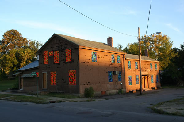
Olek, untitled, via olek nyc
The first artwork one likely sees upon arriving at ABC No Rio’s Ides of March biennial exhibition (through April 9th) is Olek’s Crocheted Windows. The front-facing windows of the second, third, and fourth floors have been covered with what look like camouflage Afghans, colorful knit rectangles whose textiles vary according to the level of the building. While certainly vibrant, Olek’s windows, in their sheathing of ABC’s interior, evoke the wood panels installed in a condemned tenement. The effect is uncanny, and it addresses the uniqueness of its venue, which was made possible by such a condemnation.
ABC No Rio was born of “a short-term occupation of vacant city-managed property” located on Delancey, just three blocks from ABC’s current location. (The above language is taken from the manifesto that accompanied the 1979 “occupation.”) “Occupation,” however, denotes a violence entirely absent from the Real Estate Show*, the watershed exhibition of what would later become the performance space, arts center, and activist hub that is now ABC No Rio. The founding artists’ politics was anything if not vivid. It combined the breadth of basic anarchism with the provincial specificity of community organizing; it occasionally gave way to soaring abstractions, though it was acutely aware of its surroundings. And while the Real Estate Show’s manifesto does brim with a certain type of optimism, it expresses a profound cynicism regarding the living and art-making that can occur within institutional frameworks. It is acerbic in its takedown of New York’s real estate market, with its tendency to displace established populations when whiter, more affluent ones come along; of New York’s housing policy, which prefers to let vacant buildings languish rather than permit non-transactional habitation (a poster for the show reads, “A BUILDING IS NOT A PRECIOUS GEM TO BE LOCKED-BOARDED-HOARDED”); and of the art market, faulted here not only for its complicity in the revaluation of whole neighborhoods, but also for its demand that artists create market-oriented work.
A condemned building, converted into a gallery where artwork would be shown but not sold, would seem the perfect interstitial site for airing the group’s concerns. 123 Delancey then proved an almost platonic answer to the question, “What room for politicized creativity exists after all problematic economies have been avoided?” Thirty years after the fact, it is thrilling to imagine that a building’s exclusion from every marketplace could become the very premise for so much new artwork. With ABC’s vacant-to-flamboyant genesis in mind, it is no wonder that Olek’s obstructed windows are inviting rather than prohibitive. (And, from the inside, the crocheted patterns do wonderful things with the light on a sunny day.)
The city of New York agreed, somewhat recently, to sell ABC its building on Rivington Street for one dollar, on the condition that hundreds of thousands be raised for necessary structural renovations. It is now securely, legally there, hundreds of sweaty shows later! Does its newfound status as a sanctioned space complicate its relationship to squatters, artists, musicians, the dispossessed? I think the question is an absolutely stupid one, but I was expecting to see more substantial, agitprop-y art in the current biennial. There is dispiritingly little engagement with the set of social problems that inspired ABC No Rio’s existence in the first place. Many of these topics beg to be taken up newly, among them: squatting’s national renaissance, induced by foreclosure-glut; the compromised position of the working artist; Bloomberg, generally, given the iconoclastic, dare I say “iconocidal.” history of the Ides of March itself.
Perfect 8, Resonance, via Perfect 8
Because of these omissions, I found myself uncharacteristically drawn to the most explicit, instrumental works in the show. In the setting of another gallery, Vandana Jain’s screen-printed, multi-colored prayer flags might have seemed ham-fisted, but here they feel pressing, with their spirals of sloganeering text reading, among other snappy things, “PUT PEOPLE BEFORE PROFIT,” “HEALTHCARE NOT WEALTHCARE,” “WE NEED A PUBLIC OPTION,” and “PREGNANCY IS NOT A PREEXISTING CONDITION.”
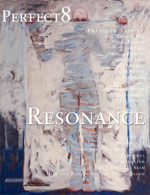
An installation by Perfect Eight falls into this explicit, instrumental camp as well. A “publication dedicated to the de-objectification of people,” Perfect Eight collates top-selling men’s and women’s magazines—women buy O, Brides, and Good Housekeeping, while men buy Sports Illustrated, Maxim, Playboy, and Stuff—and, next to a newsstand-style diagram of these magazines, offers another “newsstand” of imaginary unisex magazines, all hailing from some utopian parallel universe. The covers of these magazines feature the work of various painters and illustrators, and their titles run the narrow gamut of really good virtues: Intelligence, Loyalty, Courage, and Intimacy. However naïve this revision of general interest, there seems something brave, not quite foolhardy, about using pulpy magazines to evince our better natures.
One of the reasons I fell for such topical works is that many of the pieces presenting themselves as radical turn out, upon further investigation, to be merely husks. Such art in this show feels born of a politically supercharged sensibility, at once eager to express itself in earnest but convinced that art prizes coding and ambiguity above all else. Work like Chanika Svetvilas’s stuffed kitchen gloves, which are covered in fake-blood, limp, accusatorily pointing, is not ambiguous—the referent just isn’t mentioned.** The work declares violence, but the violence isn’t felt because there is no target, no victim. As a result, it feels like an empty polemic. A sculptural installation by Fabian Berenbaum simulates an interior wall being torn open and held there with surgical hooks; a bloody heart is exposed. Is it a commentary on the building’s abundant living history? Or does it insist that if you look penetratingly enough at any space you will find grotesque inscriptions of violence? Or does it simply look good and visceral?
Other works fall prey to a similar vagueness but are somehow more appealing. Michael de Pasquale’s photos, which depict smashed objects against a white background, are satisfyingly, senselessly destructive. They court the “bad” impulses. Carol Warner, represented in the garden, has painted white blocks of text that cover old graffiti, and the blocks read, on the northern wall, “Pre War and Pretty,” and, on the eastern wall, “Beautiful Inside & Out” and “Create a Dream Space.” The text is sunshiny dreck, but it is forgiven by how beautifully it laminates these walls—years-worth of accumulated spraypaint, tidily supplanted by legible sentiments. They are very interesting palimpsests, and I loved looking at them.
Jacob Riis, picture taken at The Black and Tan Dive, via freebird books
Nanna Debois-Buhl’s short documentary Other Halves (from 2007) is one of the only pieces that essentially belong to ABC No Rio’s neighborhood, though it was not made specifically for the biennial. The title is a reference to Jacob Riis’s iconic collection of photographs, How the Other Half Lives, which documents the destitute as they reside in Manhattan’s slums. A Danish immigrant like Riis, Debois-Buhl boasts a deep and thorny affinity for the photographer. Other Halves consists mostly of black and white stills (an homage to Riis) that revisit the locales photographed and made recognizable by Riis, once marginalized sites of extreme impoverishment. The early passages of the film refract images of Canal Street vendors through fresh eyes, recasting commonplace sights as novel ones. Her film proceeds to take the viewer on a tour of what she would ostensibly like us to think of as “Riis territory,” most of which has been gentrified, its once-dangerous public spaces turned into thriving parks. At one point in the film, Debois-Buhl’s tour guide points out an illegal sweatshop where “I [heart] NY” T-shirts are fabricated. Debois-Buhl duly captures the window, but that is all. It becomes clear that the filmmaker’s position is not analogous to Riis’s, as the “other half” is inaccessible to her, nor does she aspire to document it.
None of the buildings in the area are now visibly vacant, nor do they obviously accommodate the demonstrable, spectacular poverty that Riis witnessed. Because of these changes in the neighborhood, it makes sense that Debois-Buhl would take up Riis’s torch by focusing on the concealment of the “other half.” Still, the “neighborhood,” now meant very globally, holds a wealth of things rife for exploration in that vigorous, 1979 mode—one just has to look harder.
—
* If the rhetoric appears lofty, the action was polite. A note from the artists captures the understated civility of the “occupation”: “On December 30, 1979, several artists entered the 1916[-]built factory showroom at 123 Delancey Street. They glass-waxed the windows and began clearing trash from the room. A plumbing line in the basement had burst during the frost of the previous week; this was repaired. The heater was turned on and a radio plugged in. Throughout the day and into the night, artists arrived with their work for the Real Estate Show…. At 9 in the evening, the last artists in the building locked up and went home.”
** This may not fall entirely upon the artist: almost no titles or statements of intent are given, and thus there is virtually no narrative thrust to be found anywhere.
]]>
Mary Billyou, Subspace Face courtesy the artist and Round Robin Collective
The former convent of St. Cecilia’s Parish—the enduring Roman Catholic parish was itself founded in 1872—is the fascinating site of the Round Robin Collective’s current group exhibition, ECSTATIC. The convent, which is nestled in a pocket of south Greenpoint remote from the subway, stopped accommodating nuns only recently, when their numbers dwindled to the point that such large quarters were no longer practical. The parish has since been remarkably open to re-purposing the space, having hosted a smattering of art shows and their attendant events (the father was rumored to have enjoyed ECSTATIC’s opening reception), but the building’s original intentions remain apparent.
The Brooklyn-based Round Robin Collective fills this unique space as cleverly as it can, with some of the participating artists explicitly addressing the convent’s history (its “sacrosanct aura,” in the words of the press release) and others finding idiosyncratic ways to situate non-site-specific works within the former bedrooms, closets, and fireplaces. The show is organized around “notions of ecstasy;” moments of “mental transport and rapture,” and the artists enjoy the etymological ambiguity of the word “ecstasy,” here understood (in what feels to me like a canonical OED entry) as “outside of the self.” Inside the convent walls, the connotations of “ecstasy” are obviously religious, but, upon entering, it’s immediately difficult to imagine any vibrant notion of “ecstasy” being achieved within the austere, dilapidated space. The dusty, institutional quality of the building instead makes the shriveled and monkish asceticism of nunnery clichés much easier to imagine.
Though the convent, with its small, serviceable gallery rooms and an inscribed history affords artists opportunities similar to those offered by a space like P.S.1, the convent’s un-rehabilitated appearance and retention of original details make it sui generis. I first visited St. Cecilia’s on a bleak Saturday just after ECSTATIC’s opening—the rain was unrelenting and the general wetness in the air seemed to pucker the cracked paint of the entry hallway. That hallway led me to a low-ceilinged chapel where the pews had been cleared aside and aggregated beneath a stained glass of the Virgin, creating a small staging area on the linoleum floor. A number of exciting events—multiple screenings, a collective sewing session, a panel discussion about alternative art spaces in New York, a cooking demonstration, and a potluck—are set to take place here during the coming weeks, all as part of the Collective’s fittingly communitarian program.
The first piece I saw was Katherine McInnis’s video piece, Threshold, which is installed in the only window of a tiny darkened room just off of the chapel. The monitor blocks the view from the window, substituting a battery of images that look at once like a slideshow and stop-motion animation. Threshold looks at and, when possible, through every window on the premises, surveying all views available from within the convent, mapping a dreary, curtailed sense of the outside. McInnis focuses on the textures that make the distressed windows opaque—paint, scratches, darkness— making it difficult for the viewer to envision any escape, nevermind an ecstatic one.
Gisela Insuaste, Suenos en mi cama, dreams in her bed (dreams in my bed, dreams in her bed) courtesy the artist and Round Robin Collective
Martin Esteves’s Come to Mock, Stay to Rock fills the neighboring room as only a five-foot-tall phallus wrapped in black electrical tape could. His sculpture is flanked by two modest, wall-bound sculptures—Audra Woloweic’s pair of effaced vinyl records, which I particularly liked, and Lisa Boumstein-Smalley’s black Plexiglas panels. Yet Come to Mock… is intended, according to the artist statement, to enter the viewer’s consideration only when she backs into it and is thus shaken from contemplation of either Boumstein-Smalley’s or Woloweic’s work. This intention is both implausible (I couldn’t have ignored the presence of the piece if I tried) and delightfully hostile to ECSTATIC’s premise (Esteves’s piece sets out to disrupt the viewer’s ecstatic reverie by physically intruding upon her apprehension of other artworks). When staging this reverie-disrupting collision, I noticed that Esteves’s monolithic sculpture is wobbly and has a sponge-like receptiveness to touch, much like a fine-art punching bag.
Some of the original decorations still adorn the corridors of the convent: I found a still-life and, a few feet away, a framed piece of pious verse set against a background of watercolor. Because the building’s raw interior brims with interest, and because there are artworks tucked away in all manner of obscure pockets, I developed an inquisitive urge to go off-road, to locate areas that either hosted a quiet cache of art or were unclaimed altogether. Across from the wall-poem are the stairs to the basement, which had apparently channeled the excess attendees of the previous night’s reception. There are no works installed downstairs, but it is still an important tier of the self-directed experience, especially for those eager to imagine how some nuns lived. There is a large kitchen, wallpapered in rose-print, and during my visit its half-length linen curtains were drawn to expose an eye-level stretch of sidewalk getting a drenching. A vestige from an earlier exhibition is still emblazoned on one wall, reading “the mountains that make up the coast are full of tall pine trees and small ferns”; in one room, atop a floor protected by butcher paper, I encountered a crowded index of wardrobes, and a few cases of energy drink; the laundry room still has a washer, dryer, and industrial sink, but it is dark and musty, arguably the building’s eeriest place.
When I returned to the first floor and made my ascent to the second, the rain had created a leak in the building’s skylight and the consequent drip was being caught by a plush sculpture suspended in the stairwell. I entered the living room, where a sofa and coffee table face a fireplace that has been retired but reanimated with a light sculpture. If the works on the first floor deal with “ecstasy” as a somewhat cerebral proposition, the second floor living room explores the more jubilant, less ponderous qualities of the term. These works are steeped in a sort of ultraviolet trippiness, possibly the result of an unhinged free-association with “ECSTASY!!!” as its prompt. Though I was vexed by the inclusion of a few pieces, Matthew Spiegelman’s Untitled (saddest smile) is one that, despite its Day-Glo cast, truly belongs to the setting. His sculpture features light fixtures (all of which seem to have been taken from the overheads of the convent’s bedrooms) arranged in a smiley-face formation, with their bulbs awakening unpredictably. The room is illuminated from above by loud fluorescents, which give Spiegelman’s sculpture little influence over the overall quality of light— making his piece a relief, which I liked. Were the delirious lights more potent, the ecstasy induced might be unbearable.
In an adjacent former bedroom are Stephanie Liner’s photo series Momentos of a Doomed Construct. At first, they appear more interested in a sort of passive, pre-ecstatic state. The female subject of Liner’s portrait series is, in certain ways, not yet fully a subject, as she rests within an ersatz womb lined with the vaguely Victorian fabric that constitutes her dress. How does one experience the necessary rupture of ecstasy, the flight from self, without having completed gestation? Though Liner’s subject is confined to this ornate, padded cell, complete with porthole, there is no urgent sense of claustrophobia. I examined the red print of the textile for some time, its birds, flowers, and butterflies, and then I looked out the window onto the plot of soil below, muddied by heavy rain, surrounded by a chain-link fence. My eye stopped upon a small, wet pyramid made of pebbles. The grounds were strewn with felled trees, which had been gathered into three dampened piles; one pile lay next to a rusting trellis. It was a melancholy pleasure to have a warm respite indoors—could I be experiencing the sort of adult sensation that compels one into a padded womb? Did I just feel a momentary pang of the ecstasy Liner is interested in? Maybe I was the one suffering from a case of the rainy-day teleological confusions, but alas, it could just be that I am male, gazing at this padded, circumscribed space from an open room with hardwood floors.
Janos Stone, I Never Thought I Would Meet Someone Like You courtesy the artist and Round Robin Collective
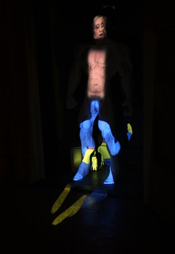
Janos Stone’s I Never Thought I Would Meet Someone Like You, located at the other end of the hallway, explores an ecstasy patently prohibited in a convent, and was among my favorite pieces in the show. Relegated to a small closet is a sculpture of a nude male, almost three feet tall, Herculean, anonymous, well-endowed, with a wispy tangle of pubic hair made from hot glue. Three discrete sets of images are projected upon different regions of this tabula rasa, resulting in a sort of “exquisite corpse” by way of Tony Oursler. The faces of male and female porn stars, all contorted with requisite glee, are cast across the sculpture’s face; an under-exercised, heavily breathing male torso is projected onto the sculpture’s body; at the bottom is a projection of a shape-shifting Second Life figure, bright blue and yellow. Everything about the piece feels anachronistic and inappropriate in this context, from the VR imagery to the naked man that doubles as a screen. Chaste visitors should be thankful that Stone has installed his piece in the closet of one of the more marginal rooms, lest they be confronted with his blasphemous specter of pornographic orgasm.
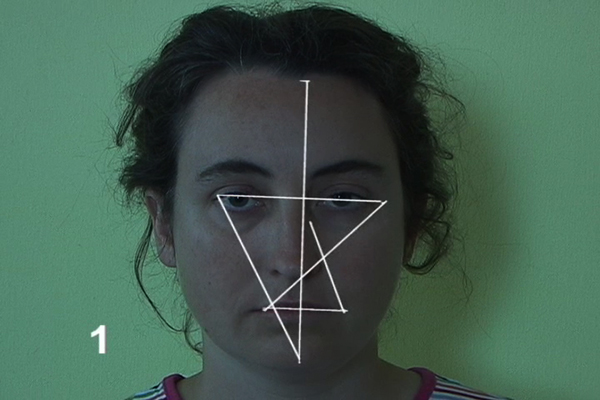
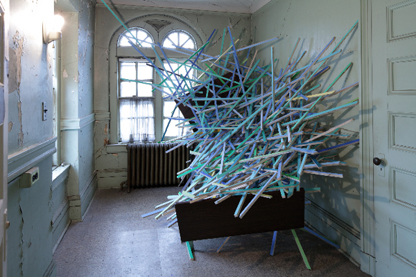
I also loved Mary Billyou’s Subspace Face, a video loop in which the artist’s face remains still while a simple matrix is superimposed upon it. As the face slowly recedes, the video offers a holistic interval, the intersection of a simple, platonic form and a very human face. Gisela Insuaste’s site-specific sculpture, Suenos en mi cama, dreams in her bed (dreams in my bed, dreams in her bed)—a chaotic latticework of wood shards, all culled from the premises, overflowing from a broken bedframe—was a total surprise to me. Despite its muted colors, the piece feels brittle and confrontational.
Collectively, ECSTATIC accomplishes its two main objectives extremely well. I left the show with an overstuffed-yet-vague idea of ecstasy, of an expansive, heterogenous, personal, remote, religious, transgressive, and ultimately elusive thing. Most exciting, however, is how vividly dramatized the setting is. Many pieces (and, if you’re lucky, a severe rainstorm) find thrilling ways to emphasize both the religiosity and the decrepitude of the space. The former quarters of the Roman Catholic priesthood, now mired in scandal, would have been much harder to sentimentalize (and would doubtfully have yielded such sympathetic contributions from artists); the sisterhood is a much different story.
]]>