At the opening of her recent exhibition at Theodore Art she was accompanied by her mother, Mary Losq, who regaled those in attendance with stories and interpretations of Juliette’s work. The artist/parent relationship can be a fraught one, but also offers a unique opportunity to understand where the artist is coming from. With an eye towards keeping the number of embarrassing childhood details to a minimum, what follows is a collaged conversation with mother and daughter.
Brian Dupont: Juliette, your fascination with abandoned areas and derelict zones are the sorts of places kids like to play, were these places you explored when younger?
Juliette Losq: I grew up in the suburbs of London, in a small town called Hornchurch, which borders on the East End and Essex. It is not an attractive town but it does have a lot of open spaces and parks, which I used to visit with my brother and friends, and we would set up camps. Everything was a bit rundown and grey, so finding a clump of trees was like discovering a forest with a huge potential to explore.

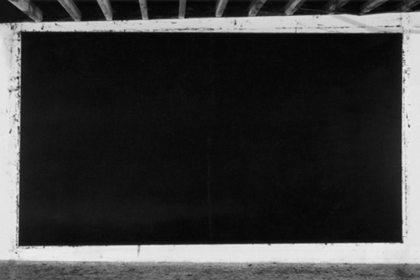
Losq’s ‘Piaculum,’ 2012. courtesy of Theodore Art, Brooklyn.
BD: Mary, you’ve been following Juliette’s development as an artist longer than anyone. What did her first forays into art look like? What do you remember about her work at the beginning?
Mary Losq: She was always drawing and painting and particularly liked to draw family and pets. When she had learnt to write she used to make up stories and illustrate them.
BD: Do you remember any of the stories? While many kids narrate their drawing, it becomes more interesting given the literary elements in Juliette’s work. Were there any nascent threads that you recognize looking at her work now?
ML: When she was 5, she started to write a set of stories called ‘Minnie Mouse and Benny Bluebird.’ There were eight stories altogether and she introduced a few characters such as ‘Sly Fox’ and ‘Wily Weasel.’ These were the villains in her stories. Now and again, ‘villains,’ in the form of mythological creatures, appear in her work.
BD How did your engagement with art start? Presuming a childhood interest, when did you start to think about art to pursue in adulthood? How did your Mom help encourage you to pursue art?
JL: I was discouraged from studying art and encouraged towards more academic subjects at school. They couldn’t find a space for me on the school timetable so I studied for my A – Level art exam at home with my father, who was an art teacher at the time. I studied English at Cambridge but always regretted having not gone to art school instead. I kept making work in my free time and took part in student shows, before moving across in to the History of Art Department, and gradually working my way back towards Fine Art in that way. Having said that I enjoyed studying both English and History of Art and there are direct links with both disciplines in my work, which often contains literary references and draws upon earlier periods of art in imagery and technique.
BD: What were your thoughts of Julliet’s education? What did you think of her continuing on to studying art after originally studying art history?
ML: Originally, I thought it risky to give up a job in the city to pursue a further course of study. However, I now realise that she had to follow her instinct and, in this case, it proved right.…
JL: Both my parents were initially happy that I did not go to art school. I think they had hopes that I would work in something more lucrative. They didn’t specifically dissuade me from giving up my job in the City to go to art school but they were worried. However, they are now very supportive and often turn up to shows in London — and now in New York! Both of them are creative people (my mother teaches music) and I was taken to museums and galleries from a very young age.
BD: You originally went to university to study art history, and then continued on to studio courses. How did you wind up taking this path? It is more circuitous than the traditional path for an exhibiting artist. Did something push you out of studying art and into making it?
JL: I think what eventually pushed me back into making art was a frustration at looking at art in museums and galleries and going into great detail about the technicalities of how it was made without actually physically making anything myself. During my MA in Eighteenth Century British and French Art at the Courtauld I found myself more drawn to the technical side of the work than the Historical context. I started going to evening classes to try my hand at some of the techniques I was studying and got the bug.
BD: The approach to space and discovery can also be very child-like, with points of view akin to watching from hidden vantage points. But just as the child might watch, there are also hidden presences that are watching (of the sort one might think adults would miss but that children or innocents might see). Do you have an interest in this dichotomy? How do you think about the viewer interpreting or arriving at a narrative for your work?
JL: One of the things I enjoyed about studying art of the eighteenth century in particular is the way that the viewer often occupies a similar position to the reader of the novels that were emerging at that time. I’m thinking of Hogarth in particular: his character development across series paintings (The Harlot’s and Rake’s Progresses) and his inclusion of myriad visual clues that generate stories within stories. This interest has carried over, to an extent, to my own work. Just as I read into a neglected landscape, projecting activities and images onto it like a screen, I want to provide the opportunity for the viewer to do this with the work I make. Sometimes the scene is more directed than others, for example where I include characters lifted from the internet or Victorian crime journals, as in Myriorama. Often I deliberately choose viewpoints and imagery that fool the viewer into thinking such a character might be hiding in there somewhere, waiting for them to discover it themselves.
BD: Mary, there is an undertone of unease and a fragmented reality in the scenes she presents, how do you engage with her subject matter?
ML: I tend to look for the hidden creatures, objects etc. within the painting.

Losq’s ‘Myriorama,’ 2012. courtesy of Theodore Art, Brooklyn.
BD: In the current show at Theodore Art, the large drawing hides many such presences, but the smaller works set the unknown figure right out in the open. What is it, and what brought it out into the open (so to speak)? Is it more disconcerting that they’re not “hiding” and are rather out in the open?
ML: No. It’s just a new way of looking at things.
JL: I was thinking about the sense that these images of marginal areas in the small works could almost be from any era. They are only discernible from their original industrial functions as being of the present, perhaps, because they have become so overgrown and, to an extent, peaceful. But I also find that tranquility eerie: they could just as easily be from some dystopian future, where everything looks largely the same but with minor disruptions or differences. The unknown figures are deliberately nonspecific, definitely organic. They could be living organisms or the pupae or entrails left behind by something now departed.
BD: The sense of narrative can seems to come from an underlying source in genre fiction, rather than documentation. What appeals to you about the creepiness or unreality found in science fiction or horror? What do you like about superimposing this anxiety on an otherwise pastoral setting?
JL: Maybe it’s having grown up in the suburbs where everything is dull and there are no extremes of nature, but I always project creatures onto a given landscape. If you show me a still pond I will imagine something rearing up out of it. I also grew up on a diet of horror films, as my father was a fan of the Universal films, and any kind of schlock horror really.
BD: Your technique of layering and masking can be stunningly complex for the simplicity that is often ascribed to drawing or watercolor. How has your engagement with the materials grown and evolved? What do you find in “drawing” that you don’t in “painting” or “photography?”
JL: People are often confused as to whether they are looking at drawings, prints or paintings when they see my work in the flesh. I’ve borrowed parts from both watercolour painting and the process of etching. I build up the work like you would an etching plate, masking off areas then inking over them until the final image is ‘developed’ and revealed. I then add further detail and watercolour washes over this. I enjoy hovering between the different disciplines. Watercolour historically has connotations of feminine domesticity, or as being a sketching medium that is used in small scale preparatory works. I like the idea of turning these presumptions on their head in terms of the scale of the work and, to an extent, the disruptions to the landscape that I introduce.

Losq in ‘Another Room.’ courtesy of Room Artspace, London.
BD: You’ve also integrated paper as an installation material; how did this come about?
JL: The paper installation side of things has come about as a way of developing my interest in recreating the experience of being in these landscapes that I’m drawn to, in the sense that I can create encompassing environments.
Having landscapes that evolve from objects in some ways replicates the process of my imagination, as I’m envisaging and creating interiors that have become overrun or that are breaking out into the exterior world.
BD: There’s a wonderful feeling of layers of old wallpaper peeling and shredding in your installation at Room Artspace. It’s an urban interior version of the abandoned spaces in your other work; how do you think the shift in setting affects your approach to making the work or the emotional content?
JL: The piece at Room was made specifically in response to that setting, with the dimensions and the derelict nature of the house in mind. It happened that I had a fireplace, as I accumulate objects that could potentially be included in future works. I also had imagery of some abandoned and overgrown archways from a military training site in Essex that I could envisage being integrated with the structure of the fireplace. I work by making visual links between different images — photos and found images — and objects. In this case I had the opportunity to extend this process to the environment in which the work was to be shown, which is the first time this has really happened.
ML: I am amazed at the method of composition, for example, the way that furniture can be part of a landscape. I am continually amazed by the development of her work. I find it interesting that rather than just painting derelict landscapes, which stand as works on their own, she now introduces unrelated creatures and objects into the work. I like the way she uses literary references as titles for her work to bring the various elements together.
BD: Juliette, what would you like to do with your work that you haven’t already?
JL: Building on the experience of the installation at Room I would like to make more paper installations. The challenge is now developing the work technically in order to move this process on. I’m interested in developing the sculptural possibilities of paper more. Maybe it’s time for another course!
Another Room with an installation by Julliet Losq is on view through November 24, at Room Artspace, 30 Manchester Street, London.
Juliette Losq: Lucaria is has been extended through December 16th at Theodore Art, 56 Bogart Street, Brooklyn.
]]>Expectations tend towards ever increasing complexity, radicalism, and experimentation, and any simplification or consolidation is read as a retreat or acquiescence to maturity.3 It’s as if artists are expected to grow up, settle down, and move to a house in the suburbs. White is resolutely urban artist, but her Fotobilds trade in the downtown energy of her classic# text paintings for the more orderly rectilinear stacking of the uptown grid. White’s introduction of photography comes at the expense of painted gesture, and its implementation feels transitional. This is highlighted by the segregation of elements within the work. Modifying the typical store awning into a closed painting stretcher, the photographic imagery projects farther forward off the wall, and wraps around the edges of the support as the paint on the canvases or PVC elements do not.4 Where her earlier work referenced urban marking, and her zigzag airbrushed scrawl functioned as a material negation that physically covered the surface, the awnings evidence the super flatness of digital printing, pristine and unmarred.5 They stand out both literally and figuratively from the other elements in her work.

White’s ’11 Oliver,’ 2012. courtesy of Leo Keonig, Inc, New York.
So why are they here? White took the photos and manipulated them in photoshop herself, and the references are personal and particular. The titles are derived from the location, but her alterations only make the connection recognizable if they are explained. (For Pix Vää the gallery has supplied a broadsheet poster that includes both images of the works and some of White’s source photos.) 11 Oliver is a fine example of the kind of found, real world abstraction White has long referenced, taking a metal wall used to hide trash storage and documenting its evolution as a surface that accumulates marks.6 Steel is transformed into data and eventually output as flat vinyl that removes any trace of the wall’s otherwise resolutely tactile materiality. Likewise the fluorescent “sprays” that sit within the inky field lack any animation, and suggest an origin in the drag of a mouse rather than the painter’s hand or arm. The speed and urgency of their adjacent airbrushed relatives is absent. But again, that makes them different, not better or worse — why is White striking out on this path and what dictates the separation of process and material from imagery?
A more direct look at the division of structures is played out in the smaller scaled PVC series. Reminiscent of Robert Mangold’s early panels based on office partitions, these shaped paintings7 turn the contours of her letter fragments into a tightly fit frame for a distinctly separate canvas. It sits on the same plane, and both together provide a painting surface at once unified and divided. As any carpenter will tell you, such an edge is nearly impossible to disguise without filling in and covering over the gap; the division is a specific choice. The painting itself gives no sense of hierarchy, as color and imagery are the same between frame and canvas;8 even the off-center and seemingly casual placement of the canvas serves to keep it equal with the perimeter. The frame contains as much surface area as the panel so it is more appropriate to consider the entire unit as “the painting.” The true emphasis is on the dividing line rather than either section, but the real world reference is that of usable objects, where structure and assembly are everyday occurrences. White turns something simple (a door, a barricade) into art by translating that common object’s entire history.

White’s ’26 Eldridge,’ 2012. courtesy of Leo Keonig, Inc, New York.
This is what White may gain by bringing the photographic image into her paintings: a greater connection to the city, the world around her. The value of painting to an artist who creates absolutely everything herself is that it remains a medium where that is possible. White’s insistence on personal craft is less an issue in today’s art world of assistance and production specialists; the division of labor is no longer a hindrance to authentic gesture.9 There is a value in reticence and in not rushing to adopt the next new technology at the expense of craft and technique, yet it is just as important to consider what that craft and technology are being used for and how they can benefit an existing medium. Eventually sign painters succumbed to newer and more efficient technology, but without their knowledge we wouldn’t have the work of de Kooning or Gorky, or even a work as challenging to the structure of painting such as Rosenquist’s F-111. White is continuing this tradition, and it is not a process that can happen overnight.10 Expansion, renovation and construction take time, but this exhibition shows the beginning of the process. White draws a line against painting in favor of the possibilities opened to art and artist.
Wendy White’s ‘Pix Vää’ runs through October 20 at Leo Keonig, Inc, 545 West 23rd Street, New York.
- She is very insistent on this point in many interviews. See Bad at Sports and Curbs & Stoops for particularly in-depth and valuable discussions.
- Anyone can make something look slapdash and rushed; on the other hand to choose that over a highly polished finish assumes that one has the requisite skill to complete the job to a higher standard. It is an extension of the old trope that an artist must somehow “earn” the right to work abstractly by “proving” that they have the requisite skill to work representationally. This mindset fundamentally assumes that abstraction is some sort of con-job. It is also the dividing line where aesthetics and construction part ways: when the painting fails and falls apart there isn’t physical debris that is going to land on by standing viewers.
- Until the very end, when such reserved is accorded the wizened calm of old age. The narratives that are imparted onto art usually tell us more about ourselves than they do the work itself.
- If the work is unframed, the edges and sides of a painting are an excellent place to see how a painter approaches their craft. The sides of the PVC panels she uses to construct her letter or number fragments are a finished white, and the edges of her canvas lack any over spray or unsightly drips.
- I feel it is important to acknowledge that the precision of technical process White brings to her work may make painting onto stretched vinyl a dicey proposition; not just any paint is likely to stick, and a spray of unconsidered industrial paint would be just as jarring within the works as is the separation.
- Which is a suitable basic definition for painting.
- Or “painting.” Only one work, 7 Monroe, is actually on view. The remaining nine works are may be viewed on Leo Koenig’s website.
- Which has as much surface area as the canvas, and is for all intents and purposes a panel.
- However how much value (or more importantly, relevance) there is in any gesture, authentic or no, is still up for debate, perhaps more-so than ever.
- Or over the course of a single exhibition.
Brian Dupont: You originally were making abstract sculptures in resin that had a certain biomorphic – pop sensibility. The narrative appears to be that after a residency at the Calder studio in Saché you made what is a fairly radical break and started making the wire works with pipe and spray paint mounted directly on the wall. Can you talk about this shift in your practice? Was it a neat, clean break, or was there a messier struggle behind it?
Peter Soriano: Wow, was it messy… at least from today’s vantage point. For some time I’d known I wanted to move in a new direction. My resin sculptures were starting to feel predictable, at least to me. I wasn’t sure I liked being defined by this “childlike” or “pop” sensibility; it felt too easy or obvious. Plus, the construction of these resin sculptures was incredibly laborious. Sanding the pieces took so long and was so intense that my fingers would bleed. On a good year I’d be lucky to finish six works. And that intense, slow labor made me crave a faster kind of fabrication, with less process. I read Italo Calvino’s Six Memos for the Next Millennium and his lectures on the values of “lightness,” “quickness,” and “multiplicity” jumped out at me. I wanted to be less burdened by process.
Before leaving for France for the Calder residency, I gave up the lease on my studio in Williamsburg that I’d had for about ten years — in cleaning out the place, much of my unfinished work ended up in a dumpster, and seeing that work trashed made me even more determined to use the change in my physical space to force a change in my work too. At the Calder studio in Saché the basement was a graveyard of half-used, discarded stuff left by previous resident sculptors — I decided to use what was there, to let it guide me. Solutions to problems are sometimes right under one’s nose. Day by day, working in that space, I had a clear idea of what I wanted to accomplish. At the same time, I had no idea of where the work was actually heading; that understanding would come later.
BD: Some of the Saché works give hints of what the practice would turn into. The Tobogisant works include pipes and cords (although not under tension); the Kittyfats also physically tie elements together with material. Onze speedboys dans une salle polyvalente uses direct marking on the exhibition space to demarcate zones for sculptural action. How did this turn into the wire works? Did you see it as a matter of reduction?

courtesy of the artist.
PS: The transition from slack tension or lose attachments made with nylon webbing — like those used in the Kittyfats series — to my more recent wire pieces took at least a year. A slow, meandering year of trial and error. The goal was to make the objects lighter and less physical, and at the same time increase their scale. After the Calder residency, I spent months working on what would become my first piece using cables. It consisted of a cluster of small objects, some colored with spray paint, that were suspended by wire so as to float in the space. It turned out that wire cable best provided the strength and flexibility I was looking for.
BD: The language you use to talk about your work is very specific; in the explanation of the wire works you talk about setting up a “situation.” Interestingly this is also a term used by Fred Sandback and Bill Bollinger, two artists who also turned line into sculpture. Were there specific artists who you thought about while changing your practice?
PS: When the word “situation” dropped into my head during an interview to help explain my wire works I did not consciously have either Sandback or Bollinger in mind — better that way I think. But I am very familiar with both artists’ works and have read interviews with Sandback where he refers to his work as a “situation” so I am sure my use of the word indirectly comes from them.
BD: I think it is interesting that while you state that you distrust the written word, your new work has developed an alternate language or syntax that you can deploy at will. Can you speak to the graphic elements in the Other Side series and how you see the interaction with the pipe and wires generate the overall situation of the work?
PS: But isn’t it natural that my distrust of the written word has led me to an alternate syntax? I think the cable and pipe inhabit the space in a particular way. They cordon it off to create a “situation” between the space of the room and its wall or walls, and it’s within this situation that a kind of conversation begins — where the sprayed marks act I suppose as the language or syntax you refer to.
BD: What is your working process for these works? Do you start with sketches or notes, or do you start to work directly on the wall?
PS: It varies. Sometimes I work right on a wall. More often I start by looking at the site and then drawing a sketch. I always have a sketchbook within arm’s reach so I tend to try out ideas on paper first.
BD: Do you find that there is a difference between your studio practice and approaching a work at a specific site? I would think that in most cases you’re dealing with something similar to the standard “white cube”, but that in some cases (such as Other Side # 82 for the Escape from New York exhibit in Patterson) the condition of the wall (and by extension the entire space) winds up playing a more prominent role.

courtesy of James Wagner.
PS: My aim is to make a piece work as intended no matter where it’s installed. I made Other Side #82 in response to a raw brick wall, but I’d like to think that it could hold up equally well on a smooth white wall. Recently I had the possibility to install Other Side –> (NUM)BERS <– three times in three considerably different spaces. I first made the piece—a series of 15 wire cable works placed together in a loose configuration — in the summer of 2011 in my cramped studio in New York. A few months later, I installed it for a solo exhibition at the elegant, white-washed Galerie Jean Fournier in Paris. Then, in the spring of 2012, it was installed in an immense, open space in the countryside, the (former) stables for a château at the Domaine de la Kerguéhennec in Brittany. The piece has very specific installation instructions that ensure consistency no matter where it is installed. That said, there’s a degree of latitude that allows the piece to be adapted for the space it is in.
BD: For all their apparent reductiveness, the wire works appear to open up some conceptual issues that have been more closely related to painting, and specifically the recent trend that has been labeled “provisional painting.” Can these works be installed by others, and if so how do you see the sense of gesture, scale, and your own “handwriting” in the work translating to a situation that is completed by someone else? Are they open enough to allow someone else to complete these concerns, or is that another layer to your practice?
PS: I think your question raises two issues. The first is the relationship of my wire pieces to the practice of painting — arguably they exist somewhere between traditional sculpture and painting. I am an admirer of the French Support-Surface movement in the 1970s, as is the critic Raphael Rubinstein, so I suspect this has both informed his labeling my work “provisional painting” and played a role in my deconstruction of painting. Interestingly, I have shown my work to two largely different audiences (one in Paris the other in New York) and in Paris many observers have always considered my work, including the early resin pieces, in dialogue with painting, while in New York, it’s more often thought of in relation to sculpture.
The second issue is a more conceptual one. What is the relationship between an artist who produces a piece and an installer who re-produces it? Who’s the author of the piece? Is it the person who provided the installation instructions or directions? Or is it the person whose hand actually draws the lines on the wall? Those questions fascinate me. No two people following my instructions will create exactly the same work. So while the work is officially mine, there’s a tension there, a grey area pertaining to authorship that I’m trying to mine.

courtesy of Contemporary Art Daily.
BD: Do you think about the relation of your work to specific disciplines, like painting or sculpture?
PS: Absolutely. I have said I like my work to reside somewhere between the three disciplines of painting, drawing, and sculpture.
BD: Your most recent piece (in Break/Step at the Radiator Gallery) removes the sculpture elements (the cable, pipe, or mounts), using only the spray paint and tape high on the wall. Does this reduction essentially to painting change how you’re thinking about space, moving from actual real world space to pictorial or metaphorical space?
PS: All this is still quite new, so new that I am not yet sure how I see it. In some ways the wires and cables became a distraction. By eliminating them something else moves to the foreground; the wall markings stand on their own, making the pieces both more and less complicated. I suspect you’re right, in part, that without the sculptural elements the situation or space becomes more metaphorical and that is the syntax is more based on a response to something observed.
BD: I found that the crisp red brackets on top of the fuzzy blue spray paint produced a fantastic amount of depth on the flat wall, and that leads to all kinds of associations (for me it was satellite images of galaxies, with the overlay of the camera grid over what was being imaged) but they always flip back to material on the wall…
PS: I like your references to camera grids and galaxies. I too love the way they float in space together both related and unrelated.

courtesy of ArtCat.
BD: Are you aiming for further reduction in your materials, and where do you see your work headed?
PS: I’m working through this at the moment, using fewer materials but at the same time making wall pieces that are more complex syntax-wise and sometimes much larger than anything I’ve made before. In my exhibition at Kerguéhennec I created a piece for a very large wall, the last of the Other Side series. It was 11-meters long and had a richness and a depth I felt I wanted to push in future pieces. Somehow I knew right away that the cables and tubes had lost their importance, that they limited the work. This is where I am now.
]]>
courtesy of SFMoMA
Setting, layout, and installation are key to a successful exhibition, yet often they are only apparent for their unwelcome intrusion. A good installation disappears, but when it goes wrong, we notice. A successful installation not only shows art in the best circumstance, but will use the physical placement to elucidate a thesis or direct the viewer towards new ideas and connections1. I would guess that it is rare for the typical museum visitor to see different installations of the same exhibit, but such a comparison has the potential to expose vastly different relationships between art and architecture, or the chronology of production in relation to individual pieces. A recent visit to Houston provided me the opportunity to view the Menil Collection’s installation of Richard Serra Drawing: A Retrospective. I saw this show at its first venue, the Metropolitan Museum of Art in New York, and there are few artists working today whose practice uses material to directly manipulate and activate space as does Serra. Such use of space as raw material amplifies the differences between the installations of the exhibition.
I may be biased towards the installation at the Met for seeing it first, but the layout followed a much more orderly chronological progression through Serra’s career, which feels more natural for a retrospective. Starting at the beginning revealed his early works on paper as coming out of a more standard drawing practice and established his use of paintstick to fill area in a way that creates mass. The Met installation wisely kept the early framed predecessors in an almost lobby like space at the entrance, and then slowly opened up the exhibition as Serra shifted away from a conventional drawing practice of marks on paper.
As an introduction, the masterful Untitled (1974) introduces the artist’s concerns with sculptural process into drawing. The perfect geometry of the rectangle is inscribed in paintstick on a sheet of paper stapled high on the wall, but the bottom edge is determined by another, blank sheet stapled over the first only at the margins of the outside edge. The second sheet creates a subtle curve reminiscent of drapery as the paper buckles with gravity and the supposed “thing” of the drawing, the heavy black rectangle, suffers a distortion of real world material. While it’s easy to wonder just how far down the first sheet of paper goes or a rectangle is filled in#, the actual mystery is created by a very simple economical application of material presages the artist’s more forceful spatial shoves to come, and it is with this work that the Met opened up the show into the works with transferring paintstick to the wall2.
The Menil is at a disadvantage for essentially having two points of entry. Serra himself positioned a tiny Giacometti3 figure in the lobby, and then set the Forged Drawing, four shaped blocks of metal with his signature paintstick covering the face on the opposite side and visible from a parking entrance. These are not a bad choice as introductory works as they are an imprecise fit with the works on linen and loudly declare Serra’s interest in mass4. Yet, they have always felt clunky and cartoony to me as supposed drawings, as if he was trying too hard to move the medium away from a dependence on a paper thin support.The group might work better on the floor, but then the visceral reaction they impart for hanging high on the wall5 wouldn’t necessarily translate6. Similarly, the juxtaposition with the minuscule Giacometti feels odd as an introduction by another artist, going a bit too far in the other direction of Serra’s practice7.
Both museums seem to find the inclusion of the films and sketchbooks problematic, and respond by segregating them from the finished drawings. The Met clustered these at the end just before the gift shop while the Menil set the vitrines off across from the main entrance to the galleries. The journals are sequential and only of utility when they can be leafed through and thoughts and connections can be made across pages, which is impractical to allow viewers to do. Serra does not draw prior to the completion of a sculpture8, so the traditional notational aspects of sculptor’s drawings are traded for blocky renderings of something already made. Perhaps given Serra’s usual scale and thoughts on removing personal gesture from the work9 it is not surprising that these works feel crammed into the pages of the sketchbooks and the draftsmanship is uninteresting. In Serra’s case, complaints about draftsmanship are utterly beside the point in his finished works. There is something to be said for using a retrospective to lay all aspects of his drawing practice bare in the interest of scholarship rather than aesthetics, but Serra’s drawings have a level of finish and intent that does not relate to the material in the journals beyond mere curiosity of what his sketchbooks look like. Likewise, the films feel shoehorned into the exhibit, and while they do serve elucidate his early procedural concerns they do not feel vital to the show. They would seem to fit best with an exhibition devoted to his earliest works, such as a small concurrent show SFMoMA ran with this show at the end of 2011. At the Met and the Menil they are tangential, more illustrative of a road not taken than as vital documents to the artist’s process. The only contemporaneous work on paper — oft reproduced Verb List — is less interesting as a drawing than as a conceptual document.
The true stars of the show are the large Installation Drawings of paintstick on linen. They are impressive in both spaces, but also foreground the influence of the architecture and exhibition design. The Met opened up into a larger main space with the transition to these works, while the Menil maintained a uniform experience. Serra has spoken how he wants his paintstick surfaces to have the anonymity of asphalt,10 but each venue presented the surface and created space to different effect. The Met’s artificial lighting spot lit the crags and granular materiality of the surfaces, while the even, diffused natural light of the Menil homogenized the surfaces into lurking masses that seem more in keeping with Serra’s intention to affect the viewer by manipulating space. Where Serra talks about the primacy of black in his drawing,11 the sensation he describes was the most acute and accurate at the Menil. The floors compounded the effect, the dark stained wood almost the color of Serra’s paintstick. This broke down the distinction between individual works to a degree, making the each piece less distinct and creating a feeling of a solid trench of material for the viewer to navigate. At the Menil the work seemed to be almost on top of you — the Met allowed them a bit more space, so the viewer could stand outside, and approach and interact with each work individually.
Serra’s use of paintstick and insistence on drawing as black12 poses an interesting dichotomy with the metal plates of his sculpture, especially in relation to the reproduction of his work. Every catalog13 I’ve ever seen of Serra’s work is printed in black and white, removing surface inflection and flattening the material to emphasize shape and mass at their most basic level. This reduction is particularly striking in regards to his massive steel sculptures, as the surfaces are in fact incredibly painterly, with texture and color on a thin skin that is delightful in spite of what I am sure is Serra’s desire to the contrary. (As the sculptures approach the scale of architecture they similarly attract graffiti.) The irony of the paintstick drawings is that the works with literal paint are less “painterly” than those mad of lead and steel plates. He can investigate visual mass and density without the distraction of color that an elegant patina of rusted steel imparts; this is played up in his black and white reproductions where the drawing is reduced to only shape and ultimately highlights the artificiality of reproduction. It is as if Serra is so intent on demanding that the viewer physically experience the work that he must degrade any mere representation to highlight just how poor a substitute it is.
It is facile to assume that the easy portability of the drawings contradicts Serra’s commitment to the physical truth of mass in space.14 While their material reality is of a simulation of mass that relies on architecture for its structure15 that interpretation ignores the truth of what the process of drawing is for Serra. Even while making work that completely challenges every idea of what the medium is, he simultaneously engages with what the medium as a basic underpinning for his entire practice.
As the exhibition continues we find that instead of retreating to a formula, Serra slowly turned, examined, and explored his primal vocabulary through the Diptych, Dead Weights, and Weights and Measure series. As he recoiled from public sculpture in the United States with the destruction of Tiled Arc he reconsidered paper as a support, perhaps seeking to make art that was not so much at the mercy of any particular governance. He modified his marking process to force the paintstick through a wire screen, making his drawings a matter of pure gesture; just as it would take two hands to scrub one of his paintstick bricks across a swath of linen, the force required to push the paintstick through the mesh obviate any sense of personal idiosyncrasy or écriture. These works represent the most basic gesture any of us can make with material.
The Met show culminates with the super gravity of the Rounds and the Calagari-like cake frosting of the Solids series. The most recent works expand on gesture to impart an impressive accumulation of material that is more noticeable for being a framed sheet of paper. With more impasto than almost any painter would think to use16, these works are nonetheless the result of sculptural concern with process; what is archived on these sheets is not anything that speaks to outside illusion or allusion, and that is a mark of how successful the exhibition is at letting the work shift our own expectations about drawing. It is not unfitting that an artist who’s practice sought to radically deconstruct all the standard conventions of the medium came back around to them by drawing circles.
installation of 'Two Corner Cut' at the Menil.
But Serra is a living artist who continues to work and the Menil finishes instead with a work made specifically for the terminal of the show. Two Corner Cut: High Low expands the scale of the installation drawings across the sides of a forty foot long dead end canyon. Sloping down from the entrance or propped up by wedge-like cuts, depending on the viewer’s ever shifting point of view, this work nevertheless introduces something new into the context of Serra’s art: the potential for flight. Aided by the Menil’s architecture17 the slight unsettling of perspective also directs the viewer’s attention upwards. Serra’s masses are insistently earthbound; even in the torqued sculptures the rim of the metal plates suggest vertical containment. Crossing the threshold into the space of Two Corner Cut there is no such limit, and there is exhilaration in this new feeling for this work. The final wall sends the viewer back the way they came, but there is no feeling that Serra will do the same.
- Of course the curatorial thesis is central to the exhibition’s goals, but how the work is installed is much more limited in a retrospective of a single artist as it is only playing off of other works by the same artist. By contrast a group survey exhibition provides much more opportunity to draw disparate and new connections between works by different artists.
- It is like wondering if Johns completely painted the flags underneath the successively layered stretchers in 3 Flags. How far down the paper and drawing goes only to be covered up may speak to Serra’s thought process (on which see my previous essay on Serra’s drawings), and how he views the marks on paper as material, but there is no easy answer. Does practicality and labor saved speak for or against his practice? What would we gain by knowing he covered up a great deal of work with a thick sheet of paper? John’s slyly painted the covered portions of his work in black and white, but Serra is neither served nor likely to engage in such humor.
- See Tyler Greene’s interview with Serra on MANpodcast.com. While it is impossible to know how much Serra was responsible for each installation at each venue, it does stand to reason that an artist of his stature and temperament probably had quite a bit of input. For the purposes of discussion please assume that distinction between the decisions of Serra and curators Michelle White, Gary Garrels, and Bernice Rose are indistinguishable.
- And in really having a lot of it, goddamn it.
- That of a threat imparted via mass.
- We move through space as vertical creatures after all.
- And it is even more out of place if you see it on your way out the door, as I did. Such a small, distilled vision as Giacometti’s serves to undercut Serra’s grandeur the same way a tiny aside by one of Shakespeare’s fools undercuts a king’s pomposity. One can also compare Serra to the adjacent Twombly collection, who Serra proclaimed as the bravest artist for taking on Jackson Pollock with only a pencil.
- In Draw it Black: A Q&A with Richard Serra on His Daring New Retrospective at the Met.
- Catalog essays Drawing as Drawing by Michelle White (pp 24) and Drawing Thick: Serra’s Black by Richard Schiff, pp 32 – 34
- Schiff.
- In pretty much every essay in the exhibition catalog.
- Ibid.
- See note 4; I think it is safe to assume that Serra has similar control over representations of his work in these instances, and that we can assign overall authorship to him.
- Compared to the sculptures which require crews of riggers and machinery, the drawings are simply rolled and crated, and can be installed with little more than a knife and staple gun.
- Without the wall they are stapled to they loose their structure, and their very existence as works of art. Rolled on a tube in a crate they are only raw material.
- It cannot go unremarked that there has always been an air of competition about his use of material.
- The proximity to the edge of the roof louvers and natural light is stronger than in other areas of the exhibition’s labyrinth, increase the feeling of rising above the plane of the floor. It is a shame that the architectural reality of fire codes demand the intrusion of a door and glowing red exit sign mar the blankness at the end of the space, though.
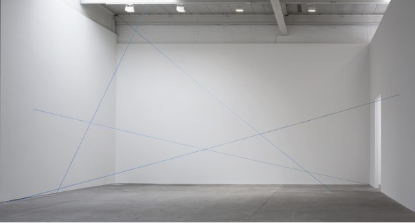
Untitled, 1972. Courtesy of David Zwirner.
After the overwhelming noise and bustle that is the New York art world during Armory week, the Fred Sandback exhibit Decades at Zwirner is initially a calming exercise in looking and letting the work slowly articulate its own position, describing and defining the gallery space with the thinnest of means. The historical patina is countered by the vibrancy of color in new yarn, the impossibility of artists today working in a similar vein is intruded on by the realities of physical space. The title of the show reflects a conceit of presenting a selection of work from 1968 to 20001, spanning each decade in which the artist worked. This creates a show akin to a small retrospective, presenting a progression through time that lays out the artist’s achievement, but also allows the work to compare to contemporary offerings.
In a most basic sense the work is historical, rooted in a minimalist reading of phenomenology that is not readily available to artists today.2 Any seismic shift in art practice usually leaves the first people on the scene as the protean figures that have to be responded to, but later duplication of their concerns is foolish. The art that evolved in around the modernist endpoint projected in the 60’s and 70’s has already been thoroughly explored; to rework that ground without a trace of irony would be to offer nothing new to an art world (and market) obsessed with novelty. In exploring a contemporary interpretation of Sandback’s work, the value lies in understanding how his practice is shifting in interpretation.
Untitled (Sculptural Study, Four-part Mikado Construction), ca. 1991/2011. Courtesy of David Zwirner.
Sandback’s polish of installation3 was based on an economy of means both spartan and flexible. While it is valid to point out that a blue chip installation is more likely to achieve these results, part of Sandback’s genius is the economy with which he started his project, and the attention to detail that was always there. Yarn elegantly tapers into a point where it disappears into floor, wall, or ceiling, but multiple strands in a single vector add weight so that instead of simple grouping of lines in space, a Sandback sculpture is constituted by an organization of incredibly extended objects, grouped or identified by color, and bounded by the same space the viewer inhabits. A key detail is the endpoints of his vectors: they disappear into wall, floor, or ceiling with an elegant taper4 and no hint of hardware or clue to how the trick is accomplished.5 His formal drawings with pastel give the same effect. The lines have a density of color that extends through the length of the form and then disappear almost into the paper the way yarn disappears into a wall. These drawings in the show (the group of 16 variations in black from 1974 and the single sheet with 2 chrome yellow lines from 1972) also do not give away their secrets anymore than the sculptures do, but more notational works (often on lined legal paper) elucidate the intention of the artist to prescribe a division of space or a relation in three dimensions.
Reading his articulation of space is different now than it must have been for previous viewers. Sandback’s work requires an empty space to function most effectively6 ; like the proverbial beam of light, any otherwise noticeable mass in the form of another painting or sculpture would distort the gravitational field of our attention and disturb Sandback’s carefully calibrated arrangements. Consider the corresponding distillation of the modern gallery space to white cube: the removal of ornament from the interior architecture provided a tabula rasa for viewing the work of art, but Sandback turns that lack of inflection and muting of detail on its ear by dissecting and exploring the resulting space. In a sense his sculpture is the entire gallery space, transformed by his simple addition of strands of yarn.
Many of the works in the exhibit are described as “Situational: spatial relationships established by the artist; overall dimensions vary with each installation.” In controlling and manipulating the entire gallery space, artists like Sandback7 laid the groundwork for more rigorous critique of the support structure of art and the art world. The first step was to remove the work from the gallery, or make the structure of the work indistinguishable from the structure of the gallery; it levels a strictly formal critique, that was soon followed by more detailed assessments of the underlying politics and economics. The first relational aesthetics were abstract.
The downside to envisioning one’s situations in a commercial gallery is that the details of the space one is transforming are likely housed in a much larger and hard to control city. While the installation of the individual pieces at Zwirner is fantastic, the attempt to shut out the outside world becomes apparent in the smallest details that slip through. Traces of the installation (dust where concrete floor has been drilled out), noise from a busy street just outside a garage door, or the infernal hum of a laser printer all sabotage the pure spatial relationships Sandback outlined. The Gallery’s website and installation photos trumpet the unexpected relationships and views, but the question is how would the artist intend these juxtapositions8 , and how are they manufactured within the space that he would turn into his sculpture? For all the precision and interest generated by the individual works, the various areas feel hollow, and the interactions contrived and stretched too thin.
The crux of the comparison is revealed in the recreation of work from Galerie Heiner Friedrich, Munich that has been faithfully abstracted9 within Zwirner. A sample of drawings chronicle Sandback’s engagement with the space, which last many years; it must have been comforting for an artist who relied on a specific architectural location to supply his work’s structure to have a home of sorts that he could work from. He tested projects and laid out variations, actively engaging with the proportions and relations of those rooms. The installation presumably gives an accurate reading of the actual, original work, a difficult trick for an artwork that was essentially site-specific. The ultimate failing is that the space is only a simulacrum of the original, and so much of Sandback’s work (and that of his peers) did respond to the actual spaces they worked with; while the effect is to present a work that would otherwise be lost, the compounding layers of abstraction neuters Sandback’s engagement. The spaces that are subject to Sandback’s division are as devoid of interaction as is an artist who has passed. It is a wonderful respite, but eventually one must walk out the door onto the loud and noisy street and get on with new engagements. The look back is worth it, though.
Fred Sandback: Decades is on view through April 21at David Zwirner, 519 West 19th Street, New York.
- Although the show just squeaks by on its own organizing principle, including single works from the end of the ‘60s and 2000 to cover the spread. While these works (‘Untitled (Vertical Two-part Corner Piece)’ and ‘Untitled’ (from 2000) relate to the Sandback’s broader oeuvre, they are a bit out of place given the otherwise cohesive nature of the drawings and spatial constructions with acrylic yarn. They appear to have been added later, and the show would be no poorer if a work that is literally stuck in a back corner were omitted at the cost of an easy framing device.
- Or more accurately artists who are developing materials and ideas of their practice toady; the artists who are finishing their careers now who pioneered this mode of work are obviously still entitled (if not expected) to work in that vein.
- Or in this case, the executors of his estate and the gallery’s installers.
- In the later works on view, Four Part Mikado Construction and the Twelve Part Vertical Construction. This unmistakably adds to their status as object, and reinforces the precision of the earlier single-strand works.
- Think about the delicate technical invention required for a moment. The Yarn must be stretched taut and held in place with no visible means; not even a smear of glue where the yarn disappears into a hole in the concrete floor. Any holes in the architecture are precisely placed and sized to unerringly accept only the stretch of yarn Sandback envisioned, and the yarn is always pristine from end to end. There is a subtlety of understanding one’s materials, even if they are otherwise fairly common, that is not often acknowledged.
- The genius of the Dia Beacon installation lies in its ability to isolate Sandback’s work from its neighbors while still linking it to the broader installation and making the entirety easily available.
- In this regard I would point to makers of earth-works like Smithson or Heizer, as well as conceptualists like LeWitt or Bochner, as artists who made work that would challenge the supposed interchanagability of the white cube, by focusing on the minute specificity of individual iterations.
- Again, look to the planning of the Dia installation.
- Lighting and ceiling height are simultaneously managed by an elegant stretch of scrim, but the floor remains industrial concrete (where I suspect the original had hardwood or perhaps even a rather sensible carpet) and there are no fixtures or other indication of a real, occupied space. It is the ghost of a shell.
Despite showing with well-respected blue chip galleries3, Jensen has remained restless and constantly searching within his painting practice, forgoing the comfort of signature subjects to focus on the process of making a painting. Where contemporaneous painters Brice Marden and Terry Winters4 emerged from the post-minimal era with a specific and identifiable interest in their respective thorough procedures (all founded on a deep respect for and understanding of the craft of painting), Jensen’s early work spoke a language built of forms excavated from the unconscious, and rife with totemic weight and symbolist reference. Scraping the canvas bare to start a singular investigation over (and over, and over) again, his references were the unfashionable Ryder and Hartley, Stout and Dove. This process, focused on finding a single path for each work has left him the respected Ethan to the adored Martin of his contemporaries. His work shuns any polish that would render them easier to live with, that would ingratiate him to wider public5. His work is easy to respect, but difficult to love.6
This respect is a result of Jensen spurning7 what the art world wants from painters. His surfaces have gone from thick, armor-like accumulations to raw, scraped traces highlighted with translucent color, but they are always unflattering and tough. His quest for a single image yields tendencies, not anything that could be described as a brand. Likewise he has not embraced the grand scale that signals high ambition (and high prices) within the art world. His works remain easel sized, and even at their largest, speak in a voice more intimate whisper than bombastic shout for attention. Quiet and unassuming, he is content to allow his pictures to stand for themselves, and as they always seem to be moving, the artist becomes hard to pin down.8

Bill Jensen, Luohan (Hungry Ghosts), 2011, Oil on linen, 32 x 28 inches. Courtesy of Cheim and Read.
Jensen’s continual pilgrimage has been rendered in miniature in his current exhibition. Greeted by a triptych (The Trinity) upon opening the door, this show already promises new directions and ideas from the artist. The presentation is a dramatic introduction, centered through the archway and with dark, atmospheric purples of the central panel flanked on either side by forms seemingly unearthed from monochrome white. Entering the space (you are after all, invited) the other works in the front gallery show the first steps towards the triptych. The remaining works are all small, and predominately pale, with forms and spaces not quite coalescing into anything more solid than the paint they are made of. The paint itself is not an insubstantial matter: through it, the artist discovers new forms. They are not strictly sketches, but as small, autonomous works, they reveal the first steps of an artist working his way out of the bright colors and references to Asian calligraphy that dominated his last show, bridging an Chinese sense of space with a Northern European light and treatment of paint.9
The Main gallery turns to predominately dark works, and the confident statements of a painter who has found a new way. The triptychs take on references to the form’s use in medieval and renaissance altarpieces, combining familiar references to Chinese painting with the swirling atmosphere of Goya’s late black paintings. They offer a stark juxtaposition: thin and vaporous purples, umbers, and ochres contrast with plaster pale whites and off-whites that fill a ragged form, perhaps a rock formation or clenched hand, emerging or turning out of field with minimal gestural inflection. Where these scholar’s rocks are divided by the edge of a stretcher, the form continues and echoes, but does not retain any density. The picture continues, but the viewer must account for the shift between modes of abstraction. This shift between panels is a common trope within the format, from Bacon’s classic triptychs to Marden’s joined panels. Jensen’s success lies in a strikingly different manipulation of material that avoids disrupting the continuation of the image, while working neither figuratively nor with a lack of internal referent.10 The single paintings magnify the scale of the dark triptych panels by amplifying the impact of the gesture within a smaller physical space. While these singular pieces don’t make a bold challenge to historical form as the multi-panelled works do, they point to a greater range and synthesis of experiment, emotion, and mood within a single picture.

Bill Jensen, Mandate of Heaven, 2010-11, Oil on linen, triptych, 56 1/2 x 123 1/2. Courtesy of Cheim and Read.
Stepping into the last gallery with a single painting on each wall is an exercise in playing catch-up, as Jensen has already set off on another search, looking for a new way. Black Sorrow (I) eases the transition, as distinct web-like traceries emerge from his scraping process, but the remaining three Book of Songs diptychs are an all together different animal. The forms are the same, but his paint is Tupernol thin and matte, and easily confused for smeared charcoal. The differently sized panels hang slightly apart, as rude forms reminiscent of Carroll Dunham are reduced to diagrams, mirroring each other from across the gap, their symmetries slightly contorting to match a unique perimeter. It is impossible to tell if the Black Sorrow (I) is a work in the same vein that was continued, or if Jensen saw the addition of a second panel as a divergent process yielding new results and thus deserving new consideration. These works are more reminiscent of drawings than finished paintings: where the mud and labor of dredging has always been important to his process, these works are notational and matter of fact. They return to line in a manner new to the artist, but are not open to interpretation or allusion. I suspect that it will be impossible to tell just which way Jensen will step next based on these works, if they are exercise, at an intermediate stage, a new beginning of false start.
Of Marden, Winters, and Jensen, all three have sought to find their way through a shared engagement with grids, traceries, and other manners of linear organization, though each artist is noted for working through different concerns. Winters moved inside his networks,11 focusing on the planes between vectors, applying his paint in a way less built than a matter of straight description.12 As Jerry Saltz noted, Marden has continued to refine himself out of his paintings, all the while producing handsome works. His bands and lines of color became more mechanical, yet carry a deeper charge of color, as if his early monochrome panels were stretched like taffy and looped around the canvas. His most recent show highlighted a sense of this return: flat, monochrome painted panels flank the edges of his web. Where Saltz asked if Marden might have another act left in him, it is ultimately a question that Jensen is beyond. Wherever his search takes him, Jensen’s practice is in constant motion. It is not a question of acts, but of steps along the journey.
Bill Jensen’s solo show ran at Cheim and Read, January 12 – February 18, 2012.
- Punctuated by the inevitable call of “is it dead yet?
- Punctuated by non-sequiters of actual bullet holes through steel panels.
- Showing with Mary Boone before he moved to Cheim and Read.
- who opened several shows across Matthew Marks spaces below 23rd street.
- And lead to mid-career retrospectives at major New York museums.
- Which is about the simplest definition of a “Painter’s painter” that I can think of.
- Obviously to a degree; one doesn’t wind up commanding a large ground floor space in Chelsea by being completely unmarketable.
- Branding is essentially the action of pinning a practice, person, or commodity down to a board, like any other butterfly. The collectors of the art world, like any other collector, certainly find pinned butterflies easier to manage than live ones.
- If one follows the order of works on the gallery website, the titles shift directly from Asian to European references, moving by way of Russia to the Netherlands.
- The brushstrokes themselves provide a minimal reference to space and scale, unlike a traditional monochrome (as in Marden). Frances Bacon has the canvas as window metaphor to fall back on, something he encouraged with elaborate framing. As this exhibition follows Joan Mitchell’s late works, herself a noted triptych-ist, there is a subtle difference in ambition. Mitchell would often simultaneously treat the seam as both continuation and starting point for a new mark, but the scale, pallet, and écriture remained unified. Jensen’s shift across the seam is much more dramatic.
- As he once appeared to move inside his seed-pods and flowers.
- In this sense his works have become more illustrative, his colors more decorative. Of the Variations being shown at Matthew Marks I find his notebooks and source material to be much more interesting than the paintings themselves, but I do not think the scale of these works as collage or drawing would satisfy his “brand.”

Byron Kim, Untitled (for J.B.), 2010, acrylic on canvas, 90 x 72 inches, via James Cohan Gallery
In his exhibition Night at James Cohan Gallery, Byron Kim presents 9 paintings of the night sky, transcribed from memory. Their treatment is at once both abstract and literal, taking an effusive memory and attempting to faithfully record it in acrylic on canvas. Such a project is necessarily quixotic, requiring a multitude of peculiar factors (time of night; conditions of atmosphere and pollution; and light) always being modified by the slippery workings of memory and dependent on the painter’s own process across a single canvas and its identically-sized relations that sit beside it in the studio. Even as architectural obstructions to his view (common to the view of anything in New York City) are represented, they are abstracted and flattened to bands that contrast the sky with no effort at spatial or representational illusionism. Even with subject and intent so clearly delineated Kim remains fundamentally an abstract painter, mining the space where flat color and solid pigment is the primary carrier of meaning.
The press release states that his “work sits at the threshold between abstraction and representation, between conceptualism and pure painting.” While not inaccurate, this situates the artist between such polar extremes that his work could fall almost anywhere. Indeed, almost every painter falls within these boundaries; at issue then is how to map Kim’s practice onto the landscape of abstract painting; what sort of conceptualist is Kim, and what sort of pure painter, and to what purpose is the demarcation?
The same text’s invocation of older abstract artists is telling. While the literalness of Agnes Martin and the dark pallet of Ad Reinhardt relate easily enough to the exhibition, only Mark Rothko remains as a link to the abstract sublime and a deeper engagement with the intimated content of the work. Yet these comparisons feel superficial. Rothko’s floating bands of color were the result of an artist making it out of himself, in a search to plumb abstraction for a deeper meaning. Kim does not engage the sublime directly; instead he approaches it via the most common and readily available agency: nature. The easy infinity of the night sky is there for all, and Kim functions as a journalist looking out for the minute changes we all might observe if we only looked up and paid attention. In his reports on nature and its subtle transformations his works instead relate more to abstract painters of a later generation, Ellsworth Kelly, (and by way of Sheldon Nodelman) Brice Marden and David Novros.
Novros’s flat painted elements, referencing objecthood, yet stubbornly remaining painting, frame the wall as Kim’s abstract bands of architecture frame the night sky. Marden has long been one of the most influential and acclaimed monochrome painters. Kim’s touchstone work Synecdoche partakes of Marden’s signature wax medium, and his views of the United Nations in paintings take the structure of a Marden monochrome and turn it into a slyly-representational puzzle. Here is where we find the afternoon conceptualist, slyly playing with the constituent parts of representation.

Byron Kim, Sunday Painting 9.12.04, 2003, acrylic and gouache on panel, 14 x 14 inches, via hosfelt gallery
Just as Kelly took fragments and slices of his everyday environment as the foundation for his early work (shadows falling on a flight of stairs, the visual alliteration of stripes and patches of fabric on a bathing tent, or the positive and negative shapes in a Paris museum window), Kim’s abstraction is rooted in everyday experiences and observations. If there is a conceptual approach to be found in Kim’s observations of his surroundings it lies in his treating the daily practice of painting as a kind of journalistic reporting on his search for the sublime. A similar tack can be found in his Sunday Paintings, where he has recorded the sky of Prospect Park week in and week out for ten years. Those works are more faithful records of the sky, painted (mostly) from life en plein air. Kim’s inscriptions of the date and personal notes from the time of their making give those works the sense of a diary or working notebook, and, by the inclusion of text on the surface, a more direct link to conceptual practice for their simultaneous challenge to the painting as window or the object implied by the monochrome.
By contrast, the large-scale works in the Night series are limited by the conceptual framework that is attached to them. Reporting and the personal suggestion of a diary has here given way to spin and complete control of the message; since Kim is a conceptual painter (by general understanding, rather than by the elucidation of the paintings) there is no space left for the actuality of these works and the simple process of making them. The paintings in Night have their meanings frozen by a need to make sure there is no misinterpreting the artist’s intentions. Surely the exhibition title and the paintings would have been enough, but the theme is hammered home with all the subtlety of media talking points. Kim’s most successful work remains fundamentally open ended, and open to ideas. When it is no longer enough for the artist to mine and explore the subtleties of the world around him, this openness is lost. The resulting paintings are hermetically sealed off from the wonder of the sublime, and, no matter how beautiful or moving they are, remain airless.
]]>