
Lior Shvil, once upon a time, 2010. via Flickr, photo: agent a loves agent j
In its tenth year, the Emerging Art Fellowship Exhibition at Socrates Sculpture Park is now on view until March 6th. The artists are self-defined as emerging; some are just out of school while others have more established New York careers. Each one receives a $5,000 grant, along with access to the outdoor studio for the entirety of the exhibition (“Facilitating, not fabrication” is the program’s mission, according to Executive Director Alyson Baker). The fellowship is unique in that it encourages interaction with the neighborhood residents and visitors, who inevitably ask questions of the artists as they’re working throughout the summer. The transparency of the process prevents an immaculately conceived final product, which is often a problem with public art.
There was particular variety this year, and many sculptures lend themselves to short abstracts: Jess Perlitz’s Everything Fought For is a viewing tower that overlooks the Manhattan skyline, pumping water from the East River directly onto itself; Lior Shvil’s once upon a time is the skeleton of a scaled-down drive-in theater, complete with PA system, flood lighting, and a chain link fence; Frank Haines’s Untitled, a gridded cube, balances on one corner, as if Tony Rosenthal’s Alamo had a run-in with Sol LeWitt; Jonathan Duram Crash and Burrow is fabricated to look like a small plane crash, and it was – until a few weeks ago – the home to some pet rabbits; Dan Steinhilber’s Cast Angels, of various dimensions, made from cement, and scattered across a lawn, looks like the abandoned paper-mâché project of a giant but also, oddly, like melting patches of snow.

Trenton Duerksen, Armchair Palimpsest, 2010. Via the Artist
The sculptures, which will all endure the elements in upcoming months, were constructed with environmental factors in mind. The park itself was an abandoned riverside landfill and illegal dumpsite until 1986, when a collection of artists and community members, lead by Mark di Suvero, transformed it into an open studio and exhibition space. The soil the park is built on is not exactly loose. Old debris – concrete slabs, large rocks, unidentifiable detritus – often impedes deep, structural foundations.
But like the inevitable snowfall (as well as the recent tornado), the less-than-uniform ground presents the artists with a problem to solve. Jory Rabinovitz, one of the artists in the show, seems to have reckoned with – and accepted – the working conditions. Optimistically, he says, these were all “restrictions that led to clarification.” His own piece, Sponge Piece for Socrates, a 32-foot tall metal dowel, “shish kabobed” with rainbow sponges, sways in even the lightest breeze. From a distance, the matte sponges look like colored concrete, but up close their webbiness is more reminiscent of the sugar crystals Japanese kids grow from kits. There’s something perverse about such a playful piece always threatening to impale somebody.
Close by, Trenton Duerksen’s Armchair Palimpsest squats like a sturdy lighthouse. A tapered, white base frames four walls of blackboard (chalk included); atop this is a wooden block on which an abstract, cartoonish form emerges into the sky, like the cross section of a La-Z-Boy arm, complete with lever. Buoyed on it all is a huge, white beach ball that, due to light reflecting off a nearby condominium complex, appears lavender against the pale sky. It bobs around like the head of a doll with a broken neck. It’s as though Duerksen has pillaged Pee Wee’s Playhouse and translated the furniture for the purposes of high design. “It’s a really elaborate pedestal is all it is,” he says, with goofy self-deprecation. Whatever it is, I want it.
Daniele Frazier’s Argyle, a four-diamond totem, seems constructed with equal parts whimsy and art-historical awareness. The alternating frontal panels, in Lily Pulitzer pink and green, contrast against the sides, which are painted in the rusty tone of steel primer. The juxtaposition of colors reiterates the structural dissonance of the work itself; it’s quite impish of Frazier to build a monumental sculpture of a decorative motif, especially in Mark di Suvero’s park. Di Suvero is an artist, who, like Barnett Newman and Constanin Brancusi, is almost definitively non-decorative, working frequently in monochrome. The piece is attractive enough, though, that it doesn’t require such unpacking; most people seem happy just to stare. “Oh, I have socks like that” has been the response of many a local dog walker.

Daniele Frazier, Argyle, 2010. Via the artist.
Nearby, Gavin Anderson’s Coastal Hermitage, a cabin he built upstate from trees milled to match the contour of the hill it’s situated on, is shingled with hundreds of shoe insoles and scraps of plastic cut from bottles of laundry detergent. Rumor has it he’s now in possession of a vat full of mixed liquid soap, collected from all those extra half-inches that linger at the bottom. The cabin itself, because of its non-squared structure, appears like a cozy Eames Room – Laura Ingalls Wilder on acid. Apparently, Anderson plans to motorize the cabin and drive it back upstate when the show comes down next spring.
In a curatorial decision made to anchor the show as a whole, the other, more classically architectural piece stands at the opposite end of the park. As Alyson Baker explained, laughing, this was done to avoid a sort of clustering that might appear “more like a shanty town than a sculpture park.” Scott Anderson, a bartender at Fort Defiance in Red Hook, as well as a sculptor, drew up plans to construct a bar for which he would get a temporary liquor license and serve alcohol. In early July, however, a serious biking accident led to a shattered pelvis and vertebrae. He’s been convalescing (miraculously well, we hear!) since then. His parents flew in from Seattle and built the bar themselves, integrating seamlessly into the community of young artists.
Since the EAF is non-thematic, unlike Socrates’ springtime exhibitions, there’s a charming chaos to the exhibition as whole. Particularly colorful this year, the park looks, from a distance, like a spontaneous outsider art project or like an amalgam of vernacular architecture. Regardless, it’s the best view of the Manhattan skyline you’re going to get. Go before the weather turns, and pack a roast pork sandwich from Steve Chu’s.
]]>
Eric Doeringer, A Painting That Is Its Own Documentation, 2010 via
For people who write about art, nothing is more demoralizing or laughable than a bad press release. And almost all press releases are bad. Not just bad in the normal ways that art criticism can be bad: the meaningless abstractions spouted by people who haven’t been forced to reread the critical texts they reference since graduation a decade ago; the reliance on an anemic visual vocabulary; the lack of humor. No. Press releases also actually contain real errors: errors of content and syntax and diction. I draw my breath the moment I read the words “For Immediate Release.” Oh shit. What now? What this time? What have they irrevocably said?
Reviewing a show goes like this: you walk in, you take a look around, you ask the gallery assistant for a press kit, you take another look around, you read the press kit, you take another quick look around, you go home, you reread the press kit, if necessary, you return, often multiple times, and then you write up the experience. For better or worse, the original text bears a trace in all subsequently written texts. I really can’t figure out why galleries don’t just pay qualified writers $150 to draft up their releases; a small sum would go a long way in preventing the dissemination of the illiteracy that counts for press, and furthermore, it would prevent the inevitably erroneous and awkwardly-phrased reviews spawned by the first press release, written by god knows who.

Angie Waller, Beauty for Ashes, 2010 via
This is all to say that I appreciated the Volunteer Lawyers for the Arts & Law Residency exhibition that’s currently up at Maccarone. Finally! A show of art with words that matter! According to the organization’s own literature, the Volunteer Lawyers for the Arts & Law Residency “provides an intellectual and artistic setting for participants to engage in ongoing discussions and debates that examine the overlap and disconnect between artistic production and the law from historical, social, ethical and philosophical standpoints.” This year’s twelve participants (seven artists and five writers) examine various points of intersection between artistic production and the law. The show’s press release (it’s actually readable and informative; that’s why I’m bothering to quote from it) explains that the “artists included in the Exhibition move beyond the representational aspects of law to explore and confront matters of intellectual and real property, contracts, freedom of speech, and moral rights of the artist.”
Though described as a collaboration between the non-profit and the gallery, Maccarone’s influence seems limited to their generous space donation more than anything else. None of the work in the show is by Maccarone artists, and for the two weeks the show is up, a receptionist from the Volunteer Lawyers for the Arts & Law replaces the normal gallery assistant. There’s a cognitive dissonance at play that comes from walking into a gallery known mostly for its young and reckless artists (Where are the smashed cars? The vials of cocaine? The reproduced pop artifacts?) and being confronted with the work of people who read and write for a living. You can tell the difference.
Eric Doeringer, who in the past has sold bootleg copies of contemporary art, printed fake Art Basel VIP cards, created a tongue-in-cheek “fan site” dedicated to Matthew Barney, embroidered the “Polo” logo by hand onto generic shirts, and recreated several books by conceptual artists, here perfectly recreates a John Baldessari wall drawing. It’s hung across from a series of canvases by Brooklyn-based artist and editor Charles Gute. These depict the grammatical errors in works by Robert Barry, Douglas Huebler, Yoko Ono, and Sol Lewitt. Gute uses standard proofreading marks – in red ink, no less – to correct instructions written by conceptual artists, instructions meant to be hyper-specific so as to be accurate enough that the pieces they describe are endlessly and hand-lessly recreate-able. My favorite edit: “Ambiguous pronoun referent – please be more specific.”
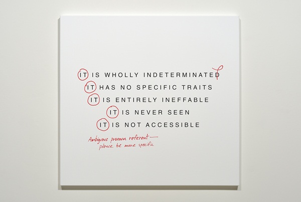
Charles Gute, Correcting Barry, 2009 via
Other works are more literally litigious and political in their content, like Angie Waller’s project that follows multiple legal cases pertaining to copyright and the Visual Arts Rights Act of 1990 (VARA). Bettina Johae, who has a background in architecture, takes up the issue of eminent domain with a red and white inkjet map of Manhattan (The Upper East Side – a stretch of clear white – appears to be the only neighborhood without seized plots). This is accompanied by a series of postcards from forgotten areas of Greater New York particularly subject to the law. A mural-scale wall painting, customized street vending cart, and a canvas portraying superimposed rabbits from the media and advertising add jolts of pictorial energy to an otherwise text-heavy, black-and-white collection of work.
Most wordiness in contemporary art is infuriating and falls into a category I’ve long-called “fake architecture math,” a twee trope that seems to be contagious within certain circles (Roni Horn, Matthew Barney). These are those faux calculations, often tiny and in graphite, that cast a cerebral air to an otherwise not-at-all-intellectual piece. Professorial numbers at the bottom of a landscape, compass markings in the margin of a photographic negative; the scribbles are banal but tasteful, like insisting upon writing grocery lists in graph paper Moleskins. There’s none of that here though. In this show, words count for something.
]]>
Jean-Michel Basquiat: The Radiant Child, titled after Rene Ricard’s seminal 1984 Artforum article, is a departure for Tamra Davis, director of such blockbusters as Billy Madison, Half Baked, and Crossroads. But Child is not the aberration it might seem; Davis has also shot music videos for The Beastie Boys (Mike D is her husband), The Lemonheads, N.W.A., Depeche Mode, and Sonic Youth. And Davis’s close, personal friendship with Basquiat affords her access to the central characters in the artist’s life, as well as lending a pervasive sense of intimacy to her film, which elaborates on – but always returns to – a rare interview she shot with him in 1986.
In a Q&A with the A.V. Club, Davis categorizes her interview subjects as being amongst a “list of people [she] felt Jean-Michel would have wanted me to speak with.” And it’s true that she has gathered some of the most significant personas of New York’s “Downtown 500,” – the 1980s cultural storm localized in SoHo but centered around Basquiat himself – to offer their thoughts. Many of those interviewed seem eager to both aggrandize a long-gone New York and to conflate it with a certain brand of obsolete celebrity. In the words of Fab Five Freddy: “Who wants to be famous now? That shit is whack.”
Surely though, a seemingly expansive but in fact incestuous group of cultural tastemakers exists in every era, despite what everyone says about the “good old days.” The Radiant Child, released exactly one year after Dash Snow’s overdose, reminds us – as if we really needed reminding – that an untenable lifestyle is often prerequisite for creative and moneyed infamy. That said, celebrity and talent are not necessary corollaries, obviously, and one should be reluctant to compare the careers of Snow and Basquiat. Their milieus – and deaths – might have been analogous, but they are not in the same league.
And this might be the primary, though perhaps unintentional, success of the film – the extent to which Davis is able to capture Basquiat’s genius. She claims to have wanted “to make a film that wasn’t just a biography,” but one that “when you watched it, you actually felt that you watched a movie, that you had an emotional reaction.” The Radiant Child undoubtedly draws an emotional reaction. But counter-intuitively, our sympathies are not garnered from the central interview, which, it should be said, is actually quite dull, but rather from the way in which the actual art is filmed. The work just looks so good. Davis indulges the paintings themselves, granting close-up detail shots and allowing them bleed to the edge of screen. The primacy of the art is somewhat surprising here, especially coming from such an uncritical, adoring, and personally invested filmmaker, and one with such an undeniably pleasing subject.
It’s unclear whether the archival footage has been edited so as to exaggerate Basquiat’s charisma or whether Basquiat’s charisma is just potent enough to redeem even most throwaway of reels. Regardless, you half-expect his charms to subsume his talent. To locate Basquiat’s genius in that paradox of personality would be a misstep though, and one that he would hate. In 1981, when Annina Nosei offered him a room underneath her SoHo gallery to use as a workspace, Basquiat’s career transitioned from street to studio. He takes deep offense, however, to an interviewer who jokingly refers to him as an artist “locked in a basement.” Basquiat, without a moment’s hesitation, responds that if he were white, he would be called an “artist in residence.”
Raised in Brooklyn by immigrant parents – his mother was Puerto Rican and his father was Haitian – Basquiat grew up trilingual and comfortably middleclass. Well-versed in art history, he resented the dismissals of his work as “child-like” and “primal.” “Primal?” he asks, “Like a primate? Like an ape?” He considered his critics, the ones who tended to review his personality rather than his work, to be “mostly just racists.” Though sympathetic and to a degree irrefutable, it’s a fraught paranoia. It’s tempting for critics to conflate Basquiat’s work with his personal appeal and similarly tempting for Basquiat himself to read prejudice into that conflation, but this could just as easily be an occupational hazard of having a magnetic personality.
The film’s interviewees make up an all-star cast: Julian Schnabel, Larry Gagosian, Bruno Bischofberger, Tony Shafrazi, Fab 5 Freddy, Jeffrey Deitch, Glenn O’Brien, Maripol, Kai Eric, Nicholas Taylor, Fred Hoffmann, Michael Holman, Diego Cortez, Annina Nosei, Suzanne Mallouk, Rene Ricard, and Kenny Scharf. These luminaries all seem to cast Jean-Michel Basquiat as that archetypical genius, too sensitive and too passionate for life, a victim of his own exhaustion. Even the spectrum of his dining is extreme: he goes from scavenging for scraps on the street to dinners at Mr. Chow’s in one year. One senses that Basquiat’ death, callous as it sounds, came as a sort of deus ex machina, saving him from inevitable bastardization and complete fatigue. As friend and mentor Julian Schnabel eulogizes, “He just didn’t have the tools to navigate the sea of shit.”
It takes a certain amount of abandon to acknowledge genius, but Basquiat’s is undeniable. Self-mythologizing is intentional by definition, but Basquiat is able to strive without betraying his originality, able to network without compromising his autonomy. He cuts a cult figure. It’s an impressive feat to seek, and then claim, the friendship and admiration of Andy Warhol, giving the impression, all the while, of total guilelessness. We see Basquiat chewing gum, lounging in a Wesleyan University t-shirt, playing with puppies, and dancing around to his favorite bebop music. But we also see him chugging bottles of Evian from Dean and Deluca, stuffing wads of cash between the pages of William S. Burroughs books, walking the runway at a Comme des Garcons show, and painting in Armani suits. The innocence and bravura don’t seem at odds though. This accomplishment would almost be enough in itself, but when paired with his body of work, Basquiat appears creatively infallible. The Radiant Child is tediously chronological at times, feeling oddly long for an 88-minute film. But despite this, and even against the backdrop of such seductiveness, Basquiat’s talent comes off as indisputable and inevitable, exposed by a lifestyle, but not determined by it. Davis has turned at least one skeptic into a believer.
]]>
Charlotte Posenenske. Series D. 1967, via MoMA
It’s been almost a year now since Artists Space remodeled and reopened. Inspired by European kunsthalles, the gallery’s new, open floorplan offers a pure viewing experience rare enough in the city and absolutely obsolete in SoHo. Artists Space is the best place in New York to view sculpture, if not art in general, a superlative only qualified because of the gallery’s lack of walls. This isn’t a place for painting. The expanse is vast, the ceilings are high, the windows are wide. There’s no differentiation between the administrative offices and the gallery itself. It’s been ten months and the novelty still hasn’t worn off; it’s still breathtaking each time I see it.
For this reason, Artists Space couldn’t be a more (im)perfect place for the Charlotte Posenenske show, which opened on June 23rd and is up until August 15th. Posenenske, born in Germany in 1930, is usually described as a minimalist, and though formally correct, this classification seems to obscure her larger, social concerns. The series on display here, Series D Vierkantrohre [Square Tubes], executed in 1967 of galvanized steel, is the last she made before abandoning contemporary art to pursue a career in sociology.
Individually, the pieces are a plain and dull – intentionally so. But cumulatively, they are modular and imposing and futuristic. A series of publications, included in the exhibition in a glass display case, show photographs of the work in various spaces: in a beer garden, in an airplane factory, in a bank lobby. Posenenske intended the sculptures for non-art contexts, and, against the platonic perfection of Artists Space, its easy to see why. Hence the gallery bringing in three other artists throughout the summer (Ei Arakawa, Rirkrit Tiravaija, and a yet-to-be-announced third) to make the modifications demanded by Posenenske’s work and writing.
In her manifesto, published in Art International in May of 1968, Posenenske explains the straightforwardness of Series D Vierkantrohre [Square Tubes]:
“They approximate architectural dimensions and for this reason also differ increasingly from the former gallery objects. They are decreasingly recognizable as ‘artworks.’ The objects should have the objective character of industrial products. They are not intended to represent anything other than what they are.”
Seemingly readymade, these “square tubes,” were designed to Posenenske’s specifications and sold only for the cost of fabrication. By avoiding a gallery presentation and dispersing her unlimited, unsigned work for cost, Posenseske simultaneously refused and exaggerated her authority as an artist. Despite the simplicity of her forms, Posenenske’s career offers no precedent for the mass-produced, hyper-salable art of the past two-odd decades. Though her work is not at all dated, few vestiges of her artistic democracy persist today.
Posenenske is the opposite of many minimalist artists, like Sol Lewitt, whose work, though reproducible, is unique and prescribed. Perhaps Posenenske’s most notable antonym is Rita McBride, who adds value to ventilation ducts she fabricates out of copper and brass. The two seem similar steps in opposite directions: the artist who establishes an artificial price point and the artist who declares an industrial item art but refuses the increase in value that determination provides. Is artistic prerogative derived from recognition or action? From the idea or from its realization? Posenenske addresses these questions in the economics of her craft
Again, in her 1968 manifesto, Posenenske explains Series D Vierkantrohre [Square Tubes] as being
“components of a space, since they are like building elements, they can always be rearranged into new combinations or positions, thus, they alter the space. I leave this alteration to the consumer who thereby again and anew participates in the creation…”
To understand her causal logic (“…they can always be rearranged into new combinations or positions, thus, they alter the space…”) once must think radically and creatively about what these “new combinations and positions” might include. The permutations are infinite and potentially transgressive. This isn’t subtle rearranging she’s referring to, but rather the possibly to stacking the ducts in the window or piling them atop each other and locking the door. Series D Vierkantrohre [Square Tubes] is not so much about space itself, but about how the space responds to the work once it’s installed. Artists Space, sleek and with a multimillion-dollar-view, is implicated by the pieces, but isn’t revealed by them. And maybe that was Posenenske’s entire aim in avoiding galleries – to escape the responsibility of interpreting a setting divorced from lived experience. Posenenske’s real success lies in her ability to expose, problematize, and elucidate whatever space her work occupies. She called her consumers “activists.” But it’s hard to be an activist on Greene Street today, and that’s why Artists Space, strangely, and especially now, is such a perfect setting for this posthumous show.
]]>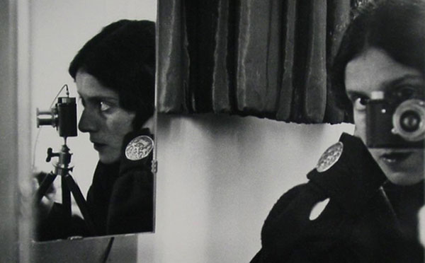
Ilse Bing. Self-Portrait in Mirrors. 1931. via MoMA
In the January 1971 issue of ArtNews, Linda Nochlin published her now-canonical essay Why Have There Been No Great Women Artists? She must not have been talking about photography. At MoMA’s Pictures by Women: A History of Modern Photography it is clear that not only are there numerous great female photographers; they might be the form’s best practitioners. The show is like a party with an immaculately edited guest list. You look at the exhibition checklist the next day and realize there weren’t many, if any, disappointments. Who was in attendance? In no particular order: Dorothea Lange, VALIE EXPORT, Barbara Kruger, Roni Horn, Sally Mann, Hilla Becher, Cindy Sherman, Diane Arbus, Martha Rosler, Kiki Smith, Laurie Simmons. And those are just off the top of my head, never mind the many compelling works by artists I hadn’t heard of.
You can be certain that the male-only version of this party would be a no-go; a similar show for men only is unthinkable. (Or at least one so identified; there have been many male-only photography shows.) This might seem as though it should raise questions about the efficacy of Pictures by Women, but it doesn’t. The curators – Roxana Marcoti, Sarah Meister, and Eva Respini – were wise in their organization of the exhibition. Unlike Global Feminisms, the 2007 exhibition at the Brooklyn Museum, Pictures by Women follows an agenda more historical than it is political. Going room by room or piece by piece, one doesn’t miss the lack of a pointed, loaded critique.
Pictures by Women chronicles the medium’s 170-year history with 200 works by 120 woman artists, culled from the museum’s permanent collection. If you navigate the six galleries correctly (I didn’t the first time), you’ll be following a chronological path from 1850-1995, from Anna Atkins’s delicate cyanotype to Carrie Mae Weems’s color prints superimposed with sandblasted text. The years in between, since the viewer’s progress is both spatial and temporal, abound with repeating motifs. The majority of the work could be described as portraiture, and more specifically still, portraiture of other women. It’s tempting to suspect prescription on the part of the curators. When afforded such an opportunity – to promote womens’ art – why wouldn’t you want to keep perspective and content twinned? And there could be worse conceits, certainly, than offering a tacit relation between portraiture and gender identity. But the curators take their responsibility towards history seriously, and one leaves the final gallery with the sense that the proportion of portraiture of women by women is not at all too thetic, but rather an objective sampling of what women really have been producing for the past 170 years.
Cindy Sherman. Untitled #92. 1981. via MoMA
The first gallery is devoted to 19th and early 20th century work and showcases miscellaneous photographic exercises: cyanotypes; platinum, gelatin, and gum prints. The novelty of the medium is still very much apparent here. Dedicated to the rise of modernism in photography, the second gallery includes mostly work by European women from the 1920s and 1930s. Emerging in the third gallery are our heroines of empathetic journalism: Dorothea Lange, with her iconic imagery of the Great Depression and Helen Levitt, with her dramatic scenes of New York City street life.
Often the inevitable inclusion of superstar artists, like Kiki Smith and Cindy Sherman, is token, their chosen work forgettable and merely obligatory. And while this is sometimes the case here, there are surprises – Diane Arbus, for example, whose eight gelatin prints, all hung in a row, serve almost as an advertisement for the entire exhibition. Gone are the Coney Island misshapes and Lower East Side despondents. Rather, we get case studies of women, and though characteristically down and out, their female-ness remains primary: a nudist waitress, a widow, a lady bartender, a woman in a bird mask, a girl in a circus costume. They seem to synthesize their antecedents: at once technically brilliant and intimately documentary.
Helen Levitt. New York. 1981. via MoMA
Other household names, such as Hilla Becher, Leni Riefenstahl, Nan Goldin, and Laurie Simmons, are given wallspace for their uber-representative work: industrial facades; muscled athletes; couples kissing in sickly light; and a belegged dollhouse, respectively. Roni Horn’s annotated, off-set lithographs came as a welcome reprieve from the memory of her lackluster retrospective at the Whitney earlier this year. One of the few exceptions to the general theme of portraiture, Horn’s close-ups of the Thames River are luscious; she conveys the materiality of liquid so successfully that it appears substantive and almost viscous. Taken in 1999, they’ve taken on a new timeliness in light of the tragic events in the gulf.
I returned, twice, to the exhibition’s entrance gallery to reexamine some the first photographs you’re meant to see: 8 of 156 platinum prints by Frances Benjamin Johnson. Originally commissioned in 1899 by the Hampton Institute, the prints were featured in an exhibition about African-American life at the Paris Exposition of 1900. The perspective lends a confusing sense of scale, and the meticulously arranged scenes look like miniature diorama setups. They satisfy that juvenile craving for detailed cross-sections, for modes of life illustrated and for privacy exposed. Here we get a “Class in American History,” in which diligent students study a “real life” Indian in headdress and “Gymnastics at Whittier,” in which children perform calisthenics – the boys in pressed suits and the girls in frilly, white aprons. We see children studying plants and seasons and learning about the history of Thanksgiving.
Johnson’s series, along with Arbus’s prints are the exhibition’s highlights. Both make a case for anachronistic photojournalism, for striking that essential balance between intimate imposition and disinterested remove. The work of Johnson and Arbus serve as mouthpieces for the rest, as questions of identity politics are subsumed into the larger account of history. Though each individual work speaks for itself, one’s experience of Pictures by Women is by definition cumulative, and the story it tells is a narrative one.
]]>
Shepard Fairey, May Day, Installation view, Photo: Adam Reich via Deitch
It’s difficult to keep an open mind when approaching the work of Shep Fairey, née Shepard Fairey. I know he’s responsible for those Andre the Giant Has a Posse stickers and for OBEY; he did the Obama poster and he was sued for cropping a copyrighted photograph. Other than that though, his work seems like little more than Urban Outfitters ready-made dorm decoration. And as with the store, Fairey’s success has followed a similar course of (un)cool. Like many other Deitch artists (Barry McGee, Jo Jackson, Futura, Larry Clark, etc.) Fairey comes out of the skate punk community whose juvenilia is one thing when relegated to the street, but it’s quite another when moved indoors, what with the referent for its alleged grittiness long since forgotten.
I’m never one to spite bands or artists for “selling out.” Usually, if something disseminates to a mainsteam audience, it’s actually just really good. Put Shep Fairey in a gallery, however, and he transforms from an underground graf artist made good into a mediocre graphic designer who scored the final Deitch show. Fairey’s “look,” though certainly sleeker now, has remained consistent over the past two decades, so my queasiness isn’t rooted in his pandering, but rather in the sheer fatigue of his imagery. He might be the prime example of the latent commercial potential in skate punk culture. But at this point, especially within Jeffrey Deitch’s walls, the associations with “youth revolution” and “cultural resistance” are distant, if they still exist at all.
Like Warhol before him, Fairey is obsessed with silkscreen and celebrity, but his colors – black, white, and red – are muddy, and the portraits seem vacant. Art Observed noted that the “stark use of colors and graphic style in combination with areas that mimic the layering of posters that occurs on real billboards, exploits the stylistic approach of advertising, but as an ad for an absent product.” This would only be true if this absent product somehow signified the very product-ness of Fairey’s own work; it doesn’t quite. Fairey’s street art might have functioned as advertisement without product, but in a gallery context the portraits are products themselves, merely tautological ads. This is maybe why it’s so perfect, but also so frustrating, to see the work in SoHo, a neighborhood now devoted to nothing but commerce. Warhol’s success as a commercial illustrator preceded his art world fame; his rendering of people as products was the result of a logical trajectory, whereas Shepard’s background works in the opposite direction; his work was already a product, it just wasn’t for sale.

Shepard Fairey, May Day, Installation view. Photo: Adam Reich via Deitch
Titled in reference to the exhibition’s opening, May Day consists of hundreds of portraits of people who, according to the press release, advocate for the working class. But many of the figures – Basquiat, Debbie Harry, Robert Rauschenberg – make no sense at all in this context. The conceit seems dishonest. With the exception some Zapatistas, Woody Gutherie and (maybe, maybe) Cornel West, the subjects are more famous than they are radical.
It seems like wasted vitriol to even bother getting upset about the show; Deitch Projects is indisputably commercial. But this is one of those phenomena that you witness and cannot believe you’re really seeing the whole picture. Say what you want about Jeffrey Deitch, but he’s got to be smarter than this, right? The fact that Fairey is responsible for the single image of the single biggest “progressive” victory of the past thirty years seems like a fluke. Perhaps propaganda is the limit of Fairey’s usefulness; mostly he seems like just a dude who avoids the whole question of art and art criticism. His success in spite of this disinterest could be massively compelling if the work was just not so bad. My problem must just be an aesthetic one. I want there to be a successful artist who skirts if not the art market then the art world. I just wish it were someone else.
When I’m bored by art, I usually turn to its viewers for some metonymical perspective. And here it’s difficult to walk through a bustling, sunny SoHo to the moribund Deitch Projects and view Fairey’s portraits as celebrations of progressive heroes. There were more wealthy Europeans in the gallery than in any equally-sized swath of SoHo, an impressive feat. A young man in a powder blue polo shirt (collar popped), whiskered jeans, and blindingly white sneakers paced through the gallery, Chanel shopping bag hanging from his tanned forearm. How much for these? he asks the gallery assistant, pointing the small portraits hanging behind the front desk. “Oh, those are $2,000, but they’re all sold out. They sold out right away.” He sighs and walks out, maybe to be told the same thing about a limited edition Louis Vuitton down the street.
]]>-Fan")
Charlie Harlan, Fan, via Charlie Horse Gallery
When thinking about contemporary art and its almost unanimous interest in commercial and domestic objects, it takes restraint not to rely on William Carlos Williams’s now-tired phrase “No ideas but in things.” But the work in Basin, the current exhibition at Charlie Horse Gallery in South Williamsburg and the first solo show for Brooklyn-based artist Charles Harlan, is obsessed — appropriately, somehow — with the transcendental properties of things. Like Emanuel Swedenborg, the 18th century Swedish scientist and Christian mystic who believed that natural objects symbolized higher realities, Harlan imbues commercial and industrial products with a sort of vague spirituality. Explaining his practice , he says: “I try to capture the moments in which I identify with objects outside of myself.”
With this week’s release of the Apple iPad, one more totem of taste and self-worth – the book – has been demoted, most likely for good. But unlike the dog-eared tomes we used to carry around, annotate, and quote from, Harlan’s objects are abandoned. They were never meant as markers of identity, chosen instead for their forlorn status as tokens of “nothing personal.” By listening for patterns and signals from the everyday panoramas of awnings, ceiling fans, and neon signage, Harlan draws correspondences between non-art objects and art-art reactions.

Charlie Harlan, Hangers, via Charlie Horse Gallery
The show’s title, ‘Basin,’ comes from the name of one of many dumpster companies that service municipal New York. Dumpsters – ubiquitous but unseen – are, for whatever reason, marked by enigmatic inscriptions: “Liberty Ashes,” “Avid,” “Stallion,” “Viking,” “Imperial,” “Tiffany,” “King’s,” “Royal,” “Crown,” “Castle,” “Amanda,” “Rose,” “Atlas,” “Hercules.” The romance and heraldry of these brand names is of the sort of irony best left to Joan Didion. To read these alien messages – tragic, and oh-so American – is to be confronted by signals both familiar and foreign. A Basin dumpster marks the gallery’s entrance, a detail that had to be pointed out to me, which, perhaps, is the point.
Despite the aircraft gray interior of the gallery, light and windows play a central role in communicating to those outside. Above the dumpster, a row of four windows are illuminated with the milky glow of neon hangers, one-to-one copies of plastic hangers, fabricated in Chinatown. Neither art nor advertisement – or perhaps both – neon, invented in the 1920s during the emergence of the middle class, was first associated with shopping and commerce and only later appropriated as an art material. Harlan seems more interested in neon’s anachronistic connotations than in its contemporary ones.
The work is mostly kept to the peripheral of the gallery space, with a set of Venetian blinds hanging on a windowless wall and an awning, inverted and propped, luminescing a steely radiance, like the hatch of a spaceship. Central though, in the middle of the room, a lit Harbor Breeze ceiling fan whirls like a centrifuge. At the show’s opening at least, viewers seemed to collect around it unconsciously, as though it were a hearth. In the wrong state of mind, these products, only slightly altered– perhaps they could be altered more? – might depress or seem like paeans to a neglected world. But there’s warmth here nevertheless, and because of this fan playing campfire, the drabness dissipates.
]]>
The Art of the Steal via IFC
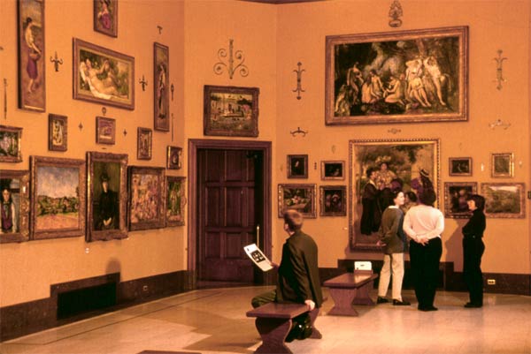
The recent art world controversies – the Sotheby’s/Christie’s price fixing; the Getty’s antiquity smuggling; Skin Fruit, the Jeff Koons/Dakis Joannou show at the New Museum; Jeffrey Deitch’s appointment as the Director of MOCA – all provoke vitriol over the same basic questions: How democratically should art be presented? What are the appropriate credentials for cultural gatekeepers? What should be delegated to museums and what to private institutions, and how? These dilemmas organize Don Argott’s documentary, The Art of the Steal, about the much-lauded Barnes Foundation, a jewelry box of masterpieces, Impressionist, Post-Impressionist and African alike. Housed in Merion, Pennsylvania, a tony suburb of Philadelphia, the Barnes Foundation was endorsed by Matisse as the only worthwhile place to view art in America. Situated in a sprawling garden, the Foundation is protected from not only metropolitan crowds, but even the peering curiosity of next-door neighbors. Conceived by Albert C. Barnes and founded in 1922 as a sort of utopia, in which cultural gems from across time and continent could be hung on equal planes, it is insulated from government bureaucracy and agenda. Mr. Barnes stipulated in his will that the Foundation remain a free-standing, educational institution, that his collection never be loaned, sold, moved, or rearranged.
But, as always, the literal etymology of “utopia” trumps the term’s concept, and the Barnes Foundation, after the death of its founder, indeed proves to be a “no place,” its future in the hands of exactly those Philadelphia elite who, despite his self-made fortune, Barnes never identified with. Mr. Barnes’s personal biography – born poor, boxed to pay for his UPenn tuition, made his millions with a patent for a venereal disease medication – surely informed his New Deal liberal politics. He amassed his collection over decades, often purchasing work by artists early in their careers before museums would be even remotely interested. Thus, the Foundation holds the world’s premier collection of Picasso, Cezanne, Renoir, Matisse, Degas, Monet, Van Gogh, and Manet, with an estimated worth of somewhere between twenty and forty billion dollars. But the Barnes Foundation’s value is undeniably greater than the sum of its parts, “priceless,” according to everyone interviewed for the film, “ a handmade thing in a machine world.”
Much of The Art of the Steal documents the legal proceeding concerning the fate of the Foundation, with former teachers and students representing a grassroots-like determination to prevent the local government of Philadelphia from moving the collection to the city proper, where it the number of visitors could be drastically increased. The relocation, it goes without saying, would bring in tourist revenue to Philadelphia, a city known more for its stodgy historicism than for its cultural significance. Relocating the Barnes Foundation from Merion, according to the film’s ethos, would not only corrupt the original intent of Mr. Barnes, but also transform Philadelphia into a Disneyland of art. One wonders if the same objections would be made if the Foundation were located outside of New York City, in Westchester, say, and that Manhattan, a cultural city, was the target of the relocation.
The Barnes Foundation via entrepreneur
Along with the dubious art direction (chapter titles in a steampunk font on torn scraps of paper; strangely literal b-roll footage) so common to documentaries, the film suffers from an excess of exposition, though this is perhaps necessary in tracing the complicated and odious iterations of bureaucracy and red tape. There are many tedious, family tree-style illustrations of who has control of what at what time and a disproportionate quantity of literal paperwork footage – sentences illuminated, words underlined, paragraphs highlighted. The film’s contemporary narratives are numerous and diverse: civil rights suits, legal hearings, corporations changing their status to “non-profit” and vice versa. The film makes clear that art, always a complex manifestation of economic value, allows a noble conceit for people whose real interest is in power and politics. Art is an opportunity for pretending that its’ not just all about the money which, 99% of the time, it is.
The Art of the Steal, it is disclosed in the credits, is financed by Lenny Feinberg, who as a former student of the Barnes Foundation, has personal reasons for endorsing the film’s blatant – just read the title – bias. The partisanship surely lends the film urgency, but it also prevents a fair discussion of the political rubric, which here seems particularly hypocritical. Mr. Barnes purchased his art according to his own set of aesthetic sensibilities, which were undeniably passionate. But one also walks away with the nagging suspicion that his connoisseurship was inflected with healthy doses of greed and revenge – he bought this art so that his enemies could not. Indeed, ostentation and competition have always constituted much of the purchasing logic of major collectors – just attend the contemporary art auctions in May to see hedge fund managers dueling it out with Russian oligarchs. It can’t really be all about the art.
The Barnes Foundation via Visit Philly
But the film conflates virtue and taste, arguing against the relocation of the Barnes Foundation to Philadelphia proper. The wish to keep the art where it is – hard to reach by public transportation and only open to a limited amount of visitors per day – is rendered noble, but not for the single, sound reason that it could be. Indirectly, perhaps even unconsciously, Argott builds a defense of curatorial decision-making, an argument that certain works, when displayed in proximity, under certain architectural conditions, send a political, if not a moral, message. Those in favor for keeping the Barnes Foundation in its original Merion location certainly understand this, but it is not the philosophical basis for their stance. Rather than a positive platform – these masterpieces, when viewed alongside the African and other non-Western art to which they are indebted, should remain in an intimate place of learning – they take a negative perspective – to move the collection to Philadelphia would be a corporate, opportunistic decision; that people not academically interested in art perhaps don’t deserve it.
It is history that gives the controversy its substance, retrospect that perceives the Barnes Foundation as a representation of a distinct era in art history worth preserving. We’ll have to wait and see if the Brant Foundation, in Greenwich, for instance, will befall the same debates in a hundred years. Will the highly commercial conceptual art of the past twenty years seem as distinctive of a particular moment? Will it be pressing that that works of John Currin, Jean-Michel Basquiat, Donald Baechler, Jeff Koons, and Francesco Clemente not be moved to Manhattan, that they remain in Connecticut forever?
]]>
Ivan Morley, Bad Memory of a Good Painting, 2009, via kimmerich.com
Recently transplanted from Düsseldorf to TriBeCa, Dennis Kimmerich opened his new gallery, Kimmerich, on Thursday, January 14th with a show of paintings by Ivan Morley. Especially bright, with a 16-foot, pressed tin ceiling and hardwood floors, the space is far from Chelsea, in both geography and feel. Kimmerich spent months traversing downtown, block by block, until he found the qualities they were looking for. TriBeCa, with its various architectural styles and mixture of commercial and residential buildings – many of them historic – is perhaps a less homogenous destination than Chelsea. The neighborhood is famously home to many art collectors who can both look and buy close to home. With apexart just around the corner, Kimmerich is well-positioned in a burgeoning gallery neighborhood.
Kimmerich’s ambiance, redolent of a long-gone and much-mythologized SoHo, seems an appropriate setting for the paintings of Ivan Morley, an artist, who, in the past, has likened his work to “souvenirs of a fictional as well as an actual place.” His charged, symbolic images, often layered atop each other, evoke embellished memories and edited nightmares. Of the eight, multimedia paintings – hair, thread and leather sneak their way in – two are on fragmented, asymmetrical canvases, a chaotic, formal alteration to match the content.

Ivan Morley, Tehachepi (sic), 2007 via kimmerich.com
The cumulative affect of Morley’s palette is unexpected. Matte and almost chalky, each color, taken on its own, is almost aggressively “classy”; they resemble the muted hues of designer house paint. But when paired, the combination is grimy, like an urban beach: graffitied and littered with trash. Morley outlines his forms with contrasting light and dark, a technique that lends a cartoonish quality to the self-consciously stoner-y images: birds of prey, beer steins, decapitated fat men.
It’s a time-worn fallacy to assume art that appears effortless is, that quick-looking gestures are. Some of Morley’s details seem to move preemptively to counter this assumption, leading one to wonder after Morley’s own assumptions for his audience. Swaths of tooled leather, strands of woven blond hair and patches of embroidery attempt to temper the paintings’ freneticism and immunize them to the charge of sloppiness.
In theory, lines so bold and images so hawkish require the intricacies of craft and delicacy for balance, but in person, the two visions frequently negate each other. Good “bad art” is arguably the most difficult to execute, perhaps the most ineffable of aesthetic talents. Like with any expression of methodical carelessness – artfully messy hair, unbuttoned dinner parties, casual diction – bad art can be very good or very bad. There’s little worse than bad art that strives to be good on its own ground and fails. Morley’s hesitations are what create the queasiness here, as he compensates for a risk he seems unwilling – or perhaps unable – to take.
]]> Three More Weekends, dir. Irina Arnaut, via
 2009 was undoubtedly the year of the vampire, but it’s 2010 now and, apparently, high-time to get some solid food in these sucubi.
Irina Arnaut’s Three More Weekends, which screened on Saturday, January 9th at Anthology Film Archives, was a welcome reprieve from the steamy abstinence (Twilight), spoofy riffs (Jennifer’s Body) and the Louisiana patois (True Blood), that dominate this recently resurrected genre.
Arnaut relies on a lingering camera to capture the unexplained relationship between the film’s main characters, two women of ambiguous age and relation to each other. They weave dreamily around a mostly empty apartment, wearing dingy pastels and ghastly makeup. Silently, they embrace, exchange pregnant glances from doleful eyes and eat meals off of filigreed china, the sustenance apparently supplied by the mysterious wounds that they must constantly tend. Lovers? Sisters? Mother and daughter? Their mute rapport is left enigmatic. What resonates though is the subtle and always-silent vying for psychological power that so often mars female relationships.
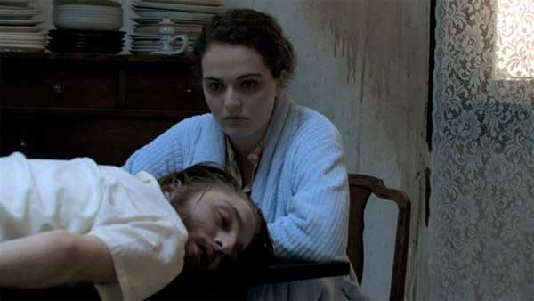 Three More Weekends, dir Irina Arnaut, via
Though timeless and placeless (brass trumpets, lace curtains, and an iron stove are among the set’s only signifiers, though of what time and place it remains unclear), Arnaut clearly takes cues from the Brothers Grimm, whose original fairytales depend upon isolated cabins, forested terrain, and highly sexualized violence for their gravitas and pedantic purpose.
When a mysterious man comes to the house, thus cutting the estrogen-soaked “domesticity,” the two women instantly understand – along with the viewer – that he must be killed. His mere presence fundamentally alters their little world; he is choked and left to lie still atop the long table from which they eat all their meals, where, that is to say, they eat each other. Antique silver scrapes against the delicate tableware, scoring the repulsive dining. Their small, dainty bites are interrupted only by flashes of a penetrating mutual gaze. Coy smiles suggest they grasp the novelty of their nourishment. All seems well until nightfall when the younger of the two women grows uncomfortable with the corpse in the kitchen and drags him out to the forest where she props him against a tree.
Whether defeated or merely exhausted, she waits, it seems, to be found by the other, who, upon waking, indeed notices the absence of both the living and the dead. Cloaked in crimson, she storms into the woods, confronts her companion and, with the camera zoomed close onto her face, speaks, for the first time in thirty minutes. I’m gonna love you foreva, I’m gonna love you foreva. Jarring, certainly, and awkward, like unconsciously swallowing for the first time in hours, but just the resolution we knew might explain it all.
The liability of pretension – and a deadened pace – threatens most films in which characters are denied speech. But in In Three More Weekends, the silence is deafening. We see, twinned with the womens’ gruesome dietary habits, that tacit urge to possess, to control, to dominate, which all too often is incorrectly reserved only for erotic love.
]]>